
Table of Contents
- What Counts as Classic Storybook Art
- Best Practices for Art Curation: Building a Cohesive Narrative
- How to Display Art Collections in a Home Gallery Setting
- Why Archival Quality Art Prints Matter for Long-Term Value
- Authentication, Provenance, and Valuation of Storybook Art
- Maintenance, Restoration, and Digital Curation Tools
- Frequently Asked Questions
Last Updated: September 28, 2026
What Counts as Classic Storybook Art
Classic storybook art is original or faithfully reproduced illustration created for children's literature, typically from the golden age of picture books through the mid-twentieth century, watercolor paintings, pen and ink drawings, and limited edition prints from titles that shaped visual storytelling for generations.
- Attribution: The illustrator or studio is identifiable, even on unsigned reproductions.
- Technique: The original artistic medium (watercolor, gouache, pen and ink) is visible in the reproduction.
- Context: The piece ties to a specific title, edition, or era.
Best Practices for Art Curation: Building a Cohesive Narrative
The strongest collections follow a single curatorial vision rather than a random assortment of favorites. Best practices for art curation start with one question: what story does this wall tell?
- By illustrator: Group works from one artist to show stylistic evolution.
- By title or fable: Build around a single tale and its many interpretations.
- By era: Cluster golden-age picture book history pieces against mid-century reprints.
- By palette: Let watercolor aesthetics in soft blues and greens anchor the arrangement.
How to Display Art Collections in a Home Gallery Setting
Displaying a collection well comes down to layout, spacing, and light control. A gallery wall works when pieces hang 2 to 3 inches apart at eye level, with the arrangement's center roughly 57 inches from the floor.
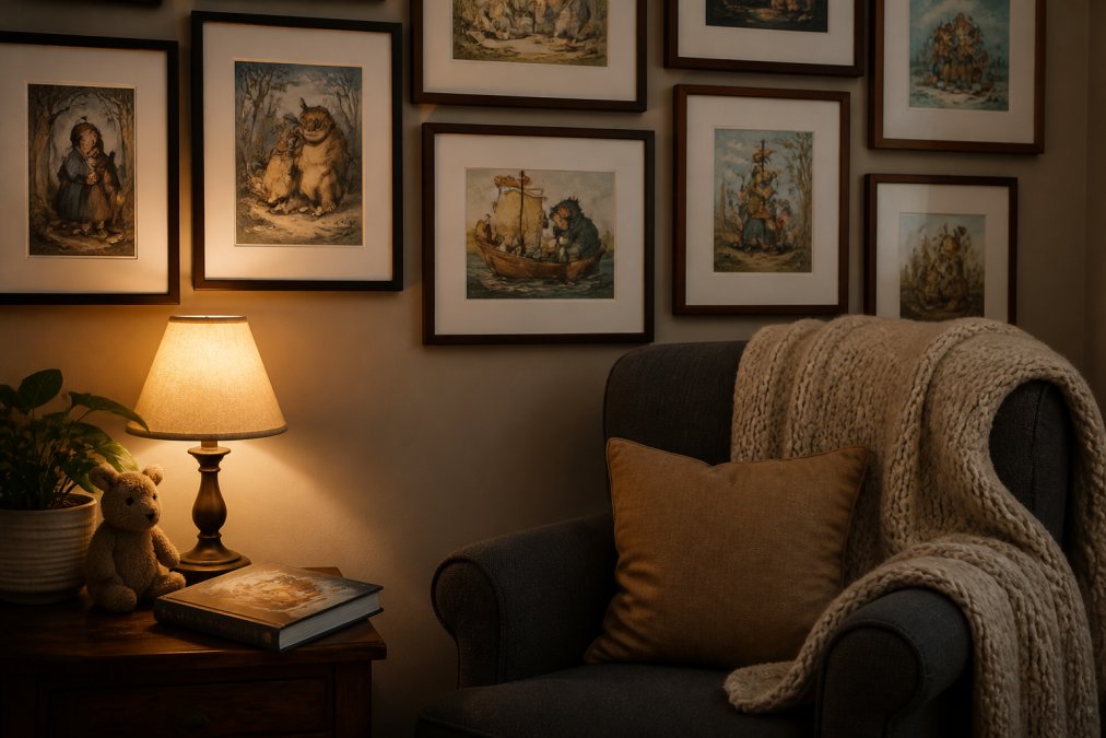
A few practical rules:
- Keep 2 to 3 inches between frames so the grouping reads as one unit.
- Match frame styles within a cluster, or deliberately alternate two finishes.
- Avoid direct sunlight; UV exposure fades inks over time.
- Hang at eye level for the room's primary use.
Sequencing a Storybook Wall Like a Spread
Most display guides stop at spacing, but storybook art rewards sequence. Illustrators compose picture books in spreads, and a wall mimicking that rhythm reads as a narrative rather than a grid.
A workable pattern for a 5- to 7-piece wall:
- Open with a wide establishing image, a full-bleed landscape or title-page scene.
- Follow with two character close-ups placed slightly lower, as if the eye is leaning in.
- Place a dramatic beat (a chase, a storm, a transformation) at the visual center.
- Close with a quiet resolution image, a final page, a dusk scene, a farewell.
Lighting Mechanics That Protect Paper
Paper-based art is far more light-sensitive than canvas or metal. The two variables that matter are illuminance and UV content.
- Ambient light: Keep framed works out of direct sun and away from unshaded south- and west-facing windows; even brief daily sun exposure accumulates.
- Artificial light: LED fixtures emit little to no UV and run cool, which matters because heat accelerates paper degradation. Halogen and incandescent spots run hot and should sit at least a few feet from the frame.
- Glazing: Standard glass blocks almost no UV. In a bright room, specify UV-filtering glazing or acrylic, museum and conservation suppliers sell it as a distinct product line.
- Rotation: Rotate light-sensitive pieces seasonally. A print that spends three months in storage each year will outlast one that hangs year-round in the same spot.
Frame and Mat Choices for Storybook Art
- Wide mats, narrow frames. A generous mat (2 to 4 inches) gives a small illustration breathing room and pushes the eye to the art. Heavy frames overwhelm small pages.
- Mat color. Off-white or warm cream is the safe default. Matching a mat to a dominant color in the illustration can work, but it dates the piece to the room's current palette.
- Mounting. Specify acid-free hinging or corner mounts. Never dry-mount or laminate a piece you might resell, both are irreversible.
- Glass vs. acrylic. Glass is more scratch-resistant; acrylic is lighter and safer for large walls and homes with kids. For a small storybook print, glass is usually the better call.
A wall built this way displays the collection and protects it, the combination that separates a curated wall from a decorated one.
Why Archival Quality Art Prints Matter for Long-Term Value
Archival quality art prints use acid-free paper and pigment-based inks rated to resist fading for decades. Standard poster stock yellows and shifts color within a few years, especially near windows.
| Print Type | Paper Weight | Finish | Best For |
|---|---|---|---|
| Satin | 210 gsm | Subtle sheen | Color pop, low-glare rooms |
| Archival matte | 230 gsm | Soft, museum-like | Framed display, fine linework |
Authentication, Provenance, and Valuation of Storybook Art
Authentication and provenance decide whether a piece appreciates or sits unsold. Provenance, the documented history of an artwork's ownership, matters as much as the art itself.
Value drivers, ranked by real-world impact:
- Condition and completeness
- Documented provenance
- Illustrator reputation and title significance
- Edition size and scarcity
Telling Originals from Reproductions
The most common mistake new collectors make is paying original prices for a high-quality reproduction. These are the verification steps dealers and auction houses actually use.
1. Look at the paper, not just the image.
Alice in Wonderland Tea Party Poster →
- Hold the sheet up to a strong light. A watermark or chain line indicates laid or wove stock typical of earlier printing; modern inkjet and offset papers are uniform and unmarked.
- Examine the surface under raking light. Original watercolor and gouache sit on top of the paper with visible brush texture and slight relief. Offset reproductions are flat; digital reproductions often show a faint halftone dot pattern under magnification.
- Check the edges. Hand-torn or deckled edges suggest an older sheet; perfectly straight, machine-cut edges on a piece claiming to be a 1920s original are a warning sign.
2. Read the printing marks.
- A plate mark, a faint indentation around the image, indicates an intaglio process (etching, engraving). Storybook illustrations were sometimes issued this way; a plate mark is strong evidence of an original print, not a photo reproduction.
- A blind stamp or publisher's chop in the margin is a common authentication marker on limited editions.
- A pencil edition statement (for example, "45/250") in the lower margin is standard for limited-edition prints. Printed edition numbers are a red flag.
3. Check the signature against the medium.
- A pencil signature below the image is typical for a print; a signature inside the image area is typical for an original drawing or painting.
- Compare the signature to known examples from the same era. Illustrator signatures evolve; one that looks too clean or too modern for the claimed date deserves a second look.
4. Verify the title and edition.
- Match the image to a specific title and edition. First editions, first printings, and stated "first thus" editions carry different weight.
- Publisher's catalogs, the Library of Congress catalog, and university special-collections finding aids are free starting points for confirming that a title, illustrator, and date combination actually exists.
Building a Provenance File
Provenance is not a single document but a chain. A strong file for a mid-tier piece typically contains:
- Purchase receipt with seller name, date, and description.
- Seller's written description of condition, edition, and any known history.
- Photographs of the piece, the signature, the edition statement, and any framing or mounting.
- Correspondence with the seller or dealer about condition or attribution.
- Auction or gallery records, if the piece has changed hands publicly.
How Valuation Actually Works
Valuation for storybook art is not a single number but a range that depends on the venue, the same piece can sell for very different amounts at a gallery, an auction, and a private sale.
- Auction results are the most transparent data point. Public records show what buyers actually paid, including buyer's premium. Use them to anchor a range, not to set a price.
- Dealer retail is typically higher than auction because it includes the dealer's expertise, framing, and return policy.
- Private sales are the least transparent and most variable. Without a documented comparable, a private sale price tells you little.
Insurance and Estate Considerations
Once a collection crosses a few thousand dollars in aggregate value, two practical steps matter:
- Scheduled personal property coverage. Standard homeowners policies often cap fine-art coverage at a low threshold. A scheduled rider lists individual pieces with agreed values.
- Appraisals. For pieces above a few hundred dollars, a written appraisal from a qualified appraiser supports both insurance and estate planning. Keep appraisals current, values shift.
Maintenance, Restoration, and Digital Curation Tools
A simple routine keeps prints in shape:
- Dust gently with a clean, dry cloth; never use liquid cleaners on paper.
- Keep humidity stable; swings cause paper to ripple and cockle.
- Rotate pieces away from direct sun seasonally.
- Store unframed works flat, in acid-free folders.
The digital and physical sides reinforce each other. A well-kept catalog makes insurance, resale, and estate planning far simpler.
Frequently Asked Questions
What is storybook art style?
Storybook art style describes the illustrative approach found in classic children's literature: hand-drawn linework, watercolor or pen and ink techniques, warm palettes, and character-driven scenes that carry a visual narrative. It includes original pen and ink drawings, vintage nursery art, and modern archival quality art prints that recreate that nostalgic look. The style prioritizes storytelling over realism, so a single image can suggest an entire tale through gesture, costume, and setting.
What is the difference between archival matte and satin prints for wall decor?
Archival matte prints use heavier, acid-free paper with a soft, glare-free surface that suits detailed linework and museum-quality display. Satin prints have a subtle sheen that lifts color saturation and contrast, which works well in brighter rooms. Both hold up over time when framed behind UV protection. At Mind Eracing Studio, satin stock runs 210 gsm and archival matte runs 230 gsm, so the matte option feels slightly heavier in the hand.
How do you choose a cohesive theme for a storybook art collection?
Start with one anchor: an illustrator, a tale, an era, or a color family. From there, apply the 70/30 rule, keeping roughly 70 percent of pieces tied to that theme and 30 percent as accents that add contrast. Group by curatorial vision rather than by size, and repeat one visual element, such as a border style or a dominant hue, across every piece. That repetition is what turns separate prints into a single aesthetic cohesion.
How can character-inspired art enhance a room's storytelling?
Character-inspired art gives a room a protagonist. A Mad Hatter print above a reading chair or an Alice tea party scene in a nursery turns decor into a visual narrative that guests notice and ask about. The character supplies an emotional hook, while the surrounding palette, textiles, and lighting carry the mood. Hanging character art at eye level with breathing room around the frame lets the figure read as a focal point instead of clutter.
Building a collection that lasts takes patience, the right materials, and a clear curatorial vision. Mind Eracing Studio offers character-inspired prints drawn from classic tales and fables, available in satin and archival matte finishes across 18 sizes and multiple orientations. Each piece is printed on heavyweight stock built for gallery-ready display, so your wall art holds up as well as it looks. Start your collection with Mind Eracing Studio and give your space a story worth telling.