
Table of Contents
- Project 1: DIY Book Page Wall Art
- Project 2: Literary Quote Canvas Art
- Project 3: Storybook Character Collage
- Project 4: Framed Print Gallery Wall
- Project 5: Upcycled Book Cover Art
- How to Style Bookish Wall Art in Any Room
- Best Materials for Literary DIY Projects
- Common Mistakes Beginners Make (And How to Avoid Them)
- Frequently Asked Questions
Last Updated: September 24, 2026
Project 1: DIY Book Page Wall Art
DIY book page wall art is the practice of turning pages from a worn or duplicate book into a framed, matte-backed piece of literary wall art, and it is one of the most affordable forms of literary wall art you can make. It is the cheapest and fastest project on this list, and it is the one most beginners finish in a single afternoon.
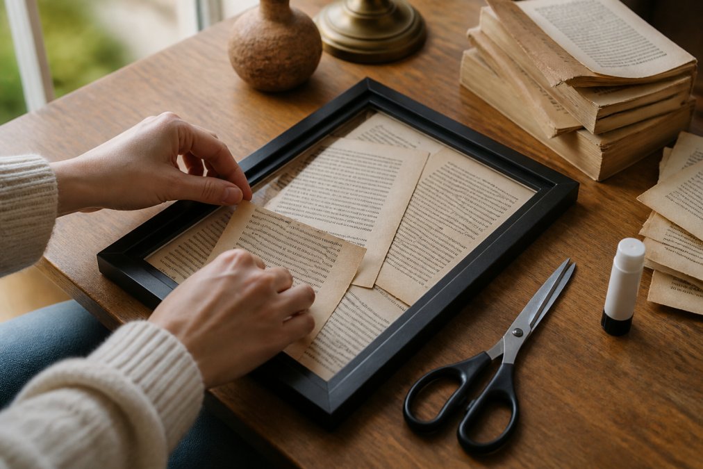
Here is the full method:
- Choose a book you own two copies of, or one already falling apart. Never cut a first edition.
- Tear pages rather than cutting them. A torn edge reads as intentional; a scissor line reads as a mistake.
- Lay pages in a loose grid or a fan pattern on a sheet of matte board.
- Glue with a thin layer of acid-free adhesive. Too much glue wrinkles the paper permanently.
- Frame with a mat so the paper never touches the glass.
Choosing Pages and Preparing Your Surface
Pick pages with strong visual texture: chapter openers, drop caps, or pages with a single short poem. A dense wall of body text turns to gray mush from across the room, which is the single most common reason a book page piece looks cheap.
Mounting and Framing Your Book Page Piece
Mounting is where most beginners rush and ruin the piece. Use a foam board backing cut 1 cm smaller than your frame on each side, then center your pages on it before any adhesive touches the paper.
Project 2: Literary Quote Canvas Art
Literary quote canvas art is a painted or printed canvas carrying a single line from a book, and it works best when the quote is short enough to read in one glance. The most common mistake is choosing a paragraph instead of a line. Pick six to ten words, maximum.
Project 3: Storybook Character Collage
A storybook character collage layers cutouts from illustrated tales into one composition, and it is the project where beginners produce the most striking results for the least skill. You need three to five character images, a backing board, and a color palette you actually like.
Project 4: Framed Print Gallery Wall
A framed print gallery wall groups several pieces into one arrangement, and the layout matters more than the individual prints. Beginners almost always hang too high and space too wide. Center the group at eye level, roughly 145 cm from the floor, and keep 5 to 8 cm between frames.
Project 5: Upcycled Book Cover Art
Upcycled book cover art turns a damaged hardcover into a wall piece by mounting the front board itself. Remove the text block, trim the board edges cleanly, and seal the cover with a matte varnish so the cloth or paper does not fray over time.
How to Style Bookish Wall Art in Any Room
Styling bookish wall art comes down to one rule: give the art a focal point and let everything around it stay quiet. A single large piece above a sofa or reading chair outperforms five small pieces scattered across the same wall. But the reason a focal point works is psychological, not just visual, a single strong image gives the eye one place to land, which lowers the visual "noise" of a room and makes it read as calmer and more deliberate.
Match the Art Style to the Room's Job
The style of the art changes how a room feels, and beginners can use that on purpose:
- Typography and quote pieces read as intellectual and focused. They suit a reading nook, a home office, or a study corner where you want the eye to slow down.
- Illustrated character collages read as playful and warm. They suit a child's room, a hallway, or a family living space.
- Minimalist book-cover pieces read as calm and modern. They suit a bedroom or a small space where too much color would feel crowded.
- Dense book-page grids read as textured and nostalgic. They suit a cozy corner but can feel heavy in a small, dark room, so keep them to one wall.
Rental-Friendly Mounting Solutions
Rental-friendly mounting means holding the art without drilling permanent holes. Damage-free adhesive strips handle pieces up to roughly 2 kg (about 4.4 lb), which covers most framed prints and posters. For anything heavier, use a leaning shelf or a picture ledge instead of an adhesive hook.
A few mechanisms matter more than the brand:
- Adhesive strips work by stretching to release, not by pulling straight off. Pull the tab slowly and parallel to the wall, or you risk taking paint with it.
- Picture ledges carry far more weight than strips and need only two small anchors, which are easy to patch. They also let you swap art without re-hanging anything.
- Washi-tape frames suit lightweight prints and paper pieces only. They are the least secure option and best for temporary or seasonal displays.
- Leaning art on a shelf or mantel needs no hardware at all and is the safest choice for heavy or oversized pieces.
Small-Space Adjustments
In a small room, scale down the group rather than the individual pieces. Two medium prints side by side usually beat four small ones, because fewer, larger shapes make a tight wall feel intentional instead of busy. Keep the top of the group below the ceiling line by at least 15 cm so the wall does not feel compressed.
Best Materials for Literary DIY Projects
The best materials for literary DIY projects are acid-free adhesive, matte board, and a frame with a mat. Acid-free adhesive stops pages from yellowing, matte board keeps paper flat, and the mat separates the art from the glass so condensation never touches it.
The Beginner Supply Checklist
You do not need a full studio to start. These are the items that actually change the result:
- Acid-free glue stick or PVA, the single most important upgrade. Ordinary school glue is acidic and will yellow paper over time.
- Matte board or foam board, gives the piece a rigid backing so it never sags.
- A frame with a mat, the mat is what keeps paper off the glass.
- Craft knife and a steel ruler, for trimming board, not for cutting book pages.
- Bone folder or a clean spoon, for pressing edges flat without creasing the paper.
- Painter's tape, for holding a layout in place while you work.
- Pencil and eraser, for sketching lettering before paint.
Paper Weight and Finish
For prints rather than handmade pieces, paper weight decides how the piece reads. Satin at 210 gsm gives colors a sheen; archival matte at 230 gsm gives a softer, glare-free finish that suits fine line work. Heavier stock (around 250 gsm and up) feels more substantial in the hand and resists waving, but it also costs more and can be harder to frame flat.
Sustainable and Eco-Friendly Choices
Most beginner guides focus on cheap materials. A more durable approach is to choose materials that are both low-waste and low-toxicity, which usually costs little or nothing extra:
- Upcycle first. Damaged hardcovers, duplicate paperbacks, and old atlases are free raw material and keep books out of the trash. This is the most sustainable route and the one most beginners overlook.
- Choose acid-free, archival supplies. They last longer, which means you replace less over time, the real measure of sustainability in decor.
- Look for low-VOC or water-based sealers and varnishes. They are easier to use indoors and avoid the solvent smell of traditional finishes.
- Reuse frames. Thrifted and secondhand frames can be repainted or refinished, and they are far cheaper than new ones.
- Avoid single-use plastic where you can. Paper tape and paper backing beat plastic wrap for finished pieces.
Tools You Can Skip
Beginners often buy more than they need. A cutting mat, a heat press, and a professional mat cutter are not required for any project on this list. A craft knife, a ruler, and a steady hand cover almost everything. Buy the specialized tools only after you have finished two or three pieces and know you will keep going.
Common Mistakes Beginners Make (And How to Avoid Them)
The most common beginner mistake is hanging art too high, followed closely by using too much adhesive. Both are easy to fix and both ruin an otherwise good piece.
- Hanging above eye level. Center the piece at roughly 145 cm from the floor.
- Over-gluing paper. A thin, even layer beats a heavy one every time.
- Mixing too many themes. Stick to one story or one palette per wall.
- Skipping the mat. Paper against glass traps moisture and causes ripples.
- Buying a frame before measuring. Measure the wall, then buy the frame.
- Ignoring the light. Direct sun fades both ink and paper over time.
Frequently Asked Questions
What is the most popular decor style right now for literary wall art?
Minimalist and eclectic styles dominate current interior design. For literary wall art, a minimalist approach uses one or two statement pieces with generous white space, while an eclectic gallery wall mixes book pages, framed quotes, and character illustrations. Both work well in modern apartments because they let you layer personal meaning without visual clutter. Start with a cohesive color palette and vary frame sizes to keep the arrangement balanced.
Can I use vintage book pages for wall art projects?
Yes, vintage book pages make excellent material for DIY book page wall art. Look for books with yellowed edges, decorative chapter headings, or illustrated plates. You can frame a single page, arrange a grid of pages, or decoupage pages onto canvas. If you want the aged look without damaging a real book, search for printable vintage page downloads online. Mount pages on acid-free backing to prevent further yellowing over time.
What materials are best for DIY literary wall art?
For the best materials for literary DIY projects, use acid-free adhesives, heavyweight cardstock, and archival matte or satin papers. Satin paper (210 gsm) gives colors a subtle sheen, while archival matte (230 gsm) offers a glare-free, museum-quality finish.
How can I incorporate literary themes into my home decor without looking cluttered?
Choose a consistent visual thread, such as a single color palette, matching frame styles, or a specific author or genre. Limit yourself to three to five pieces per wall and leave breathing room between frames. Group smaller items together and anchor larger statement pieces on their own. Mixing textures like canvas, paper, and wood adds depth without visual noise. The goal is curated, not crowded.
How do I choose the right art for a reading corner?
A reading corner benefits from art that feels intimate and calming. Choose pieces with warm tones, soft lighting, and subject matter that complements quiet reflection, such as storybook illustrations or literary quotes. Scale matters: a single medium-to-large print above a reading chair works better than a busy gallery wall. If you want a character-driven focal point, a framed print from a classic tale adds personality without overwhelming the space.
Building a wall that feels personal takes more than a nail and a frame. It takes pieces that actually mean something to you, and that is where Mind Eracing Studio comes in. Our character-inspired posters are printed on your choice of satin or archival matte paper, available in 18 sizes and three orientations, so one print can anchor a reading nook or start a full gallery wall. Browse the collection and find the story you want on your wall.