
Table of Contents
- What Is Literary Inspired Home Decor Style?
- The Role of Books in Interior Design
- How to Style Bookshelves Like a Pro
- Literary Wall Art Prints and Quote-Led Typography
- Building a Cozy Reading Nook Decor Scheme
- Color Palette Psychology for Literary Rooms
- Budget-Friendly DIY Literary Decor for Small Spaces
- Conclusion
- Frequently Asked Questions
Last Updated: September 23, 2026
What Is Literary Inspired Home Decor Style?
If you have ever wondered what is literary inspired home decor style, it draws its visual language from books, storytelling, and the printed word, using books, vintage pages, typography, and narrative artwork as a room's foundation. At Mind Eracing Studio, we see it as one of the most personal ways to furnish a home, turning a shelf or wall into a self-portrait of what you love to read.
The Role of Books in Interior Design
Books do more than fill shelf space. They supply color, texture, and visual height, and signal that a room belongs to someone with a point of view. A wall of spines reads as a design narrative before a single object is styled around it.
Why Books Work as Design Elements
Books are modular, color-variable, and textural. Each spine is a small rectangle of color, and a shelf of them functions like a mosaic. A wall of books can carry a room the way wallpaper or a large painting would, but it is rearrangeable.
Three properties make books uniquely useful in interiors:
- Color control. You can sort by spine color to create a gradient, a monochrome block, or a deliberate clash. No other decor category gives you this level of adjustable color at zero additional cost.
- Texture variation. Cloth-bound, paper-backed, jacketed, and bare-board books each catch light differently. Mixing them prevents the flat, printed look that a wall of identical spines creates.
- Scale flexibility. A single large art book can anchor a coffee table; a row of mass-market paperbacks can fill a narrow shelf. Books scale up or down without looking out of place.
The Genre-to-Room Translation
This is where literary decor separates itself from generic book styling. The genre you read most can drive the room's palette, materials, and mood. Most guides stop at "add books"; the stronger move is to let the genre set the design language.
| Genre | Palette | Materials | Lighting |
|---|---|---|---|
| Gothic | Charcoal, oxblood, black, tarnished brass | Velvet, dark wood, wrought iron | Low, warm, pooled |
| Romantic | Cream, faded rose, sage, gilt | Linen, aged paper, soft wool | Diffused, golden |
| Mystery / Noir | Ink blue, smoke gray, amber | Leather, glass, chrome | Directed, shadowed |
| Fantasy / Adventure | Forest green, ochre, deep teal | Wood, brass, woven textiles | Warm and layered |
| Modern literary | White, ink, one saturated accent | Matte finishes, clean lines | Bright and even |
The Structural View
Architects and interior designers have long treated built-in shelving as architecture rather than furniture. A floor-to-ceiling bookcase changes how a room is perceived: it adds visual weight, defines a wall, and can make a low ceiling feel taller by drawing the eye upward. The American Institute of Architects design resources note that personal, story-driven interiors consistently rank among the most requested residential design directions.
How to Style Bookshelves Like a Pro
Styling bookshelves like a pro means breaking the grid. Filling every shelf edge to edge at the same height flattens the unit into a wall of rectangles; the fix is deliberate variation.
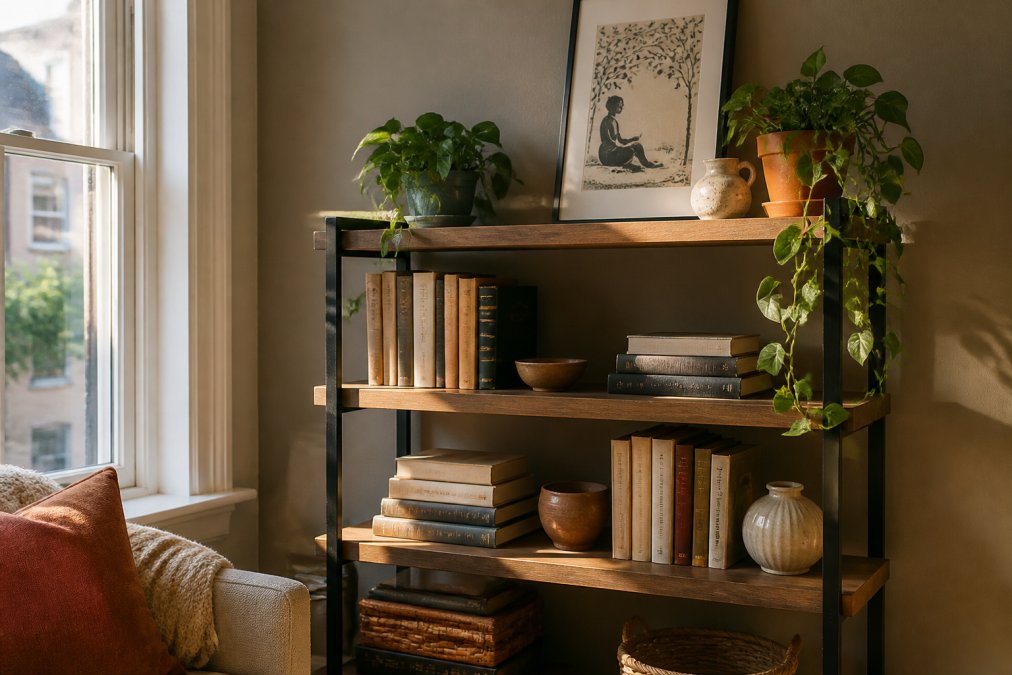
Work through these steps in order:
- Clear every shelf and sort books by color or theme, not author.
- Group books in odd-numbered clusters of three or five.
- Alternate horizontal stacks with vertical rows on each shelf.
- Leave roughly one-third of each shelf empty for breathing room.
- Add one non-book object per cluster: a ceramic, a candle, a small frame.
- Lean a framed print against the back of the top shelf for depth.
- Repeat the accent color in at least three spots across the unit.
Literary Wall Art Prints and Quote-Led Typography
Literary wall art prints do the heavy lifting in this style because they carry the narrative without requiring floor space. A single character-driven illustration can anchor a gallery wall the way a large mirror anchors a hallway.

Choosing the Right Print for the Right Wall
Let the wall, not the print, drive the size. Designers commonly treat artwork as a percentage of the wall it hangs on:
- Small accent wall or narrow strip: one print at 12x18 inches or smaller, centered at seated eye level.
- Standard living room wall: one print at 18x24 inches, or a triptych of three smaller prints.
- Large blank wall: one oversized print at 24x36 inches or larger, or a gallery grid of six to nine pieces.
- Above a sofa or console: the art should span roughly two-thirds of the furniture's width.
Quote Prints vs. Character Art: When to Use Each
Both work, but they do different jobs.
- Quote prints are best when the words themselves are the point. They work in entryways, offices, and reading corners where a single line can set a tone. Keep the typography simple: one font family, one weight, generous margins. A quote print with three fonts and a decorative border reads as a craft project, not a design choice.
- Character art is best when you want visual interest without relying on text. An illustration of a character from a classic tale carries the literary signal even at a distance, and it scales better across a gallery wall because it has more visual complexity.
- A mix works when you have a large wall and want both. Pair one quote print with two character prints in a three-piece arrangement, keeping the frames identical so the content can vary.
The Color Psychology Angle Most Guides Skip
The palette of your art should match the genre of your room, not just your personal taste.
Mad Hatter Art Poster — Surreal Vintage →
- Gothic rooms benefit from high-contrast art: black backgrounds, oxblood or bone accents, heavy borders. The art should feel like it belongs in a dim room.
- Romantic rooms benefit from soft, warm art: cream backgrounds, faded florals, muted gold. The art should feel like it was printed on aged paper.
- Modern literary rooms benefit from clean, high-contrast art: white backgrounds, ink or navy linework, minimal framing. The art should feel like a book cover, not a painting.
- Fantasy and adventure rooms benefit from saturated, layered art: deep greens, ochres, teals. The art should feel like it could be a map or a bestiary page.
Framing and Matting
A frame is not neutral. A thin black frame on a white wall reads as modern; a wide gold frame on a dark wall reads as traditional; natural wood reads as casual. Match the frame to the genre, not the furniture.
Building a Cozy Reading Nook Decor Scheme
A cozy reading nook decor scheme needs four things: a seat you can sink into, directed light, a surface for a cup, and a wall that rewards a second look. Everything else is optional.
Color Palette Psychology for Literary Rooms
Color does more work in a literary room than most people expect. The palette sets whether the space reads as a traditional library, a modern reading corner, or something with darker Gothic undertones.
| Palette | Core Colors | Reads As | Best For |
|---|---|---|---|
| Traditional library | Deep green, walnut, brass | Established, scholarly | Rooms with wood trim |
| English countryside | Cream, sage, faded rose | Soft, nostalgic | Sunlit living rooms |
| Gothic literary | Charcoal, oxblood, black | Moody, dramatic | Small windowless rooms |
| Modern bookish | White, ink blue, one accent | Clean, contemporary | Apartments and rentals |
Budget-Friendly DIY Literary Decor for Small Spaces
Small spaces and tight budgets are not obstacles to this style. They are an advantage, because literary decor rewards density and personal meaning over square footage and price.
- Print public-domain illustrations at home and frame them in thrifted frames.
- Use vintage book pages as a mat behind a smaller print.
- Stack books spine-in for a clean, uniform look, or spine-out for color.
- Mount a single narrow shelf at picture-rail height for a rotating display.
- Group three small prints in one frame to make a single larger piece.
- Repurpose a damaged hardcover as a floating shelf support.
Conclusion
The hardest part of building a literary inspired home decor style is not finding the pieces but resisting the urge to fill every surface at once. Rooms in this style need negative space the way a page needs margins.
Frequently Asked Questions
What is literary inspired home decor style?
Literary inspired home decor style uses books, book-related art, and storytelling motifs to give a room the feel of a personal library. Think stacked books, vintage pages, typography prints, and cozy reading nooks. It is less about following one historical period and more about curating objects that suggest a life of reading. You can mix a modern sofa with an antique bookcase and literary wall art prints to create a space that feels collected rather than decorated.
How do I choose art that reflects my favorite stories?
Start with a specific scene or character that matters to you, then look for art that captures its mood rather than a literal illustration. For example, a Mad Hatter art poster can bring surreal, storybook mystery to a reading nook, while an Alice in Wonderland tea party poster adds whimsical, hand-drawn charm. Choose a size and orientation that fits your wall, and pick satin for vivid color or archival matte for a softer, museum-like finish.
What color palettes work best for bookish decor?
Warm, muted tones like amber, deep green, burgundy, and aged paper cream create a classic library feel. For a modern literary room, pair charcoal or navy with brass accents and one bold color from a favorite book cover. Color psychology suggests that warm tones encourage relaxation, which suits a reading nook, while cooler tones can make a space feel more focused. Test paint swatches next to your books and art before committing.
How can I make my home look like a classic library on a budget?
Use what you already own. Stack books vertically and horizontally on shelves, turn a few covers outward for visual height, and add a vintage page or two in a simple frame. Thrift stores often sell hardcover classics for a few dollars. For wall art, a rolled poster like the Vintage Storybook Snow White illustration starts at $20.99, and other character prints start at $16.27. Group items in odd numbers and vary heights to avoid a flat look.
Can literary decor work in a small apartment?
Yes. In a small space, focus on one wall or corner instead of spreading bookish items everywhere. A single narrow bookshelf, a small reading chair, and one literary wall art print can define a cozy reading nook without crowding the room. Choose vertical art to draw the eye upward, and keep book stacks low so surfaces stay usable. A satin or archival matte poster in a compact size fits tight walls well.
What are examples of literary art for home walls?
Literary art includes character portraits, storybook scene illustrations, quote-led typography, and vintage page reproductions. A surreal Mad Hatter print, a whimsical snail art poster, or an Alice-inspired colorful poster are all examples that bring narrative into a room. You can also frame a page from a damaged classic book or use a botanical illustration from a naturalist text. Mix one or two larger pieces with smaller prints to build a gallery wall.
How do I style bookshelves like a pro?
Start by clearing everything off, then group books by color or subject. Alternate vertical stacks with a few horizontal piles to break up lines. Leave about 20 percent empty space so the shelf can breathe. Add one or two non-book objects per shelf, like a small vase, a candle, or a framed literary print. Lean a poster against the back of the top shelf for a relaxed, collected look. Repeat shapes and colors across shelves to tie the display together.