
Table of Contents
- Why Displaying Literary Inspired Wall Art Is Different
- How to Choose Art for Your Space: Sizing and Placement Rules
- How to Arrange a Gallery Wall With Book-Themed Prints
- Best Frames for Art Prints: Protecting Paper and Ink
- Rental-Friendly Mounting: Adhesive Strips vs. Hardware
- Creative Hanging Techniques for a Reading Nook Focal Point
- Lighting Considerations That Bring Out Print Colors
- Conclusion: Build Your Curated Collection Over Time
- Frequently Asked Questions
Last Updated: September 6, 2026
Hanging literary inspired wall art goes beyond simply picking a favorite quote and hammering a nail. The real challenge is pairing pieces that feature dense typography or detailed storybook scenes with the architectural needs of your room, all while protecting the paper from fading and damage. This guide from Mind Eracing Studio covers the practical tips for displaying literary inspired wall art, from sizing rules and archival framing to rental-friendly mounting that won't leave scars on your walls.
Most guides treat art as a single object, but literary prints behave differently. A page of text reads as texture from across the room, while a character-driven illustration pulls focus up close. You need to plan for both viewing distances. Below, we’ll walk through sizing, layout, framing, and hanging so your collection looks intentional from day one.
Why Displaying Literary Inspired Wall Art Is Different
Book-themed decor carries a unique tension: it is both visual art and reading material. Unlike abstract paintings, literary wall art invites viewers to step closer and decode the imagery or text, which means your arrangement must accommodate two modes of viewing: a distant impression and an intimate inspection.
This dual nature changes how you handle spacing. Pieces with fine line work or small typography need breathing room so they don’t blur together. Conversely, large canvas prints of classic literature scenes can anchor a room from a distance. The key is to sort your collection by visual weight before you start measuring anything.
How to Choose Art for Your Space: Sizing and Placement Rules
Before buying a single print, measure the wall and the furniture beneath it. A common approach is to keep the total width of your art arrangement between two-thirds and the full width of the sofa or headboard below it. This prevents a small piece from getting lost above a large sectional.
For a single statement piece, aim for the artwork to occupy roughly 60 to 75 percent of the available wall space. If the piece is smaller, group it with complementary items rather than leaving it isolated. When selecting prints, consider whether the piece is text-heavy or image-heavy; typography art often reads better in larger formats where the words remain legible from a distance.
How to Arrange a Gallery Wall With Book-Themed Prints
A gallery wall is the most effective way to display a curated collection of literary prints. The best frames for art prints in a mixed arrangement share a common visual trait, such as the same wood tone or mat color, even if the sizes vary. This unifies disparate images without making the wall feel monotonous.
Start by laying the frames on the floor to experiment with spatial composition. Move pieces until the visual balance feels right, then transfer the layout to paper. Cut out templates and tape them to the wall to confirm spacing before committing to nails or adhesive.
The 57-Inch Rule and the 2/3 Furniture Rule
Center the entire gallery at 57 inches from the floor to the midpoint of the arrangement (si.edu). This standard aligns with average eye level in most homes. For a gallery above a sofa, keep the bottom edge of the frames 6 to 10 inches above the back of the furniture.
Balancing Text-Heavy Art With Visual Composition
Alternate dense prints with lighter, open imagery. If one piece is a full-page literary quote, pair it with a character portrait that has negative space. This rhythm prevents any single section of the wall from feeling cluttered or overwhelming.
Best Frames for Art Prints: Protecting Paper and Ink
Framing is where you protect your investment. Paper-based prints are vulnerable to humidity, UV rays, and acid migration from cheap cardboard backing. A floating frame with a visible gap between the print and the glass is a stylish choice for vintage charm, but the materials underneath matter just as much as the visible profile.
Archival Matting and UV Protection Glass
Use acid-free matting to prevent yellowing and discoloration over time (nga.gov). Archival matting acts as a barrier between the print and the glass, which is essential since condensation can cause ink to stick to the surface. Pair this with UV protection glass to slow fading from direct sunlight. Many collectors find that a satin finish print, which offers a subtle sheen, holds up well under standard gallery lighting without excessive glare.
The Preservation Angle Most Guides Miss
Most general art-hanging guides ignore that literary art, especially vintage book pages, first-edition prints, or hand-pulled etchings, is paper-based and requires a different standard of care than a canvas reproduction. If your piece is on rag paper or has deckled edges, you need to think like a museum archivist, not a decorator.
Glazing options ranked by protection:
- Standard picture glass - Blocks about 40% of UV rays. Fine for short-term displays in low-light hallways, but not for anything you want to keep for decades.
- UV-filtering acrylic (e.g., Optium Museum Acrylic) - Blocks 99% of UV rays, is shatter-resistant, and weighs about half as much as glass. This is the default choice for rare book pages or signed prints. The trade-off is cost and a slight static charge that can attract dust.
- Museum glass - Offers 99% UV protection with an anti-reflective coating that eliminates glare. It is the clearest option but also the most expensive and heaviest. Use it for pieces with fine typography that you want to read without reflection.
Matting mechanics: A mat is not just decorative. It creates a physical air gap between the print and the glazing, preventing condensation from trapping moisture against the ink. For literary pieces with heavy ink coverage, always use a mat with a window, never press the glass directly against the paper. Use 4-ply acid-free mat board as a minimum; 8-ply is better for oversized pieces that need extra support. The mat should be at least 2 inches wide on each side to keep the paper from bowing against the glass over time.
Backing materials: Many cheap frames come with a brown cardboard backing that contains lignin, which off-gasses acids that yellow paper. Replace it with acid-free foam core or a corrugated plastic board. Seal the back with archival tape (not duct tape) to block dust and insects.
A practical trade-off: UV glass and acrylic cost 2 to 3 times more than standard glass. If budget is tight, prioritize UV protection for pieces hung on walls that receive any indirect daylight, and use standard glass only for pieces in windowless hallways or north-facing rooms.
Rental-Friendly Mounting: Adhesive Strips vs. Hardware
For renters or anyone who dislikes patching drywall, adhesive strips are a reliable solution for lightweight posters. They are designed to hold securely on smooth surfaces and release cleanly when pulled correctly. However, adhesive strips are not suitable for heavy, large framed pieces; for those, you need proper mounting hardware.
A common mistake is using adhesive on textured walls or applying too many strips, which makes removal difficult. Always follow the weight rating on the package and clean the wall surface with rubbing alcohol before application. For framed prints over a few pounds, use a wall anchor and screw to ensure the piece stays level and secure.
Creative Hanging Techniques for a Reading Nook Focal Point
A reading nook is the natural home for literary wall art. To create a focal point, hang a single dramatic piece slightly lower than the 57-inch rule, around 54 inches, since you will likely be seated when viewing it. This pulls the eye down and makes the space feel intimate.
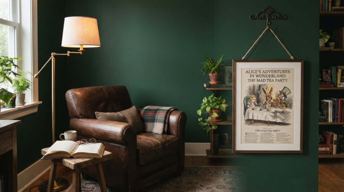
For a more casual, collected look, try propped art. Leaning a framed print on a shelf or mantel against the wall adds depth and is completely damage-free. Clamp hangers are another option for displaying single pages or unframed book pages without committing to a permanent installation.
Lighting Considerations That Bring Out Print Colors
Lighting makes or breaks a display. Overhead ceiling lights often cast shadows or create glare on glass. Instead, use a picture light mounted on the frame itself or a track light aimed at a 30-degree angle to minimize reflection. For prints with rich, saturated colors, warm LED bulbs around 2700K to 3000K enhance the pigments without washing them out.
Avoid placing valuable prints directly opposite a window (getty.edu). Even with UV protection glass, prolonged direct sunlight will fade inks over time. If your wall gets strong afternoon sun, consider sheer curtains or choose a different wall for your most prized pieces.
Fixture Types and Beam Angles
A picture light mounted on the frame is the simplest solution for a single piece. Look for LED picture lights with a swivel head so you can aim the beam at the center of the art, not the glass. For a gallery wall, use adjustable track lighting with individual heads. Position each head so the beam hits the art at a 30-degree angle from vertical, this is the standard gallery angle that minimizes both glare and shadow from the frame's depth.
Color temperature matters more than brightness:
- 2700K (warm white) - Enhances reds, browns, and gold tones. Best for vintage book pages, sepia-toned illustrations, and classic storybook art with warm palettes.
- 3000K (soft white) - A neutral warm tone that works well for most literary prints, especially those with mixed warm and cool colors.
- 3500K-4000K (cool white) - Brightens blues and greens. Use this only if your literary art features cool, moody palettes like night scenes or ocean imagery. Avoid cool light for typography prints, it makes white paper look clinical.
The Thematic Color Coordination Angle
Most lighting guides stop at glare reduction, but the real opportunity is using light to tie your literary art into the room's existing color scheme. A common pattern is to select a single accent color from the art and echo it in the lighting temperature or the lamp shade nearby.
For example, if your framed print features a deep crimson binding or a golden hour landscape, a warm 2700K bulb will pull that color into the room. If the art is a black-and-white engraving, use a neutral 3000K light and let the frame's wood tone provide the warmth. This creates a visual bridge between the art and the furniture below it.
Practical setup for a reading nook: Use a floor lamp with a swing arm positioned to the side of the chair, not directly above the art. Aim the light at the art from a 45-degree side angle. This creates a pool of light that illuminates both the print and the pages of the book you are reading. A dimmer switch is a worthwhile addition, literary art with dense text can feel overwhelming under full brightness; dimming to 70% softens the contrast and makes the space feel cozier.
Conclusion: Build Your Curated Collection Over Time
Curating a literary wall is a process, not a one-time purchase. Start with one anchor piece, live with it, and add complementary prints as you find them. Mind Eracing Studio offers a range of character-inspired art drawn from classic tales, with satin and archival matte print options that pair well with the archival framing methods covered here. Add a piece that captures your favorite story, and build your arrangement around it.
Frequently Asked Questions
What is the 57 rule for hanging art?
The 57-inch rule means the center of your artwork should sit 57 inches from the floor, which matches average eye level. Measure from the floor to the middle of the frame, not the top. This works for most rooms, but you can adjust it upward in kitchens or hallways where people stand. For literary wall art in a reading nook, sitting eye level matters more than standing eye level, so lower the piece to around 48 to 54 inches.
What is the 2/3 rule for wall art?
The 2/3 rule states that a wall arrangement should cover roughly two-thirds of the furniture width beneath it. For a 60-inch sofa, your gallery wall or single print should span about 40 inches. This prevents your literary wall art from looking lost or overwhelming the seating area. When hanging above a desk or bookshelf, apply the same ratio to create visual balance.
What are some unique ways to display literary inspired art?
Beyond standard frames, try leaning prints on a bookshelf or mantel for a casual, layered look. Use clamp hangers to attach art directly to floating shelves, or mix framed prints with physical books arranged on small display ledges. For a true focal point, group a character-inspired poster like the Mad Hatter Art Poster with a vintage reading chair and a brass floor lamp to create a dedicated literary corner.
How do I mix character-inspired art with modern home decor?
Match your frame finish to existing hardware in the room. Black or natural wood frames bridge storybook art and contemporary furniture. Keep the rest of the wall minimal so the print reads as a curated accent rather than a themed decoration. Choose a satin print for a subtle sheen that catches light, which helps character art feel more polished and gallery-like in a modern apartment.