
Table of Contents
- Why Style Identification Matters for Collectors and Storytellers
- How to Identify Authentic Storybook Illustration Styles: A 7-Step Method
- Identifying Artistic Mediums in Storybooks
- Classic Storybook Art Styles and Their Technical Markers
- Children's Book Illustration Techniques That Reveal the Artist's Hand
- AI-Generated vs. Human-Made Storybook Illustration: How to Tell
- Matching Style to Story: Age Group, Mood, and Manuscript Consistency
- Frequently Asked Questions
Last Updated: September 26, 2026
Why Style Identification Matters for Collectors and Storytellers
Knowing how to identify authentic storybook illustration styles changes how you buy, frame, and live with illustrated art. It is less about memorizing artist names and more about reading the marks a maker leaves behind: line quality, palette, composition, and medium. This guide from Mind Eracing Studio walks through a practical method for doing exactly that.
How to Identify Authentic Storybook Illustration Styles: A 7-Step Method
Start with the printed page itself, not the artist's reputation. This seven-step read, done in order, separates a genuine period illustration from a modern imitation in under ten minutes. It is the same sequence an art director uses: work from the smallest mark outward to the largest production decision, because small marks are the hardest to fake.
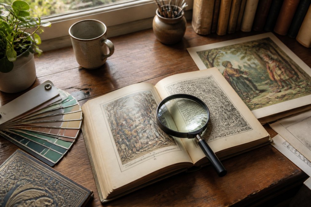
- Inspect line quality first. Look at whether outlines are confident and continuous or hesitant and broken.
- Identify the medium. Watercolor blooms, gouache opacity, and ink hatching each leave distinct edges.
- Map the color palette. Count the dominant hues and note whether they are mixed or flat.
- Study composition and visual hierarchy. Find where the eye lands first and how the artist directs it.
- Check texture and paper grain. Screen dots and uniform noise signal digital output.
- Compare against a known body of work. Style should hold steady across an artist's books.
- Confirm production details. Trim size, printing method, and publisher marks date the piece.
Step 1: Read the Line Quality
Line quality is the fastest tell, and the one most imitators get wrong. Hand-drawn lines vary in weight, wobble slightly, and thin out at the ends of strokes; vector lines stay perfectly uniform.
Three line signatures worth memorizing:
- Dip pen: sharp, high-contrast, with occasional ink spatter and a slight scratch into the paper.
- Brush: swelling and tapering within a single stroke, with soft edges where the bristles splay.
- Pencil under-drawing: faint graphite ghosts visible beneath the final ink, often slightly off-register from the finished line.
Step 2: Study the Color Palette and Medium
Palette reveals both the artist's hand and the printing era. Older picture books favor four to six hues because each color required a separate press plate, and every extra color added cost. Modern digital illustration often pushes wide, saturated gradients that would have been prohibitively expensive to print in 1960.
Step 3: Check Composition and Visual Hierarchy
Composition shows intent. Ask where your eye lands first, then trace how the artist moves you through the frame. Strong picture book work uses size, contrast, and placement to guide a child's gaze toward the emotional center, usually a face, usually on a third-line rather than dead center.
Identifying Artistic Mediums in Storybooks
Medium identification comes down to edges and surfaces. Every traditional medium fails in a specific, repeatable way, and those failures are your evidence.
- Watercolor: soft, blooming edges; visible paper texture; colors lighten toward the wash edge.
- Gouache: matte, opaque color; brush marks sit on top of the paper rather than soaking in.
- Pen and ink: crisp black linework; hatching and stippling build tone instead of washes.
- Colored pencil: visible directional strokes; waxy sheen in raking light.
- Mixed media: layered surfaces where one medium sits over another, often ink over wash.
Classic Storybook Art Styles and Their Technical Markers
Classic styles are recognizable because each one solves the same problems, depth, mood, and clarity, with a distinct set of tools. Learn the marker, and the style identifies itself.
| Style | Key Technical Marker | Best For |
|---|---|---|
| Watercolor and gouache | Soft washes or opaque flat color, visible paper grain | Whimsical, gentle tales |
| Pen and ink | Hatching, stippling, high-contrast linework | Detailed, older-reader books |
| Flat graphic | Hard edges, limited palette, no shading gradient | Bold, modern picture books |
| Realistic rendering | Deep perspective, layered lighting, fine detail | Nonfiction and middle grade |
Watercolor and Gouache
Watercolor and gouache dominate the whimsical end of picture books. Watercolor brings transparency and light; gouache brings opacity and control. Many classic illustrators used both in one spread, laying opaque figures over transparent backgrounds.
Pen and Ink, Flat Graphic, and Realistic Rendering
Pen and ink carries detail through line alone, using hatching and stippling where a painter would use tone. Flat graphic strips away shading entirely, relying on shape and color. Realistic rendering builds depth with perspective, lighting, and layered shading.
Children's Book Illustration Techniques That Reveal the Artist's Hand
Children's book illustration techniques leave fingerprints that are hard to fake. The most reliable are the small imperfections: a slightly misaligned registration, a hand-lettered title, a brushstroke that runs past its intended edge.
AI-Generated vs. Human-Made Storybook Illustration: How to Tell
AI-generated illustration fails in predictable places, but the obvious tells, extra fingers, garbled text, are the ones generators have been trained to fix. The durable tells are structural: how strokes relate to each other, how texture behaves across object boundaries, and how the image holds up under magnification.
Run this checklist on any illustration you suspect:
- Count the fingers and check joint direction on every visible hand.
- Read any text in the image; AI lettering is often near-legible but wrong.
- Compare repeated objects (chairs, flowers, windows) for identical copies.
- Trace a single line from start to finish and check for unexplained breaks.
- Check whether shadows fall from a single consistent light source.
- Look for texture that continues across object boundaries instead of stopping at them.
The Stroke-Rhythm Test
Zoom to 200% and trace three separate contours, say, a tree trunk, a sleeve, and a fence rail. In human work, the three lines share a family resemblance: similar taper, pressure variation, and wobble frequency. In AI work, each line is locally plausible but the three do not share a rhythm, because each was generated independently to satisfy the prompt.
The Texture-Continuity Test
Traditional media pick up paper grain that runs in the same direction across the whole image, including across areas of different color. A digital overlay sits on top: it crosses a shadow boundary without darkening, or continues at full strength into a region that should be flat. Under a loupe, real grain looks like a continuous field; an overlay looks like a sticker.
The Halftone and Metadata Check
With a physical print, magnification settles most cases. Commercial offset printing lays down halftone dots at a fixed screen ruling, typically 133 to 175 lines per inch for book work, visible under a 10x loupe as a regular grid rotating at different angles per ink color. A digital print shows no dot structure or a stochastic spray. Neither proves AI, but a seller claiming a 1950s first edition that shows stochastic digital printing is a red flag regardless.
Why This Matters for Buyers
The same tells apply whether you are buying a vintage book or commissioning new illustration. If you are hiring an illustrator, ask for process shots: thumbnails, a rough, a color study, and the final. A human produces these as a byproduct of working; a generative workflow cannot produce a coherent progression, because there was none, only a prompt and a result.
Matching Style to Story: Age Group, Mood, and Manuscript Consistency
Style should follow the reader's age and the story's emotional register, not the illustrator's portfolio. Picture books for ages three to six reward flat graphic and watercolor work with large, readable shapes; middle grade readers respond to pen and ink and semi-realistic rendering with more detail per page.
Frequently Asked Questions
What are the different styles of children's book illustrations?
The main styles you will see are watercolor, gouache, pen and ink, flat graphic, cartoon and character design, and realistic or semi-realistic rendering. Each leaves different technical markers: watercolor shows soft bleeds and paper texture, pen and ink shows crosshatching and line weight variation, and flat graphic work uses solid blocks of color with minimal shading. Learning to read these markers is the fastest way to identify authentic storybook illustration styles when you are browsing prints or evaluating a manuscript.
How can you tell the difference between digital and traditional illustration styles?
Traditional media like watercolor, gouache, and ink leave physical evidence: irregular edges, visible brushwork, paper grain, and slight color shifts where pigments pooled. Digital painting can replicate these, but the tell is usually uniformity. Look at the texture in the shadows, the symmetry of repeated details, and whether the line quality varies naturally. A hand-drawn line thins and thickens with pressure; a digital line often stays the same weight across an entire illustration.
How do you spot an AI-generated storybook illustration?
AI-generated art tends to fail on the small structural details. Check hands, ears, and background objects for melting or merged shapes. Look at pattern repetition in fabric, foliage, or architecture, which often repeats in an unnatural loop. Line quality is another marker: human illustrators vary pressure and speed, while AI output often has a uniform, slightly soft edge across the whole image. Comparing the rendering style of the main character to the background is also useful, since AI often renders them at different levels of finish.
How do I keep illustration style consistent across a full picture book?
Build a mood board before you draw a single spread, then pull a fixed color palette and a small set of brush or pen tools from it. Lock your character proportions and line weight by drawing a reference sheet you check against every new page. Style consistency comes from repetition, not inspiration. Review all spreads side by side at the end and flag any page where the palette, line quality, or lighting direction drifts from the others.
Identifying style takes practice, and the fastest way to build the skill is to live with good illustration. Mind Eracing Studio curates character-driven prints drawn from classic tales and fables, printed on satin or archival matte stock in 18 size options, so the line quality and palette you study on the page are the same ones on your wall. Browse the collection and add a piece that earns its place in the room.