
Table of Contents
- Understand the Fundamentals of Styling Character Art
- How to Choose Art for Your Space
- Modern Gallery Wall Layout Ideas That Work
- Tips for Mixing Art Styles with Character Pieces
- Placement and Hanging Standards for Maximum Impact
- Lighting Techniques That Preserve and Showcase Your Art
- Common Mistakes to Avoid When Styling Character Art
- Conclusion
Last Updated: August 29, 2026
Understand the Fundamentals of Styling Character Art
Character-driven pieces don't clash with contemporary design, they anchor spaces with personality and narrative depth that mass-produced decor cannot deliver. The key is understanding scale, proportion, and visual weight. A bold character piece works best with breathing room around it, allowing each artwork to speak without competing for attention.
At Mind Eracing Studio, we focus on character-inspired art that brings storytelling to life. Our satin and archival matte print options ensure colors and fine detail stay true to what you see online. Start by assessing your space's existing architectural features, crown molding, built-in shelving, or distinctive wall treatments become anchors for art placement. Character art complements architecture beautifully, creating a collected feel that reads as intentional rather than random.
How to Choose Art for Your Space
Match the piece's visual weight to your room's proportions. A small, delicate character print gets lost on a large, open wall, while a bold, saturated piece demands proper wall space.
Consider your existing color palette first. If your sofa is neutral and your accent wall is cool-toned, a warm character piece in jewel tones or earthy hues creates visual contrast without clashing. Think about the narrative you want your space to tell, character art from classic tales carries emotional weight, nostalgia, whimsy, drama, or mystery depending on the subject.
Investing in a high-quality print from Mind Eracing Studio at $16.27 per piece means archival materials that won't fade or yellow over time. One exceptional piece hung well beats three mediocre ones scattered randomly.
Test your choice before committing. Print a sample image at your intended size and tape it to the wall for a few days. See how light hits it at different times and how it interacts with your furniture and architecture. This simple step prevents costly mistakes.
Modern Gallery Wall Layout Ideas That Work
A gallery wall works in modern homes when it follows clear compositional logic rather than random arrangement. Balance symmetry with asymmetry, structured enough to feel intentional, loose enough to avoid sterility.
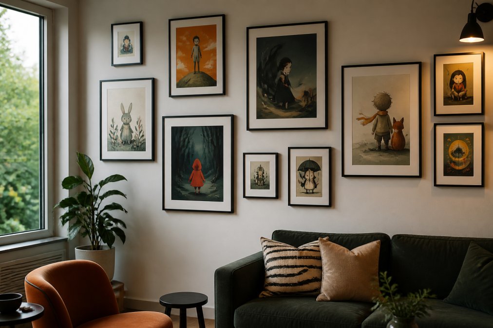
Start with a focal point. Choose your strongest, most visually dominant piece and build around it. Position it slightly off-center; dead center reads as formal, while offset placement feels more collected and editorial.
The Grid Layout works best with similar-sized pieces spaced evenly, 2-3 inches between frames. This feels modern and organized without rigidity.
The Salon Wall mixes sizes, orientations, and frame styles, with outer edges forming an invisible rectangle. This creates visual cohesion while allowing pieces to breathe.
The Linear Progression arranges pieces in a horizontal or vertical line with slight size variation, creating movement and guiding the eye.
Negative space between pieces prevents visual clutter and lets each artwork function independently. Most people hang pieces too close together; breathing room makes a gallery wall feel intentional rather than overcrowded.
Consider mixing frame styles and materials. A sleek black frame paired with natural wood and simple metal creates visual texture and prevents the wall from feeling too matchy.
Tips for Mixing Art Styles with Character Pieces
Mixing art styles works when you establish a visual thread connecting the pieces. Character art can coexist with abstract pieces, photographs, and architectural prints if they share a color story or emotional tone.
The most common mistake is mixing styles without considering color harmony. If your character piece features deep jewel tones, flanking it with bright, saturated abstracts creates visual chaos. Choose supporting pieces that echo the color family instead.
Emotional tone matters equally. Whimsical character art works alongside playful, colorful pieces, while darker character art pairs better with moody abstracts or black-and-white photography. Scale variation is your tool for visual interest, a large character piece benefits from smaller supporting artworks, preventing chaos while keeping your primary piece as the focal point.
Texture layering adds sophistication. Pair a character print with fine detail against a smooth abstract, or combine matte-finish with satin-finish pieces. Mind Eracing Studio's satin and archival matte options give you this flexibility within a single collection.
Don't shy away from mixing character art with architectural elements. A gallery wall of character prints looks intentional when it incorporates floating shelves, decorative molding, or recessed niches.
Placement and Hanging Standards for Maximum Impact
The standard eye-level hanging height is 57-60 inches from the floor to the artwork's center (the American Academy of Dermatology). Above a sofa, hang art slightly higher, about 8-10 inches above the furniture, creating visual connection without cramping either element.
For gallery walls, apply the eye-level standard to the center of the entire composition. Individual pieces will sit above and below this line, but the overall composition centers at eye level.
Maintain consistent spacing between wall-mounted pieces, ideally 2-3 inches between frames. Use a level and measuring tape to mark positions before hanging. Proper hanging hardware prevents damage, use picture hooks rated for your framed piece's weight. For substantial gallery walls, locate studs when possible for the most secure anchor.
Frame depth influences how art reads in a space. A shallow frame sits nearly flush against the wall, while a deeper frame creates shadow and dimension, affecting how light interacts with your character art.
Lighting Techniques That Preserve and Showcase Your Art
Lighting makes or breaks how character art appears. Poor lighting flattens colors, creates glare, and ages artwork prematurely.
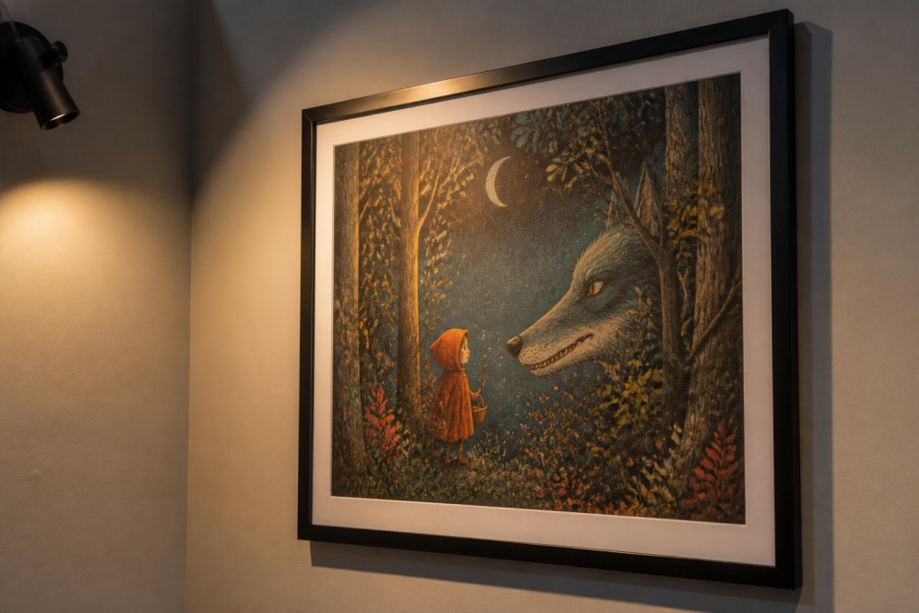
Accent lighting, a dedicated light source aimed at the artwork, transforms how the piece reads. Picture lights mounted above the frame work well for single pieces, while track lighting or adjustable spotlights offer flexibility for gallery walls.
Warm light (2700K-3000K) complements character art with earthy, jewel-tone palettes, while cool light (4000K-5000K) works better for cooler undertones (ies.org). Most homes benefit from warm accent lighting, which creates intimacy and brings out color richness.
Position light at roughly 30 degrees from vertical to prevent glare and shadow issues. Archival matte prints diffuse light rather than reflecting it, allowing slightly more direct positioning without glare concerns. Avoid direct sunlight on character art, UV rays fade even archival paper over time (loc.gov). Consider UV-protective glass or acrylic in the frame for pieces with vibrant colors.
Combine ambient room lighting with accent lighting on your character art to prevent isolation and allow it to function as part of overall room design. Test your lighting before finalizing placement, observing how it looks at different times of day.
Common Mistakes to Avoid When Styling Character Art
Hanging art too high creates visual disconnection. Measure carefully and follow the 57-60 inch standard, adjusting for context.
Undersizing is equally common. A small character print on a large, empty wall creates visual imbalance. Choose a larger piece or create a gallery wall with multiple works.
Mismatched framing undermines intentionality. While mixing frame styles works beautifully, using completely random frames reads as accidental. Establish a visual thread, perhaps all wood frames, or a mix of wood and metal in complementary finishes.
Ignoring your room's existing color palette creates jarring conflict. A character piece should enhance, not fight against, what's already there.
Poor lighting is a silent killer of beautiful art. Even exceptional character prints look flat without proper illumination. Invest in decent accent lighting, it's far less expensive than replacing artwork.
Overcrowding a wall creates visual noise rather than a collected aesthetic. Every piece should earn its place. Restraint and intention create stronger spaces than abundance.
Hanging pieces without considering architectural features wastes an opportunity. Character art looks most impactful when it interacts with crown molding, trim work, built-ins, or architectural niches.
Finally, choosing pieces purely based on price leads to disappointment. A $16.27 archival matte print from Mind Eracing Studio will outlast and outperform cheaper alternatives by years.
Styling character art in modern homes transforms how a space feels and functions. The pieces you choose become part of your home's narrative, anchoring rooms with personality and intentionality that mass-produced decor cannot match. Start with Mind Eracing Studio's curated collection of character-inspired prints, available in both satin and archival matte finishes, and follow the placement, lighting, and composition principles outlined here. The result is a space that feels collected, personal, and unmistakably yours. Explore our Whimsical Snail Art Poster or The Emperor to see how character art elevates modern interiors.


Frequently Asked Questions
How do I know character art will look good in a modern home?
Character art works beautifully in modern spaces when you focus on composition and proportion rather than matching decor themes. The key is selecting pieces that complement your color palette and hanging them with intentional negative space. Bold, well-executed character pieces become focal points that add personality without clashing with clean modern lines. Start with one statement piece to test how it feels in your room before committing to a full gallery.
What is the best way to group character-inspired prints?
Use the 3-5-7 rule as a starting framework: arrange prints in groups of 3, 5, or 7 pieces for visual balance. Space frames 2-3 inches apart for a cohesive gallery wall. Vary frame sizes and orientations to create movement while maintaining alignment, either center them vertically or stagger them horizontally. Character art from the same artist or collection naturally groups well, but you can also mix styles if they share a color story or similar artistic technique.
How do I choose art for your space without seeing it in person first?
Request high-resolution images and check the product specifications carefully, including dimensions and finish options. Character art from Mind Eracing Studio comes in both satin and archival matte finishes, satin makes colors pop with subtle sheen, while matte offers a museum-quality, painterly feel. Read product descriptions that detail the color palette and mood. Order a single piece first to evaluate how the colors, scale, and finish work in your actual lighting before purchasing additional prints.
Can I mix character art with other decorative styles?
Yes. Character art combines well with architectural features, statement lighting, and textured materials. Layer character pieces with modern furniture, minimalist decor, or eclectic accents by focusing on visual weight and scale. A bold character print can anchor a gallery wall with abstract art, photography, or sculptural pieces. Keep the overall composition balanced by ensuring no single element dominates, let each piece breathe with adequate negative space around it.
This article was written using GrandRanker