
Table of Contents
- How to Choose Art for Your Living Room
- How to Choose Wall Art Size: Scale and Proportion Rules
- How to Choose Art by Color: Palette Matching and Visual Balance
- How to Choose Art for Small Spaces Without Overwhelming Them
- Frames, Mounting Styles, and Matting: Finishing the Look
- Building a Gallery Wall and Mixing Styles for a Curated Collection
- What Most Guides Get Wrong When You Choose Art for Your Space
- Original Artwork vs. Prints: Budgeting and What to Look For
Last Updated: July 31, 2026
Choosing art for your space looks simple until you're standing in a half-furnished room holding a print that feels completely wrong. This guide from Mind Eracing Studio breaks down every variable, from scale and color to psychological impact and preservation, so you make choices you'll still love five years from now. Most people start with aesthetics and ignore proportion. Get the scale right first, and nearly everything else falls into place.
Art selection is not about matching your sofa. It's about setting the emotional register of a room.
How to Choose Art for Your Living Room
The living room is where art does its heaviest lifting. It's the first space guests see, the room where you spend the most time, and typically the largest vertical canvas in your home.
Identifying the Focal Point and Statement Piece
Every living room has a natural focal point: a fireplace, a large window, or an architectural feature. Your statement piece should anchor that focal point, not compete with it. A statement piece is typically 60 inches or wider for a standard living room wall.
Choose one wall as your primary art wall before buying anything. A common mistake is purchasing art before identifying the focal point, resulting in a room that feels visually scattered.
For character-driven art or narrative prints, the living room is ideal. Figurative work and storytelling imagery give viewers something to engage with repeatedly, making the space feel alive rather than decorated.
Matching Artistic Style to Room Atmosphere and Mood
The atmosphere of a room is determined by its art more than most people realize. Warm tones and organic forms create intimacy. Geometric abstraction creates energy. Narrative illustration creates curiosity and conversation.
Match the artistic style to the emotional function of the room. A space designed for relaxation benefits from art with calm composition and soft color relationships. A dining room where you want conversation to flow benefits from art with story, detail, and visual complexity.
How to Choose Wall Art Size: Scale and Proportion Rules
Scale is the single most misunderstood variable in art selection. A piece that is too small creates visual isolation; a piece that is too large overwhelms the room's proportions.
The standard rule is that art should fill roughly 60-75% of the available wall width above a piece of furniture. Above a sofa, measure the sofa's width and multiply by 0.66. For a single statement piece above an 84-inch sofa, you're looking at a minimum width of about 55 inches.
For rooms with high ceilings, scale up vertically. Tall, narrow works read well in spaces with 10-foot or higher ceilings. In rooms with standard 8-foot ceilings, horizontal formats maintain better visual balance.
Placement and Hanging Height Guidelines
Art should be hung so that its center is at eye level, approximately 57-60 inches from the floor. This is the standard used by most galleries and museums and aligns with the natural human sightline whether standing or seated.
For art hung above furniture, the bottom edge of the frame should sit 6-8 inches above the furniture's top surface. This creates a visual connection between the art and the furniture below it.
According to Smithsonian Institution's guidelines on art display and installation, consistent hanging height across a room creates a sense of intentionality that elevates the entire interior.
| Placement Scenario | Recommended Center Height | Bottom Edge Gap |
|---|---|---|
| Standalone wall art | 57-60 inches from floor | N/A |
| Above sofa or console | 57-60 inches from floor | 6-8 inches above furniture |
| Gallery wall grouping | 57-60 inches at grouping center | Maintain consistent spacing |
| Above fireplace mantel | Eye level when seated | 4-6 inches above mantel |
| Hallway or narrow space | 57-60 inches from floor | N/A |
How to Choose Art by Color: Palette Matching and Visual Balance
Color is where people overthink art selection. The goal is not to match your art's colors exactly to your existing palette, but to create a color relationship that feels intentional.
There are three workable approaches. Direct palette extension: choose art that contains one or two of your room's existing accent colors. Contrast anchoring: choose art whose dominant color sits opposite your room's dominant tone on the color wheel, creating visual tension and energy. Tonal harmony: choose art in the same color family as your walls but with greater saturation or depth.
For rooms with neutral walls, you have maximum flexibility. Bold, colorful art becomes a focal point immediately. For rooms with already-saturated walls, choose art with more restrained color or strong compositional contrast to avoid visual competition.
Negative space within the art matters too. A composition with significant negative space reads quietly even if the colors are saturated. A densely composed piece reads loudly regardless of palette.
How to Choose Art for Small Spaces Without Overwhelming Them
Small spaces benefit from art more than large ones, but the selection logic is different. One well-scaled piece reads as intentional design. Several small pieces scattered across a compact wall read as clutter.
Choose one piece that fills a meaningful portion of the wall and let the art do the work. A single 24x36 inch print on a small bedroom wall creates more visual impact than four 8x10 frames arranged around it.
Vertical formats work particularly well in small spaces because they draw the eye upward, creating a perception of greater ceiling height. For rooms under 200 square feet, avoid art with extremely busy compositions or very dark color fields. Character-driven illustration with clean linework and controlled color palettes works well because it carries visual interest without visual weight.
Frames, Mounting Styles, and Matting: Finishing the Look
The frame is not a neutral decision. It's the final layer of the art's visual argument.
For contemporary interiors, thin metal frames in black, brass, or natural aluminum are most versatile. For warmer, more traditional spaces, wood frames in walnut, oak, or painted white create a softer boundary.
Matting adds breathing room between the art and the frame. A standard mat width is 2-3 inches, but wider mats (4-5 inches) create a gallery-quality presentation.
Archival matte and satin prints should be mounted with UV-protective glass or acrylic to prevent fading. Float mounting, where the print appears to hover in front of the backing material, creates a contemporary, bespoke feel.
Building a Gallery Wall and Mixing Styles for a Curated Collection
A gallery wall is a deliberate composition that functions as a single large-scale work, not a collection of art you couldn't decide where to put individually.
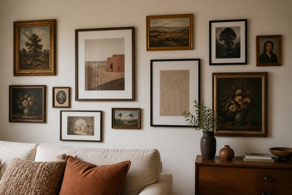
Start with the largest piece and position it slightly left of center. Build outward, maintaining consistent spacing between frames (3-4 inches is standard). Vary the sizes but keep the frames consistent in color or material to hold the composition together.
Mixing artistic styles is acceptable and separates a curated collection from a matched set. The key constraint is visual weight: each piece should carry roughly equivalent visual weight within the grouping, whether through size, color saturation, or compositional density.
According to the American Alliance of Museums' guidance on collection presentation, the most engaging personal collections share a throughline, whether thematic, tonal, or stylistic.
What Most Guides Get Wrong When You Choose Art for Your Space
Most art selection guides treat the process as purely aesthetic. But art selection is an environmental design decision with measurable psychological consequences.
The Psychological Impact of Art on Your Environment
Research in environmental psychology shows that figurative and narrative art, particularly work depicting human or animal subjects with expressive character, increases a sense of connection and warmth in a space. Abstract work tends to increase perceived spaciousness and modernity.
As documented in research published by the American Psychological Association on art and wellbeing, exposure to art in domestic environments is associated with reduced stress and increased feelings of personal identity and belonging. Character-driven art, particularly work drawn from classic literature and fables, carries additional psychological resonance by connecting viewers to stories they already know.
Digital Art, Projection, and Emerging Display Options
Digital art displays now represent a legitimate alternative to traditional framed prints. High-resolution screens like Samsung's The Frame display art in near-print quality and allow you to rotate works seasonally.
The trade-off is this: digital displays require power, generate heat, and have a finite lifespan. Traditional archival prints, properly framed and mounted, can last decades without degradation. For art that carries personal meaning, a physical print remains the more permanent choice.
Art Maintenance, Preservation, and Sustainable Sourcing
UV light is the primary enemy of print longevity. Direct sunlight will fade even high-quality archival prints within a few years. Position art away from direct sun exposure, or use UV-filtering glass or acrylic in the frame.
Dust accumulates on frames and glazing. Clean frames with a dry microfiber cloth. Never use liquid cleaners near the art itself.
Look for prints produced on acid-free, archival-quality paper. Archival matte paper resists yellowing and degradation over time. When buying original artwork or limited edition prints, ask about edition size and whether the artist or studio controls the production process.
Original Artwork vs. Prints: Budgeting and What to Look For
Original artwork is unique, carries the artist's direct mark, and typically appreciates in value over time. The trade-off is cost and availability.
Limited edition prints occupy the middle ground. They're produced in controlled quantities, often with the artist's direct involvement in quality approval. For most buyers furnishing a home, limited edition prints represent the best balance of quality, accessibility, and long-term value.
Open-edition prints, including archival-quality character art and narrative illustration prints, offer the widest selection and most accessible price points.
What to look for regardless of format:
- Archival-quality paper or canvas substrate
- Pigment-based inks rather than dye-based
- Clear edition information and certificate of authenticity for limited editions
- A studio or publisher with transparent production standards
Visit Mind Eracing Studio's collection to see the print options and specifications directly before making a decision.
Choosing art for a space you actually want to live in requires more than scrolling through images until something feels right. Mind Eracing Studio offers a curated collection of character-inspired prints on archival matte and satin substrates, designed to bring narrative depth and visual distinction to any room. Each piece is produced with controlled color accuracy and print quality, so what you see in the preview is what arrives on your wall. Add a piece from the collection and start with art that was made to mean something.
Frequently Asked Questions
How do I choose the right size art for my wall?
When choosing wall art size, aim for the artwork to fill roughly two-thirds to three-quarters of the wall width above a piece of furniture. For a sofa, that typically means a single piece or grouped arrangement spanning most of the couch's length. Leave breathing room on the sides, negative space is part of the composition. For large, open walls, go bold with an oversized canvas or a gallery wall arrangement rather than a piece that gets lost in the space.
How high should art be hung on a wall?
The standard hanging height guideline is to position the center of the artwork at eye level, which is generally around 57 to 60 inches from the floor. This is the standard used by most galleries across the United States. When hanging art above furniture, keep the bottom edge of the frame 6 to 8 inches above the piece below it. In rooms where people are usually seated, like a dining room, you can lower the center point slightly so the art reads naturally from a seated position.
What kind of art works best in a living room?
The living room is your home's most visible space, so it benefits from a true statement piece, something with visual weight and personality. Art that reflects your interests, whether that's bold color-field prints, character-inspired illustrations, or photography, tends to spark conversation and feel more personal than generic decor. Focus on a cohesive color palette that ties into your existing furnishings, and don't be afraid to choose art that expresses a distinct mood or atmosphere rather than simply matching the sofa.
Can I mix different art styles in one room?
Yes, mixing artistic styles is one of the hallmarks of a well-curated, collected-looking interior. The key is to anchor the mix with a unifying element: a consistent color palette, a shared frame finish, or a common theme. For example, pairing a classic fable-inspired print with a modern abstract piece works well when both share warm tones or similar visual weight. Avoid mixing too many competing focal points; let one piece lead and let the others support it.
How do I choose art for a small space without it feeling cluttered?
In small spaces, proportion and negative space matter most. One well-chosen, properly scaled piece almost always outperforms a cluster of small, unrelated prints. Lean toward vertically oriented art to draw the eye upward and make ceilings feel higher. Light, airy compositions with open backgrounds keep a small room feeling breathable. If you want multiple pieces, limit yourself to two or three with consistent framing and tight, intentional spacing to maintain a cohesive, uncluttered aesthetic.
How do I choose art that actually matches my room's color scheme?
Start by identifying the two or three dominant colors in your room, your walls, largest furniture pieces, and any rugs or textiles. Then look for art that either echoes one of those tones as an accent or introduces a complementary color that adds contrast without clashing. You don't need an exact match; art that pulls from the same warm or cool temperature as your palette will feel cohesive. Archival matte prints tend to render color more accurately than satin finishes under warm indoor lighting, which is worth considering when ordering online.
How do I know if a print I order online will look the way it does on screen?
Color accuracy between a screen and a physical print depends heavily on print medium and paper quality. Archival matte prints generally reproduce colors more faithfully under typical home lighting, while satin finishes can shift slightly depending on light angle. When ordering from any art retailer, check whether they use archival-quality inks and acid-free paper, these are the two biggest factors in color longevity and accuracy. Reviewing a brand's return or satisfaction policy before purchasing gives you a practical safety net if the colors don't translate as expected.
This article was written using GrandRanker