
Table of Contents
- The Visual Difference: Mass-Produced vs. Curated Art Prints
- Paper Quality and Archival Inks: The Foundation of Lasting Beauty
- Best Paper Types for Art Prints and Their Visual Impact
- Giclée vs. Standard Poster Prints: Understanding the Difference
- How to Curate a Gallery Wall That Looks Intentional
- The Role of Framing and Presentation in Perceived Quality
- Personal Expression Through Intentional Design Choices
- Conclusion
Last Updated: August 8, 2026
The Visual Difference: Mass-Produced vs. Curated Art Prints
When you walk into a room with mass-produced decor, something feels off. The colors seem flat. The composition lacks intention. A space with thoughtfully selected curated art prints tells a different story immediately.
This isn't about snobbery. It's about understanding why curated art prints look better than mass-produced decor. Mind Eracing Studio has built its approach around this principle: character-inspired, intentionally selected art transforms a space in ways generic wall decor cannot.
The core issue is simple: mass-produced decor is designed for everyone, which means it's optimized for no one. Curated art prints are selected with specific aesthetic and emotional intent. That intent translates into visual impact.
What Makes Curated Prints Stand Out
Curated art prints stand out because they're chosen with purpose. Each piece reflects deliberate decisions about color, composition, and subject matter. This intentional design creates visual cohesion that mass-produced alternatives cannot achieve.
When you curate art, you're making statements about what matters to you. A collection of character-inspired prints from classic tales tells visitors something about your taste and values. That narrative quality is impossible to replicate with generic decor manufactured for bulk distribution.
Curated prints typically receive more attention to production quality, inks, paper, and printing techniques are selected to enhance the artwork rather than minimize costs. The selection process itself creates cohesion, with pieces chosen to complement each other rather than assembled randomly.
The Limitations of Mass-Produced Decor
Mass-produced decor operates on different logic. It's designed to appeal broadly, which means it avoids anything distinctive. The result is safe, forgettable wall decoration that fills space without creating presence.
Most mass-produced prints use standard poster printing with minimal consideration for archival quality. Colors are often oversaturated to compensate for low-grade paper and inks. Over time, these prints fade, yellow, or lose vibrancy within months.
Mass-produced decor also lacks intentionality. There's no curation, no consideration of how pieces work together or what they communicate. They're manufactured to be inoffensive and interchangeable, which makes them forgettable.
Paper Quality and Archival Inks: The Foundation of Lasting Beauty
The difference between a print that looks beautiful for decades and one that deteriorates within a year comes down to materials: paper quality and inks.
Curated art prints fundamentally diverge from mass-produced alternatives here. When you invest in curated prints, you're investing in materials engineered to last. Mass-produced decor cuts corners because durability doesn't affect the initial sale.
Why Acid-Free Paper Matters
Acid-free paper is foundational to any print meant to last. Paper manufactured with acid breaks down over time, causing yellowing, brittleness, and deterioration. A print on acidic paper shows visible aging within five to ten years.
Acid-free paper maintains its integrity for decades. The chemical stability preserves both structural integrity and visual appearance. Museums use acid-free materials for preservation because they understand that longevity requires the right foundation.
When comparing curated art prints to mass-produced alternatives, check the paper specification. If the manufacturer doesn't specify acid-free paper, that's a red flag suggesting the print is optimized for cost rather than longevity.
Archival Inks and Color Longevity
Archival inks are pigment-based formulations that resist fading, color shifting, and chemical degradation. They're more expensive than standard dyes, which is why mass-produced decor typically uses cheaper alternatives.
A print made with archival inks maintains color fidelity for decades. The blacks stay true black. Colors retain their intended vibrancy. A print made with standard inks fades noticeably within a year or two, particularly if exposed to sunlight.
By using archival inks on acid-free paper, curated prints like those from Mind Eracing Studio are engineered to look as good in ten years as on the day you hang them.
Best Paper Types for Art Prints and Their Visual Impact
The choice of paper type dramatically affects how a print looks and feels.
Matte Finish vs. Satin: Which Suits Your Space
Matte finish paper has no gloss, creating a soft appearance and eliminating glare. Satin finish paper has a slight sheen that enhances color saturation and creates luminosity.
Matte finishes work well in spaces with natural light or where you want to minimize reflections, creating a gallery-like aesthetic. Satin finishes enhance colors and create visual drama. Neither is objectively better, it depends on your space and preferences.
Paper Weight and Texture
Heavier paper feels more substantial and resists damage better than lighter paper. For curated art prints meant to last, heavier paper is preferable. It communicates quality through physical presence.
Texture also matters. Smooth paper creates a refined appearance. Textured paper adds visual interest and can enhance artwork by creating subtle depth.
| Paper Characteristic | Impact on Appearance | Impact on Longevity |
|---|---|---|
| Acid-free | Maintains white, prevents yellowing | Prevents deterioration for decades |
| Archival inks | True color fidelity, vibrant hues | Resists fading and color shift |
| Heavier weight | Feels substantial, professional | More durable, resists damage |
| Matte finish | Soft appearance, no glare | Reduces light reflection |
| Satin finish | Enhanced colors, slight luminosity | Subtle sheen adds visual interest |
Giclée vs. Standard Poster Prints: Understanding the Difference
The printing technology used dramatically affects the final result. Giclée printing uses archival inks and fine art papers to create museum-grade prints through high-precision inkjet technology. Standard poster printing uses cheaper lithographic or digital processes with mass-market inks and paper.
The visual difference is substantial. Giclée prints have superior color fidelity, sharper detail, and greater longevity. Standard poster prints are cheaper but sacrifice quality in every measurable way.
Color Fidelity and Resolution
Color fidelity refers to how accurately the print reproduces original artwork colors. Giclée printing excels because archival inks and fine art paper allow for wider color gamut and accurate reproduction. Standard poster printing often produces oversaturated or washed-out colors.
Resolution also differs significantly. Giclée printing reproduces fine details with exceptional clarity. Standard poster printing often results in visible banding, dithering, or detail loss, particularly in subtle color gradations.
A giclée print of a classic fable illustration shows every brushstroke and subtle color variation. A standard poster print appears flatter and less detailed.
Durability and Heirloom Quality
Heirloom-quality prints use archival materials throughout, acid-free paper, archival inks, and museum-grade framing. Giclée prints on acid-free paper with archival inks meet this standard. Standard poster prints do not.
A heirloom-quality print can be passed down and displayed in changing environments while maintaining visual integrity. A standard poster print shows visible deterioration within years.
This reflects different intentions. Curated art prints assume long-term value. Mass-produced decor assumes temporary use.
How to Curate a Gallery Wall That Looks Intentional
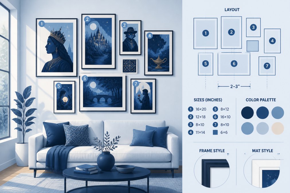
A gallery wall is more than multiple prints on the same wall. When done well, it's a cohesive visual statement. The difference lies in intentional curation.
Establish a unifying principle: color palette, subject matter, style, or theme. Character-inspired prints from classic tales already share a narrative connection that creates coherence.
Creating Cohesive Aesthetics
A cohesive gallery wall feels intentionally selected. This happens when pieces share visual characteristics through color, frame style, matting, or theme.
Limit your color palette so all prints use similar color families. Use consistent framing, the same frame style or matting throughout creates visual harmony. Consistent spacing creates order and intentionality.
Character-inspired prints work particularly well for gallery walls because they naturally share thematic connection, creating narrative cohesion that feels curated rather than random.
Avoiding Visual Clutter
Visual clutter happens with too many prints, inconsistent framing, or competing color palettes. Avoid it by starting with fewer prints than you think you need. A well-curated wall with five intentional pieces looks better than a cluttered wall with fifteen random ones.
Frame consistency matters significantly. Using the same frame style, color, and finish creates visual calm. Color harmony is equally important, limiting choices to 2-3 primary colors creates cohesion that makes the wall feel intentional.
The Role of Framing and Presentation in Perceived Quality
How a print is framed dramatically affects how it's perceived. A beautiful print in a cheap frame looks diminished. The same print in a quality frame looks elevated. Framing is part of the artwork's presentation, and presentation affects how we experience the work.
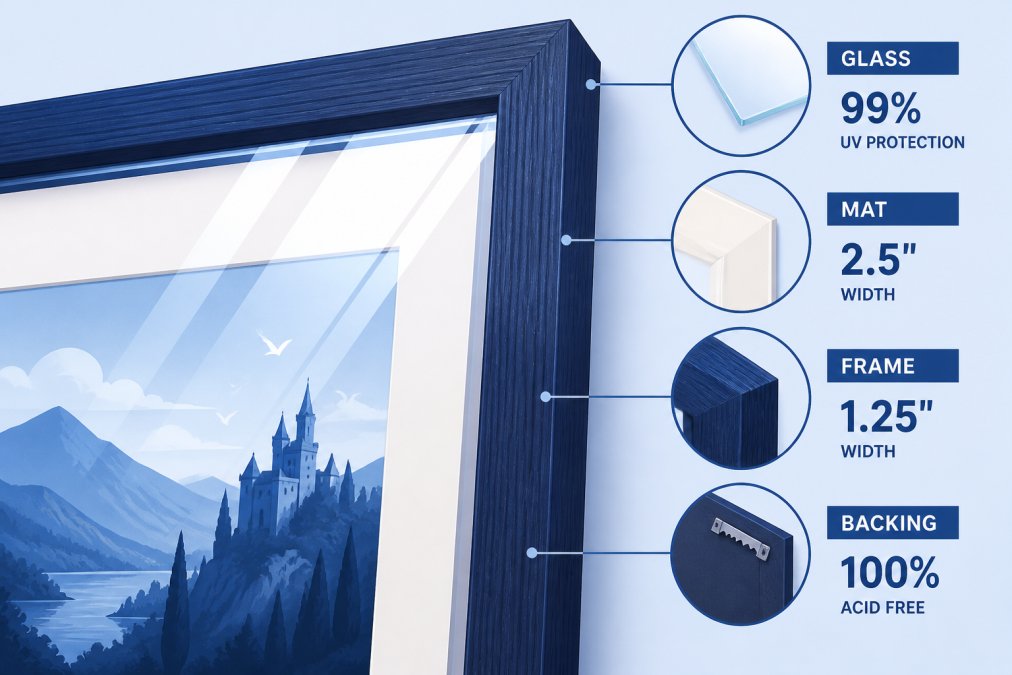
Framing protects the print from damage and environmental degradation while providing visual context that enhances or detracts from the artwork. It signals how the artwork is valued.
UV Protection and Display Considerations
UV protection is essential for print longevity. Ultraviolet light causes fading and color degradation. Museum-quality framing uses UV-protective glass that blocks harmful radiation while remaining optically clear.
Display placement matters. Direct sunlight accelerates fading even with UV protection. Indirect natural light or artificial lighting is preferable. Temperature and humidity stability also matter, extreme fluctuations cause paper to expand and contract, leading to warping or cracking.
Quality matting is acid-free and buffered, protecting the print from acid migration while creating visual separation that enhances presentation.
Personal Expression Through Intentional Design Choices
Curated art matters beyond aesthetics because the art you display tells a story about who you are. Character-inspired prints from classic tales communicate something different than generic mass-produced decor. They signal intentional choices.
Personal expression through art is about authenticity. When you select prints that genuinely resonate with you, your space becomes a reflection of your identity. This is fundamentally different from mass-produced decor, which appeals to everyone equally.
Living in a space surrounded by intentionally selected art creates a sense of ownership and belonging. Mass-produced decor creates generic anonymity. You're living in a space that could belong to anyone.
When you're ready to transform your walls with art that reflects your taste and values, understand what makes curated prints worth the investment. Mind Eracing Studio offers a curated collection of artistic posters and prints, bringing storytelling to life through unique, character-inspired designs drawn from classic tales and fables. We provide art enthusiasts and collectors with distinctive, colorful wall decor, available in high-quality satin and archival matte print options to elevate any space. Our focus on imaginative, character-driven art ensures each piece is a standout addition, capturing the imagination and adding a touch of whimsy to your home. Add prints that matter to you.
Frequently Asked Questions
What's the difference between giclée prints and standard poster prints?
Giclée printing uses archival-quality inks and acid-free paper to produce museum-grade art with superior color fidelity and longevity. Standard poster prints typically use commercial inks on lower-grade paper, resulting in faster color fading and reduced detail. Giclée prints maintain their visual impact for decades, while standard prints often show visible deterioration within 5-10 years of display.
How does paper quality affect the look of curated art prints?
Paper quality directly impacts color vibrancy, texture, and durability. Acid-free, heavyweight papers with archival properties preserve color accuracy and prevent yellowing. Premium papers also enhance the tactile and visual experience, matte finishes reduce glare and create sophisticated aesthetics, while satin finishes add depth and visual richness. Lower-grade papers appear flat and fade noticeably over time.
How do I choose art prints that look cohesive in my gallery wall?
Start by selecting prints that share a unifying element, consistent color palette, theme, or artistic style. Limit your color range to 3-4 primary colors to maintain visual harmony. Mix frame styles sparingly and consider varying print sizes while maintaining proportional spacing. This intentional curation prevents visual clutter and creates a gallery wall that feels designed rather than randomly assembled.
Will character-driven art from classic tales work in a modern apartment?
Yes, when styled intentionally. Character-inspired art works beautifully in contemporary spaces when paired with minimalist framing, limited color palettes, and strategic placement. The key is treating the prints as curated art pieces rather than nostalgic decoration. Pairing classic character art with modern furnishings creates an eclectic, sophisticated aesthetic that tells a personal story while complementing contemporary design.
This article was written using GrandRanker