
Table of Contents
- Why Fable Art Print Color Accuracy Matters
- Understanding RGB vs CMYK for Digital Art Prints
- How to Calibrate Your Monitor for Art Printing
- Setting Up ICC Profiles and Color Management
- How to Proof Art Prints for Color Accuracy
- Troubleshooting Common Color Shifts in Fable Art Prints
- Preparing Your Files for Print-Ready Color Accuracy
- Conclusion
Last Updated: August 29, 2026
Why Fable Art Print Color Accuracy Matters
When you order a fable art print online, you're trusting that what arrives matches what you saw on your screen. That trust breaks the moment you unbox it and find the colors are completely different. The rich burgundy has faded to rust. The vibrant gold looks dull and muddy.
This is the core problem with fable art print color accuracy. Your monitor and your printer speak different languages. One uses RGB light, the other uses CMYK ink. Without proper color management, that translation fails spectacularly. Mind Eracing Studio understands this frustration intimately, which why we offer high-quality satin and archival matte print options to elevate any space.
Monitors emit light directly into your eyes. Printers deposit pigment on paper, which reflects light back. These are fundamentally different processes. A monitor can display colors that no printer can reproduce. Without understanding this gap, you're essentially guessing whether your fable art print will look right.
This guide walks you through the complete workflow for ensuring your fable art print color accuracy, from calibrating your display to preparing files that print exactly as intended.
Understanding RGB vs CMYK for Digital Art Prints
Your monitor displays color using RGB (red, green, blue) light. These three colors combine at full intensity to create white light. This is additive color, you're adding light to create new hues.
Printing works the opposite way. Printers use CMYK (cyan, magenta, yellow, black) inks. These pigments subtract light from white paper. This is subtractive color, you're removing light to create new hues.
The problem is simple: RGB has a larger color gamut than CMYK. Your monitor can display colors that your printer physically cannot reproduce. A brilliant neon blue on screen becomes a duller, more muted blue in print.
When preparing fable art print color accuracy work, design within CMYK's capabilities from the start. Work in CMYK from the beginning, or at minimum, soft proof your RGB work against a CMYK profile before sending it to print. This is where most digital artists stumble. They design stunning work in RGB, send it to print, and watch the colors collapse.
How to Calibrate Your Monitor for Art Printing
Monitor calibration is the foundation of fable art print color accuracy. Without it, everything downstream fails. You can have perfect files and perfect printer settings, but if your monitor is showing you lies, none of it matters.
Calibration has two components: brightness and color accuracy. Brightness sets your monitor's luminance to a standard level (typically 120 cd/m² for print work) (iso.org). Color accuracy ensures that when your monitor displays a specific color value, it actually displays that color, not a shifted version of it.
Why Monitor Calibration Affects Print Results
An uncalibrated monitor is like trying to paint with broken color vision. You make decisions based on what you see, but what you see isn't what's actually there. You might boost the saturation of a character's dress because it looks dull on your screen. In reality, it's already perfect, your monitor is just displaying it poorly. When it prints, the dress is oversaturated and looks garish.
Calibration corrects this by creating a profile that tells your system how to display colors accurately. Now when you design your fable art print, you're seeing colors that actually correspond to what will print.
Budget-Friendly Calibration Tools and Methods
Professional calibration tools run between $200 and $1,000+. Budget calibration sensors like the Datacolor SpyderX Elite or X-Rite i1Display Pro typically cost $150-$300 and work with your monitor to create an accurate ICC profile. Within 10 minutes, you have a profile that's dramatically more accurate than your monitor's factory settings.
If you can't afford that, Windows and macOS both include basic calibration utilities built into their display settings. You manually adjust gamma, brightness, and color balance by eye using reference images. It's imprecise, but it's better than nothing.
Another approach: rent calibration time from print shops or photography studios for $50-$100. You get a professional-grade result without owning the equipment.
The key is this: some calibration is infinitely better than no calibration.
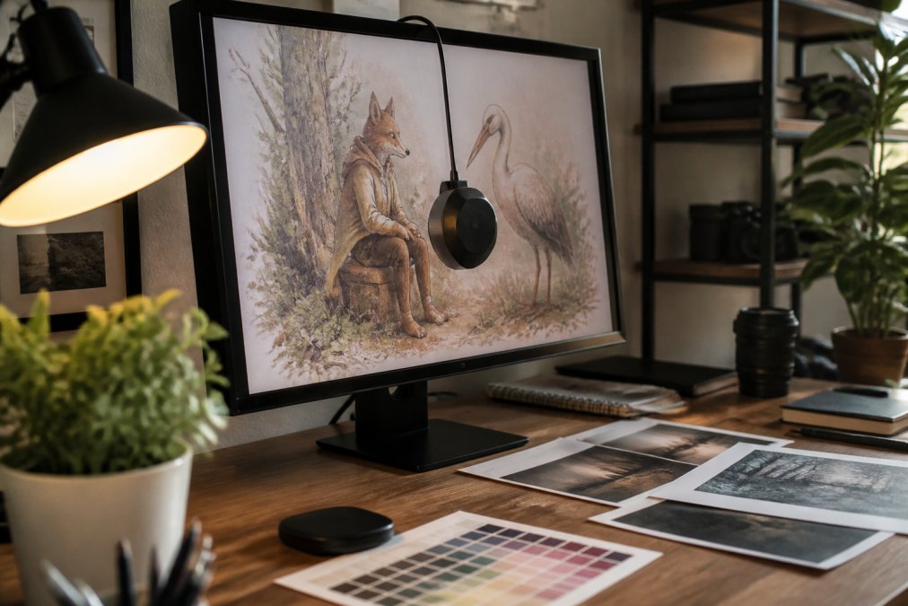
Setting Up ICC Profiles and Color Management
Once you've calibrated your monitor, you need to tell your applications how to use that profile. An ICC profile is a file that describes how a device (your monitor, your printer, your paper) reproduces color. It's essentially a translation dictionary.
Setting up color management means configuring your applications to use the correct ICC profiles at every step. In Adobe Creative Suite, this happens in Edit > Color Settings. You choose a working color space (typically Adobe RGB or ProPhoto RGB for print work) and specify how colors should be converted when moving between spaces.
The rendering intent matters here. This is the rule your software uses when converting a color that exists in one color space but not another. Relative Colorimetric rendering intent shifts out-of-gamut colors to the nearest in-gamut equivalent while leaving in-gamut colors alone (adobe.com). For fable art print work, Relative Colorimetric usually produces better results.
When you export files for print, embed the correct color profile in the file itself. This tells the print shop's software how to interpret your colors. Without an embedded profile, the printer has to guess, and it will guess wrong.
How to Proof Art Prints for Color Accuracy
Soft proofing is your chance to see what your fable art print will actually look like before it goes to the printer. It's a critical step that most digital artists skip.
Soft Proofing Techniques on Your Display
Soft proofing uses your monitor to simulate how colors will appear on a specific paper with specific inks. In Photoshop or similar applications, you load a printer profile and a paper profile, and the software remaps your image to show what it will look like under those conditions.
To soft proof effectively, you need the correct ICC profile for your printer and paper combination. Many print shops provide these profiles for download. Once you have the profile, open your image in Photoshop and go to View > Proof Setup > Custom. Load the printer profile and the paper profile. Now you're seeing what your fable art print color accuracy will actually be. If you don't like what you see, adjust your image now, before you print.
Soft proof in the same lighting conditions where you'll view the final print. Lighting conditions dramatically affect color perception, and a print that looks perfect under one light can look completely wrong under another.
Paper Stock and Substrate Interaction
Paper choice fundamentally changes how your fable art print looks.
Glossy paper has a shiny surface that reflects light directly back at you. Colors appear more saturated and vibrant. Blacks are deeper. Matte paper has a textured surface that diffuses light. Colors appear slightly less saturated, but the image looks more refined and less commercial.
For fable-inspired character art, the choice matters. A whimsical illustration with pastel colors might benefit from matte's softer appearance. A bold, saturated character design might sing on glossy paper where the colors pop.
The substrate also affects color accuracy. Different papers have different white points. A bright white paper makes blacks look deeper and colors more saturated. A warmer, off-white paper shifts the entire image warmer. When you soft proof, you're accounting for this. You need to soft proof against the specific paper you'll actually use.
Mind Eracing Studio offers both satin and archival matte options because paper choice is part of the creative decision. We provide ICC profiles for each paper type, so you can soft proof accurately before ordering.
Troubleshooting Common Color Shifts in Fable Art Prints
Even with perfect calibration and soft proofing, color shifts happen. Understanding the common causes helps you fix them.
Color Temperature Shifts
The most common issue is a shift toward warm or cool tones. Your print arrives looking too yellow or too blue compared to your monitor. This usually means your monitor and your printer have different color temperatures.
The fix is to ensure both your monitor and your printer are calibrated to the same color temperature. If you're printing to a professional lab, ask what color temperature they use and set your monitor to match.
Saturation Collapse
You designed vibrant, saturated colors. The print arrives looking dull and washed out. This happens when you didn't account for CMYK's smaller color gamut. Those saturated colors looked great in RGB but don't exist in CMYK.
The fix is to soft proof before printing and adjust your image to work within CMYK's capabilities. Reduce saturation slightly or shift the hue to land on a color CMYK can reproduce accurately.
Shadow Detail Loss
Shadows in your image look deep and detailed on screen. In print, they're just black with no detail visible. This is usually caused by too much black ink overwhelming the other inks.
The fix is to reduce the black ink percentage in your shadows. Instead of 100% K, try 80% K with supporting CMY values. This is called rich black, and it produces deeper shadows with better detail than black ink alone.
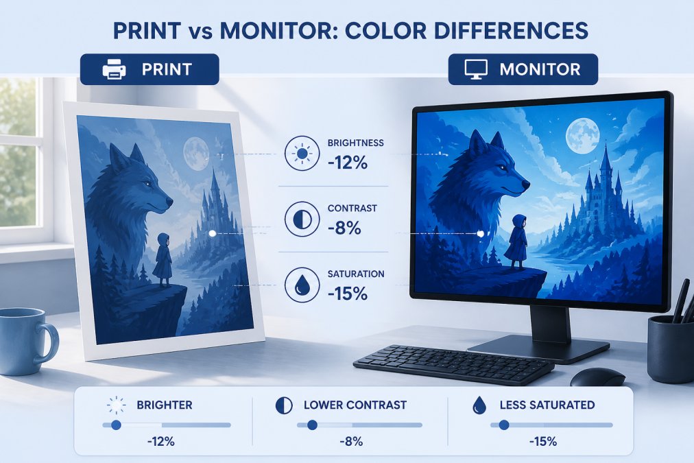
Preparing Your Files for Print-Ready Color Accuracy
File preparation is where theory meets reality. You can have perfect color management and perfect soft proofing, but if your file isn't prepared correctly, the printer can't execute your vision.
File Format and Resolution Essentials
Print requires TIFF or PDF formats. These are lossless, meaning they don't compress your image data and lose information. JPEG uses lossy compression, which is fine for web but unacceptable for print.
TIFF is the standard for print workflows. It preserves all your image data and your ICC profile. PDF is increasingly popular because it can contain multiple elements in a single file and preserves color information reliably.
Resolution matters enormously. Print requires 300 DPI (dots per inch) minimum. A 300 DPI file at 8x10 inches is 2,400 x 3,000 pixels. A 72 DPI file (typical for web) at the same size is only 576 x 720 pixels. When you enlarge a low-resolution file to print size, the printer has to guess at missing pixels, creating blurry results.
For fable art print color accuracy, shoot for 300 DPI at your final print size. If you're creating digital artwork, design at 300 DPI from the start.
Color Depth and DPI Requirements
Color depth is the amount of color information stored for each pixel. 8-bit color (256 levels per channel) is standard for print. 16-bit color is unnecessary for most print work and creates unnecessarily large files.
When you prepare your file, ensure it's in 8-bit, CMYK color space. Convert from RGB to CMYK in your design application, not in the printer driver. Your design application can use color management to make an intelligent conversion.
Embed your ICC profile in the file. In Photoshop, go to File > Save As, choose TIFF or PDF, and check "Embed Color Profile." This tells the printer lab exactly how to interpret your colors.
| Step | Purpose | File Format | Color Space | Resolution |
|---|---|---|---|---|
| Design | Create artwork | PSD (layered) | RGB or CMYK | 300 DPI |
| Soft Proof | Simulate print output | PSD or TIFF | CMYK | 300 DPI |
| Export for Print | Prepare final file | TIFF or PDF | CMYK | 300 DPI |
| Output to physical media | TIFF or PDF | CMYK (embedded) | 300 DPI |
Achieving fable art print color accuracy is not magic. It's a systematic process: calibrate your monitor, understand color spaces, soft proof your work, and prepare files correctly. Each step builds on the previous one. Skip any step and the entire chain breaks.
Mind Eracing Studio's satin and archival matte print options are designed to work within this framework. We provide ICC profiles for both finishes, and we expect files prepared according to these guidelines. When you combine your diligent color management with our print quality, you get fable art prints that look exactly as you intended.
Start with monitor calibration. It's the foundation everything else rests on.
Frequently Asked Questions
Q: How do I ensure my fable art prints match the colors on my monitor?
A: Start by calibrating your monitor using a color calibration sensor or software tool, which adjusts your display to industry standards. Next, install and activate the correct ICC profile for your printer and paper type. Use soft proofing in your design software to preview how colors will appear on your chosen paper stock before printing. Finally, print a test swatch on the same paper you'll use for your final print to verify color accuracy in person.
Q: What is the difference between RGB and CMYK for art printing?
A: RGB (red, green, blue) is the color space your monitor uses to display light-based colors. CMYK (cyan, magenta, yellow, black) is the color space used by printers, which mix physical inks. Your fable art print will look different from your screen because RGB has a wider color gamut than CMYK. To minimize this shift, convert your artwork to CMYK before sending it to print, and use soft proofing to see how the conversion will affect your colors.
Q: Why do my fable art prints look different than they do on screen?
A: Color shifts occur because monitors display colors using light (RGB), while printers reproduce colors using ink on paper (CMYK). An uncalibrated monitor, incorrect ICC profiles, and different paper stocks all contribute to color mismatches. Lighting conditions also matter, view your print under the same lighting where it will hang. Calibrate your monitor, use the correct color profile for your printer, and soft proof your design to catch shifts before printing.
Q: What paper types are best for maintaining color accuracy in character art?
A: Archival matte paper provides excellent color fidelity and longevity, making it ideal for character-driven fable art that you want to preserve. Satin finishes offer richer color saturation and slight sheen, enhancing vibrant character illustrations. Glossy paper delivers the most saturated colors but can cause glare. Paper weight and brightness also affect how colors appear, heavier, brighter papers (100 lb+) show colors more accurately than thin or dull stocks. Always soft proof and print test swatches on your chosen paper to verify results.
This article was written using GrandRanker