
Table of Contents
- Why Art Colors Don't Match Photos (And How Lighting Changes Everything)
- Step 1: Set Up Proper Lighting for Artwork Photography
- Step 2: Use a Color Checker Card to Capture Accurate Reference Data
- Step 3: Understand Monitor Color Calibration for Artists
- Step 4: Master RGB vs CMYK for Art Prints
- Step 5: Apply Color Correction in Post-Processing
- Achieving Consistent Color Accuracy Across Devices
- Conclusion
Last Updated: August 22, 2026
Why Art Colors Don't Match Photos (And How Lighting Changes Everything)
If you've ever ordered an art print online and felt disappointed when it arrived, you're not alone. The vibrant blues you saw on your screen turned muted. The warm yellows looked cold. The reds shifted toward orange. This happens because accurate color reproduction involves far more than taking a picture and hitting print. The disconnect comes down to three invisible culprits: lighting conditions during photography, monitor calibration, and the color space your device uses to display images.
At Mind Eracing Studio, we understand this frustration firsthand. Our curated collection of character-inspired art prints depends entirely on accurate color reproduction. When you're selecting a print for your home, you need confidence that the colors you see online will translate to your wall. This guide breaks down exactly how to ensure art colors match photos, from photography through to the final print in your hands.
The real challenge isn't complicated, most people skip foundational steps. They photograph under fluorescent office lights, view the image on an uncalibrated laptop screen, and wonder why the print looks wrong. By following this guide, you'll eliminate guesswork and achieve color accuracy that holds up in the real world.
Step 1: Set Up Proper Lighting for Artwork Photography
The single most important factor in accurate color photography is lighting. Without proper illumination, no amount of post-processing can fix what you've captured. Your goal is to create even, diffused light that reveals the true colors of the artwork without introducing color casts or harsh shadows.
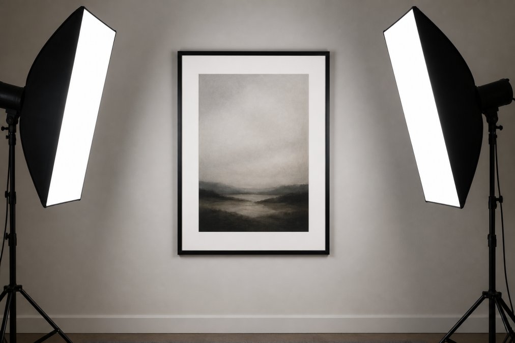
Avoid natural sunlight and overhead fluorescent lights. Sunlight changes color temperature throughout the day, warm at sunrise, neutral at midday, cool at sunset. Fluorescent bulbs introduce a greenish or bluish cast that distorts colors. Instead, use dedicated lighting equipment designed for photography. Two softbox lights or LED panels with adjustable color temperature give you control over light quality.
Position your lights at 45-degree angles on either side of the artwork. This angle minimizes glare and harsh reflections while providing even illumination. The lights should be equidistant from the artwork to avoid one side appearing brighter. Even two affordable LED panel lights positioned correctly will outperform expensive equipment positioned poorly.
Color temperature matters significantly. Measure your lights in Kelvin units, the standard for describing light color. Daylight-balanced lighting runs around 5500K, ideal for general photography (cie.co.at). At 3200K (tungsten/warm white), colors shift toward orange. At 6500K or higher (cool white), colors shift toward blue. Consistency matters most, stick with one temperature throughout your session.
Avoid mixing light sources. Using both natural window light and artificial lights creates conflicting color temperatures. Close the curtains, turn off overhead lights, and rely entirely on your controlled lighting setup. This single decision eliminates more color problems than any post-processing adjustment can fix.
Step 2: Use a Color Checker Card to Capture Accurate Reference Data
A color checker card is a small reference tool containing color patches with known, standardized values. When you include one in your photograph, you create a visual anchor that allows you to correct color shifts in post-processing. It's one of the most practical investments for anyone serious about color accuracy.
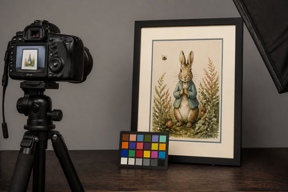
Place the color checker card in the same plane as your artwork under the same lighting conditions. Position it so it's visible in the frame but doesn't obscure the art, typically at the bottom corner. Later, in post-processing, you can use the known color values from the card to adjust your entire image. If the white patch looks slightly blue in your photo, you know the entire image has a blue color cast that needs correction.
The X-Rite ColorChecker Passport is the most widely used option, with 24 color patches plus neutral gray and black references. The neutral gray patches are especially valuable, they should appear as pure gray with no color tint. If they have a blue, green, or yellow cast, your image needs white balance correction.
Using a color checker card works because it gives you objective reference points. Rather than guessing whether a color looks right, you can measure it against a known standard. This approach is fundamental to professional color workflows in photography, printing, and design.
Step 3: Understand Monitor Color Calibration for Artists
Your monitor is lying to you. Most computer screens come from the factory with color accuracy ranging from acceptable to terrible. Without monitor color calibration for artists, you're making color decisions based on inaccurate information. A red that looks vibrant on your screen might appear dull on a calibrated display, or vice versa.
Monitor calibration means adjusting your screen's color output to match a standardized color space. The most common standard is sRGB, the default color space for web images and most consumer devices. For ensuring your artwork colors match photos, sRGB is your target.
You have two options: hardware-based and software-based calibration. Hardware calibration uses a colorimeter that measures how your monitor displays colors, then creates an ICC profile specific to your display. Software calibration relies on your eyes and visual test patterns. Hardware calibration is more accurate, but software calibration is free and better than nothing.
For hardware calibration, devices like the X-Rite i1Display Pro or Datacolor SpyderX Elite take measurements and generate a custom profile in 15-20 minutes. Once complete, your operating system loads that profile automatically. The investment typically ranges from $100 to $300.
For a budget approach, use free online calibration tools or built-in display settings. Adjust your monitor's brightness, contrast, and color temperature until neutral grays appear truly neutral. It's not perfect, but it's a meaningful improvement.
Once your monitor is calibrated, keep it that way. Don't adjust brightness or color temperature manually. Don't move your monitor to a different location with different ambient lighting. These changes break your calibration.
Step 4: Master RGB vs CMYK for Art Prints
Understanding RGB vs CMYK for art prints is essential because these are two completely different color models. RGB (Red, Green, Blue) is how digital screens create color by emitting light. CMYK (Cyan, Magenta, Yellow, Black) is how printers create color by applying pigments to paper. The gap between these two systems is where most color mismatches happen.
RGB can display more vibrant colors than CMYK can reproduce (iso.org). That brilliant neon blue on your screen might not exist in the CMYK color space available to a printer. When you send an RGB image to print, the printer must convert it to CMYK, and that conversion often results in duller, less saturated colors. This is called color gamut limitation.
For artwork photography and printing, work in RGB throughout your editing process. RGB gives you the widest color range and the most flexibility. Only convert to CMYK as a final step if you're sending files to a commercial printer that requires it. Most online print services handle the RGB-to-CMYK conversion automatically.
Bright, saturated colors, especially in the blue and green ranges, are most likely to shift during RGB-to-CMYK conversion. If your artwork relies on these colors, soft-proof your image before printing. Soft proofing means viewing your RGB image with a simulated CMYK color space applied, so you can see what the final print will actually look like.
When Mind Eracing Studio produces our character-inspired art prints in satin and archival matte finishes, we soft-proof every design to ensure the colors you see on our website will match the physical print. The satin finish typically produces slightly more vibrant colors than matte, which absorbs light and can make colors appear slightly muted.
Step 5: Apply Color Correction in Post-Processing
Once you've photographed your artwork under controlled lighting with a color checker card in the frame, the real work begins in post-processing. This is where you correct color casts, adjust white balance, and fine-tune color accuracy to match what you actually see with your eyes.
Start with white balance adjustment. Open your image in editing software and use the white balance tool to click on the neutral gray patch from your color checker card. The software analyzes that patch and corrects the entire image so the gray appears truly neutral. This single step fixes most color cast problems.
Next, examine the other color patches on your checker card. Do the reds look red? Do the greens look green? If any patches appear shifted, use your software's color adjustment tools to bring them into alignment. Hue, saturation, and luminance sliders let you fine-tune individual color ranges.
Color correction is iterative. Make a small adjustment, step back, and evaluate. The goal isn't perfection, it's matching the colors you see in person. Your eyes are quite good at color perception, especially when comparing the original artwork and the photograph side by side.
Save your corrected image in RAW format if possible, or as a high-quality JPEG with minimal compression. RAW format preserves maximum color information and gives you flexibility for future adjustments. For final prints, JPEG is fine, but keep a RAW backup if you want to revisit color matching later.
Achieving Consistent Color Accuracy Across Devices
Color accuracy doesn't end once you've corrected a single image. The real challenge is maintaining consistency across every device that displays or prints your artwork. Your phone, laptop, tablet, and printed page all interpret color differently. The solution is a color management system that translates color information consistently across all these devices.
ICC profiles are the technical foundation of color management. An ICC profile is a file that describes how a specific device interprets color data (color.org). When you have ICC profiles for your monitor, printer, and phone, software can translate colors accurately between them. Without profiles, each device guesses, and the guesses rarely match.
For your monitor, the ICC profile comes from calibration. For your printer, you either create one using a hardware calibration tool or download one from the manufacturer. For your phone, most phones don't support custom ICC profiles, which is why phone screens are notoriously unreliable for color work.
The practical workflow is straightforward: photograph under controlled lighting, correct on a calibrated monitor, and print to a printer with a known ICC profile. Each step uses color management to ensure the next step receives accurate color information.
One often-overlooked factor is metamerism, where colors appear different under different lighting conditions. A print that looks perfect under warm indoor lighting might look slightly different under cool daylight. This isn't a failure of color matching; it's a property of how human color perception works. View both the original and the print under consistent lighting conditions.
Ensuring your artwork colors match photos requires attention to lighting, calibration, and color management, but the payoff is confidence that what you see online will translate to your wall. The steps outlined here eliminate guesswork and replace it with a repeatable process. When you're selecting art prints for your home, you deserve to know exactly what you're getting. Mind Eracing Studio's commitment to high-quality satin and archival matte prints starts with these same color accuracy principles, ensuring every character-inspired design arrives with the colors you approved. Get started with Mind Eracing Studio and transform how you think about art print quality.
Frequently Asked Questions
Why do my art prints look different than the colors on my screen?
Your monitor displays colors using RGB light, while printed art uses pigments that reflect light differently. Additionally, your monitor may not be calibrated to match industry standards, and lighting conditions when viewing the print differ from your screen's backlighting. Monitor color calibration for artists ensures your screen accurately represents what the print will look like. Metamerism, where colors appear different under various lighting conditions, also plays a role. The same print viewed under daylight versus artificial light may show color shifts.
What's the difference between RGB vs CMYK for art prints?
RGB (Red, Green, Blue) is used by screens and digital cameras, mixing light to create color. CMYK (Cyan, Magenta, Yellow, Black) is the standard for physical printing, using pigments that absorb light. When you photograph art, your camera captures RGB data. Before printing, this must be converted to CMYK, which can shift colors, particularly bright blues and greens. Understanding RGB vs CMYK for art prints helps you anticipate these shifts and adjust your photos during post-processing to ensure the final print matches your original artwork.
How can I use a color checker card to improve photo accuracy?
Place a color checker card in your first shot alongside the artwork under the same lighting conditions. This card contains 24 color patches with known values. When processing your photos, use the card as a reference to correct white balance and overall color cast in your image editing software. How to use a color checker card involves selecting the neutral gray patch in your software and letting it auto-correct your image, then manually fine-tuning if needed. This ensures your photo accurately represents the artwork's true colors before any print reproduction occurs.
How do I know if my monitor is showing accurate colors?
Without monitor color calibration for artists, you're working blind. Your screen may display colors differently from reality. Use a hardware calibrator (a device that measures your monitor's output and creates an ICC profile) or perform a visual calibration using reference images. After calibration, your monitor should display neutral grays without color casts, and color gradients should transition smoothly. Check your calibration monthly, as monitor color accuracy drifts over time due to aging backlights and dust accumulation.
This article was written using GrandRanker