
Table of Contents
- Why Book Themed Wall Art Is Trending in 2026
- How to Choose Art for Your Space: A Literary Approach
- Literary Wall Art Ideas That Define 2026 Interiors
- Styling Art Prints in Modern Homes: Making Literature Fit
- The Psychological Pull of Book-Themed Decor
- DIY and Personalized Book-Themed Wall Art
- Why Book Themed Wall Art Belongs in Your 2026 Home
- Frequently Asked Questions
Last Updated: September 14, 2026
Why Book Themed Wall Art Is Trending in 2026
Book themed wall art is trending in 2026 because interiors have shifted toward emotional depth, personality-driven decor, and visual storytelling over purely decorative pieces. At Mind Eracing Studio, we watch this shift play out in what collectors actually buy: character-driven prints from classic tales, not generic abstracts. Below, we'll show you exactly how to choose and style literary prints, plus the ideas defining this year's interiors. The five sections ahead cover room matching, palette, styling, psychology, and DIY.
American Psychological Association overview of color and emotion research
The trend fits a broader cultural move. People want a home sanctuary that says something about who they are, not just what season it is. A print of a tea party scene or a weathered hatter does that in a single glance.

How to Choose Art for Your Space: A Literary Approach
Choosing art for your space starts with matching the story's mood to the room's function, then confirming the palette supports the room's emotional tone. Get those two right and almost any literary print will work.
Match the Story to the Room's Purpose
A reading nook wants a quiet, introspective scene. A playroom can handle mischief and saturated color. A living room sits between the two: characterful, but not chaotic.
A common mistake is buying a print for its subject and ignoring where it will hang. The same Mad Hatter piece feels charming above a bookshelf and overwhelming in a minimalist bedroom. Ask what the room is for before you ask what the art shows.

Consider Color Palette and Emotional Tone
Warm, grounding palettes rule 2026: terracotta, ochre, deep amber, forest green. These earthy palettes pair naturally with storybook illustration, which tends to run warm and saturated.
If your room is neutral, a single colorful print becomes the focal point. If the room already has strong color, choose a print with a shared undertone so the piece supports the space instead of fighting it. Color psychology matters here: warm tones read as cozy and nostalgic, cool tones as calm and contemplative.
Literary Wall Art Ideas That Define 2026 Interiors
Literary wall art ideas in 2026 lean toward character-driven prints and textured, abstract depth. Both directions borrow from illustration and folktale traditions rather than fine-art abstraction.
Character-Driven Prints from Classic Tales
A dapper rabbit with oversized pink ears, a lantern-lit interior with animals gathered at a door, a roly-poly figure scattering coins: these are the images defining this year's walls. They work because they're specific. A recognizable character starts a conversation that a color field never will.
Mind Eracing Studio builds its collection around exactly this: character-inspired designs drawn from classic tales and fables, printed on satin or archival matte stock. Each piece is meant to be a standout rather than a filler.
Abstract Depth and Textured Storybook Scenes
Not every literary print needs a face. Textured, painterly scenes, a forest rendered in dark, layered brushwork, a moody interior with deep shadows, give you the storytelling quality without a literal character. This is where book-themed decor overlaps with the abstract-depth trend: both prize surface and atmosphere over flat graphic punch.
Hang one character print and one atmospheric scene together and you get a curated pairing that reads as intentional rather than collected.
Styling Art Prints in Modern Homes: Making Literature Fit
Styling art prints in modern homes comes down to one rule: let the frame and surrounding objects do the modern work so the artwork can stay whimsical. The print doesn't have to match your sofa. It has to belong to the room's logic.
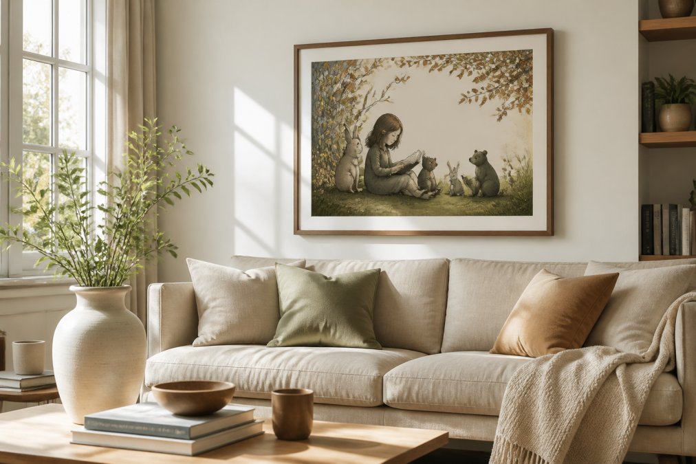
Choose a thin black or natural-wood frame for a contemporary read. Keep the surrounding palette quiet, then repeat one color from the print in a cushion, a vase, or a stack of books. That single echo creates aesthetic cohesion without turning the room into a theme.
Worried a character print will look out of place in a modern apartment? It won't, if you treat it as the one expressive element in an otherwise restrained space. Modern interiors can absorb a lot of personality when everything around it is calm.
The Psychological Pull of Book-Themed Decor
Most 2026 trend coverage stops at aesthetics. The reason book-themed wall art holds up beyond a single season is psychological, and it comes down to three mechanisms you can actually design around.
Narrative transportation. When a viewer recognizes a scene from a story they know, they don't just see an image, they mentally re-enter the story. Researchers who study reading describe this as transportation: the reader becomes absorbed in a narrative world and carries emotional residue out of it. A framed tea party or a lantern-lit forest door triggers that re-entry in under a second, which is why these prints hold attention longer than a color field. For your wall, the practical takeaway is that recognizable scenes reward a second and third look, so they work best where people linger, a reading chair, a hallway with foot traffic, a bedside wall.
Nostalgia as an anchor. Nostalgia is not just sentiment; it functions as a stabilizing emotion. Psychologists who study it describe it as a way people maintain continuity of identity, especially during periods of change. That maps directly onto home decor in 2026, a year of churn in work patterns and housing. A print from a fable you loved at eight does something a trend-driven abstract cannot: it connects the room to a version of you that predates the current moment. The design implication is that the strongest book-themed pieces are specific, not generic. A general 'vintage books' print reads as decor. A specific character from a specific tale reads as memory.
Identity signaling. Rooms communicate. A shelf of books signals a reader; a wall of literary prints signals the same thing without the dust. This is the same instinct behind the broader 2026 shift toward personality-driven decor, but book-themed art does it with a built-in shared reference. Two guests who recognize the same illustration have an instant topic. That social function is part of why the trend has legs, it performs well in the room and in conversation.
American Psychological Association overview of color and emotion research
What This Means for Placement
If the pull is narrative, place the art where narrative happens. Reading nooks, bedside walls, and hallways between rooms outperform formal dining rooms, where the eye moves fast and the story never gets a chance to land. If the pull is nostalgia, choose the story you actually loved, not the one that photographs best. If the pull is identity, group two or three prints that share a tradition so the wall reads as a point of view rather than a purchase.
The Trade-Off to Know
There is a cost to specificity. A recognizable character print is harder to move between rooms than a neutral abstract, because it carries a mood. Buyers who rotate art seasonally often find that one strong literary piece anchors a room better than three interchangeable prints, but it also commits the room to a tone. That commitment is the point, and it is also the reason this trend rewards buyers who know their own taste over buyers chasing a palette.
DIY and Personalized Book-Themed Wall Art
DIY and personalized book-themed wall art lets you build a collection around the specific stories that matter to you rather than whatever a big-box retailer stocks. There are three routes, and they trade off differently on cost, effort, and how the finished wall reads.
Route 1: Curated Groupings (Lowest Effort, Highest Cohesion)
The most reliable route is a curated grouping: three to five prints from the same tale or the same illustrator's tradition, hung as a set. Keep the frames identical and vary the image sizes. The repetition of the frame is what makes a grouping look deliberate rather than collected. A common pattern is one large anchor print flanked by two smaller pieces at matching heights, with the group centered over a piece of furniture rather than the wall itself.
Route 2: Public-Domain Printing (Lowest Cost, Most Control)
For something more hands-on, print public-domain illustrations from classic editions and frame them in matching stock. The Library of Congress and similar public-domain archives host scanned illustrations from nineteenth- and early twentieth-century editions, and the files are free to download and print for personal use. The catch is resolution: older scans vary widely in quality, and a file that looks fine on screen can show softness or visible halftone dots when enlarged. Check the pixel dimensions before you commit to a large size, and when in doubt, print smaller.
A practical workflow most people land on:
- Download candidate images and view them at 100% zoom, not fit-to-screen.
- Pick a single aspect ratio for the whole group so the frames line up.
- Print on archival matte or satin stock at a local or online print shop.
- Order identical frames in one finish and one profile depth.
- Lay the group out on the floor before you put a single nail in the wall.
Route 3: Custom Commissions (Highest Cost, Highest Specificity)
If you want a specific fable represented and no print exists, a commission is the only route that gets you exactly there. Expect the highest cost and the longest lead time of the three, and expect to give the artist reference material. For most buyers, curation beats customization: a curated collection built around character-driven designs gives you the storytelling without the guesswork of sourcing, printing, and framing yourself.
Sizing and Hanging Mechanics
Standard print sizes make framing cheap and predictable. Common pairings are an 8x10 inch print in an 11x14 inch matted frame, or an 18x24 inch print in a 24x36 inch frame. Mat width is what separates a print that looks framed from one that looks mounted, a mat of roughly 2 to 3 inches on the short side reads as intentional.
For a gallery wall, keep the gaps between frames consistent, typically 2 to 3 inches, and treat the whole group as one shape when you center it. For a single statement piece, hang the center of the frame at eye level, roughly 57 to 60 inches from the floor. Most people hang art too high, which makes even a great print feel disconnected from the furniture below it.
The Trade-Off
DIY saves money and gives you control, but it costs time and it puts the cohesion burden on you. A curated set costs more per piece but arrives matched on palette, finish, and proportion. If your wall is the focal point of a room, buy the cohesion. If it is a hallway or a secondary wall, DIY is the better use of budget.
Why Book Themed Wall Art Belongs in Your 2026 Home
Book themed wall art belongs in your 2026 home because it delivers what this year's interiors actually reward: emotional depth, personality, and a story worth looking at twice. The trends point the same direction, toward grounding elements, natural tones, and spaces that feel personal rather than performed.
Here's how the main directions compare, so you can pick the one that fits your room:
| Direction | Best For | Palette | Effort |
|---|---|---|---|
| Character-driven prints | Reading nooks, playrooms, living rooms | Warm, saturated | Low |
| Textured storybook scenes | Bedrooms, calm living spaces | Muted, earthy | Low |
| Curated gallery groupings | Hallways, studio walls | Mixed with one anchor tone | Medium |
| DIY framed illustrations | Budget-conscious collectors | Neutral frames, varied art | High |
Every print in the Mind Eracing Studio collection ships in satin or archival matte, so you can fit a tight wall or anchor a large one. The Alice in Wonderland Tea Party Poster starts at $16.27, and the Vintage Storybook Snow White Illustration at $20.99.

Library of Congress public domain image collections
Frequently Asked Questions
What will be the most popular wall art in 2026?
Book themed wall art is set to dominate in 2026. The trend reflects a broader shift toward emotional depth and personality-driven decor, with buyers choosing pieces that tell a story rather than generic abstract prints. Character-inspired designs drawn from classic tales and fables are especially sought after, and they work across warm minimalism, mindful maximalism, and modern interiors alike.
How do I style book-themed art in a modern home?
Start by choosing a print with a color palette that echoes your existing room tones, such as terracotta, ochre, or deep greens. Frame it in a simple black or natural wood frame to keep the look contemporary. Hang it at eye level in a reading nook or above a sofa, and pair it with grounded elements like natural fibers, textured throws, or a small stack of books to complete the vignette.
Why is literary-inspired decor becoming a major trend?
Literary-inspired decor answers a growing demand for home sanctuary and intellectual comfort. After years of minimalist white walls, people want spaces that feel personal and nostalgic. Book-themed art delivers visual storytelling and emotional depth without overwhelming a room. It also connects to the rise of curated spaces, where every piece on the wall carries meaning rather than filling square footage.
Is vintage-inspired book art still popular in 2026?
Yes. Vintage storybook illustrations remain a strong presence in 2026 because they combine nostalgic design with the luxury art market's growing appetite for bespoke wall art. Pieces like the Vintage Storybook Snow White Illustration at $20.99 show how classic fairy-tale imagery fits modern interiors when paired with clean framing and warm, earthy palettes. The style works in nurseries, reading nooks, and living rooms alike.
The challenge with literary decor is finding prints that carry real storytelling instead of generic fantasy clip art. Mind Eracing Studio curates character-inspired art drawn from classic tales and fables, printed on high-quality satin or archival matte stock in 18 sizes. Browse the collection and add a piece that gives your space a story worth telling.