
Table of Contents
- Why Curated Art Prints Belong in a Reader's Home
- Quick Comparison: Curated Art Prints for Every Space
- Best Places to Buy Independent Artist Prints
- How to Start an Art Print Collection
- Tips for Framing Art Prints
- Styling Literary Wall Art in Reading Nooks and Home Libraries
- Frequently Asked Questions
Last Updated: September 13, 2026
Why Curated Art Prints Belong in a Reader's Home
Curated art prints are a tightly edited selection of artwork chosen around a theme, a story, or a collecting goal, rather than a random assortment of posters. For readers, they turn a wall into a narrative: a character study, a fable, a moment from a book that shaped you.
This guide from Mind Eracing Studio covers how to buy well, frame properly, and style literary wall art so it holds up over years, not seasons.
The case for buying with intent is simple. A shelf of books tells visitors what you read. A wall of curated art prints tells them what you felt while reading it. That is a different, more personal kind of decorating, and it is why bookish decor has moved from novelty to a genuine collecting category.
Most buying guides stop at "find art you like." That advice is useless when you are standing in front of hundreds of options and trying to decide which ones will still matter to you in five years. What matters more is the framework: where the print came from, what it is printed on, and how it will live on your wall.
Below, we break down where to buy independent artist prints, how to start a collection without overspending, and how to style literary wall art in reading nooks and home libraries.
Quick Comparison: Curated Art Prints for Every Space
The table below maps the Mind Eracing Studio collection by space and mood, so you can match a print to a room before you browse further.
| Best For | Finish Options | Price | |
|---|---|---|---|
| Skekso | Living room, creative studio, dramatic focal wall | Satin (210 gsm) or archival matte (230 gsm) | $16.27 |
| Mad Hatter Art Poster | Gallery walls, reading nooks, moody interiors | Satin or archival matte | $16.27 |
| Alice in Wonderland Tea Party Poster | Reading nooks, nurseries, studios | Satin or archival matte | $16.27 |
| Alice-Inspired Art Poster | Sofa walls, nurseries, playrooms | Satin or archival matte | $16.27 |
| March Hare Tea Party Poster | Living rooms, creative studios, reading nooks | Satin or archival matte | $16.27 |
| Whimsical Snail Art Poster | Nurseries, kids' rooms, boho interiors | Satin or archival matte | $16.27 |
| podling | Living rooms, reading nooks, creative studios | Satin or archival matte | $16.27 |
| Cheshire Cat Art Poster | Gallery walls, living rooms, kids' rooms | Satin or archival matte | $16.27 |
| Pinoccio | Bedside walls, creative nooks, playrooms | Satin or archival matte | $16.27 |
| Vintage Storybook Snow White Illustration | Reading nooks, rustic kitchens, kids' corners | Fine art, semi-gloss, or matte | $20.99 |
Best Places to Buy Independent Artist Prints
The best places to buy independent artist prints are direct-from-artist shops and small curated studios, not mass marketplaces. Direct sellers control their own print files, paper stock, and color proofing, which is exactly what determines whether the print on your wall matches the image on your screen.

That control matters more than most buyers realize. On a large marketplace, thousands of sellers upload files to the same automated pipeline, and nobody checks whether a given piece prints well on the paper it lands on. A curated shop does the opposite: it selects a small number of pieces and prints each one on stock chosen for that artwork.
What to Look for in an Independent Art Seller
Four things separate a serious seller from a storefront:
- Named paper stock with a weight. Satin at 210 gsm and archival matte at 230 gsm are concrete specifications. "Premium paper" is not.
- Multiple finish options. A seller who offers both a sheen finish and a matte finish understands that the same artwork reads differently under each.
- Size and orientation range. A range of sizes and orientations means the piece can fit the wall you actually have.
- Care guidance. Even a short note on dusting and handling signals the seller expects the print to last.
Red Flags When Buying Art Online
The most common red flag is a listing that shows a mockup instead of the artwork. Mockups place an image in a staged room, which hides print quality entirely.
Watch for these as well:
- No stated paper weight or finish
- The same artwork listed by dozens of unrelated sellers
- Sizes described only in vague terms like "small, medium, large"
- No care instructions anywhere on the product page
- Return terms that exclude prints, which makes a color mismatch your problem
Color shift between screen and paper is real, and it is the single most common complaint in online art buying (the FTC). A seller who names the finish and the paper weight is giving you the information you need to predict how the piece will look in person.
How to Start an Art Print Collection
Start an art print collection by choosing a theme first and a print second. Theme-first buying produces a wall that reads as intentional; print-first buying produces a pile of unrelated images that never quite hang together.
The theme does not need to be narrow. "Characters from classic tales" is a theme. "Things that feel like a story" is a theme. What matters is that every piece you add answers to the same idea, so the collection grows into something rather than just accumulating.
Building a Theme Around Classic Literature
Classic literature gives you more thematic range than almost any other subject, because the source material is public and endlessly reinterpreted. Alice in Wonderland alone supports a tea party scene, a grinning cat in deep foliage, a dapper rabbit in a vintage interior, and a surreal portrait of a weathered gentleman in a tall hat, and those four pieces read as a set without repeating themselves.
A practical sequence for a literature-themed wall:
- Pick one anchor piece, usually the largest and most visually dense.
- Add two supporting prints that share a palette but not a subject.
- Hold the fourth slot open until you find something that fills a gap rather than duplicates a mood.
Budgeting for Your First Few Pieces
A collection built at $16.27 per print leaves room for the part most buyers forget: framing, which often costs more than the artwork itself.
A realistic first-year budget splits roughly into thirds. One third goes to prints. One third goes to framing and matting. The final third stays in reserve for the piece you did not plan for, which is usually the one you end up liking most.
Buying unframed and framing gradually is the standard approach for a reason. It lets you match frame profiles to the room instead of to the order, and it spreads the cost across months.
Tips for Framing Art Prints
Framing decisions affect how a print looks more than most buyers expect, and they affect how long it lasts even more. The right frame and mat protect the paper; the wrong ones let light, moisture, and handling do slow damage.
Framed vs. Unframed: What Works Best
Framed works best for anything going on a wall you care about. Unframed works best for pieces you plan to rotate, or for a casual, pinned-up look in a studio or kids' room.
| Situation | Recommendation | Why |
|---|---|---|
| Living room or home library | Framed with mat | Protects the print and reads as finished |
| Reading nook | Framed, mat optional | Small spaces benefit from a defined edge |
| Kids' room or playroom | Unframed or simple frame | Easy to swap as tastes change |
| Gallery wall | Consistent frames | Uniform frames let the art carry the variation |
| Rental or temporary space | Unframed, archival backing board | Moves without damage |
Protecting Prints with Archival Materials
Archival framing means every material touching the print is acid-free and photo-safe. Standard cardboard backing and cheap mats are acidic, and over time they cause paper to yellow and become brittle (loc.gov).
Three rules cover most of it:
- Use an acid-free mat and backing board
- Keep the print from touching the glass, either with a mat or spacers
- Hang away from direct sunlight, which fades ink regardless of paper quality (si.edu)
Styling Literary Wall Art in Reading Nooks and Home Libraries
Styling literary wall art works best when the artwork sits at eye level from the seat, not at standard gallery height. A reading nook is a seated space, so the art should meet you where you actually look.
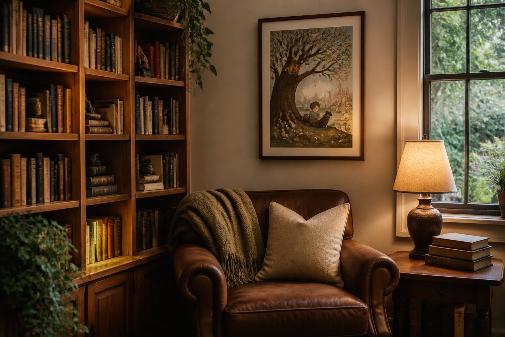
Hang a single larger piece centered above the chair rather than a cluster of small ones. In a tight corner, one strong image does more than four competing ones, and it gives the eye somewhere to rest while you read.
In a home library, the opposite approach works. A multi-panel arrangement above a shelf run turns the wall into a continuation of the collection. Group prints by palette rather than by size, and keep the gaps between frames consistent, roughly 5 to 8 centimeters, so the arrangement reads as one composition instead of scattered pieces.
The psychology here is straightforward. A reading space signals rest, and the art in it should reinforce that signal rather than interrupt it. Saturated, busy pieces work in a living room where there is activity to match them. In a nook, a piece with a clear focal point and a warmer palette settles the space.
Building a wall of curated art prints is slower than filling a cart, and that is the point. The challenge is resisting the urge to buy a whole wall at once, because a collection assembled over months reads differently than one assembled in an afternoon.
Mind Eracing Studio makes that gradual approach practical. Every print starts at $16.27, with satin and archival matte options, 18 size formats, and horizontal, vertical, and square orientations, so a single piece can be tried on a wall before the next one is chosen. The character-inspired designs drawn from classic tales and fables give a collection a natural throughline, and the archival matte finish means the piece you buy this year still looks right next to the one you buy in three.
Get started with Mind Eracing Studio and build a reading wall one story at a time.
Frequently Asked Questions
What makes an art print 'curated'?
A curated art print comes from a deliberately selected collection rather than an open marketplace of thousands of uploads. The seller chooses each design for quality, theme, and visual consistency. Mind Eracing Studio, for example, builds its catalog around character-driven art from classic tales and fables, so every piece fits a clear creative direction. Curation means someone with a point of view decided what belongs, which usually translates to more cohesive wall art and fewer duds.
What is the difference between archival matte and satin prints?
Satin (210 gsm) has a subtle sheen that makes colors look brighter and more saturated, which suits bold, high-contrast artwork. Archival matte (230 gsm) has a softer, glare-free surface that emphasizes painterly texture and holds ink tones longer, making it the better pick for framed pieces in bright rooms. Both options from Mind Eracing Studio cost the same, so the choice comes down to where you plan to hang the print and how much light hits that wall.
How do I choose art prints for a home library?
Start with the mood you want the room to carry, then pick art that reinforces it. A home library usually benefits from literary-inspired pieces: storybook illustrations, typography prints, or character art drawn from classic literature. Keep the palette consistent across pieces, and mix sizes so the wall has rhythm. Two or three larger prints often look more intentional than six small ones scattered across the same wall.
Are art prints a good investment for collectors?
Open-edition prints are decorative purchases, not financial investments, and you should buy them because you want them on your wall. Value comes from limited editions, artist reputation, and documented provenance, none of which apply to most print-on-demand posters. If you are collecting for personal enjoyment, focus on archival quality and pieces that mean something to you. A print that holds its color for decades and still makes you smile is a good return.
How can I display literary art prints effectively?
Hang prints at eye level, roughly 57 to 60 inches from the floor to the center of the frame. Group pieces 2 to 3 inches apart for a gallery wall, and give a single statement print more breathing room. Keep direct sunlight off the surface to slow fading, and use archival matting if you frame. In a reading nook, one larger piece above the chair often works better than a crowded cluster.