
Table of Contents
- Whimsical vs Minimalist Character Art: A Quick Comparison
- Defining Whimsical and Minimalist Aesthetics for Bedrooms
- How to Style Character Art in Bedrooms
- The Best Whimsical Art Prints for 2026
- Choosing Art for Neutral Interiors and Small Spaces
- Balancing Playfulness with a Restful Environment
- Frequently Asked Questions
Last Updated: September 15, 2026
Whimsical vs Minimalist Character Art: A Quick Comparison
The choice between whimsical vs minimalist character art for bedrooms comes down to one question: should the room tell a story, or stay quiet? Whimsical art leans on narrative, color, and fantastical detail; minimalist art reduces a figure to essential lines, often in monochrome or a restrained neutral palette. Neither is better, the smartest bedrooms borrow from both.
This guide from Mind Eracing Studio breaks down how each style behaves in a real room, where the hybrid approach works best, and how to style character art so it reads as intentional design, not clutter.
Whimsical wins for kids' rooms, reading nooks, and anyone who wants a focal point with narrative pull. Minimalist wins for small bedrooms, neutral interiors, and adults who need the room to stay calming. The strongest option for most bedrooms is the hybrid: one whimsical statement piece, everything else restrained.
Defining Whimsical and Minimalist Aesthetics for Bedrooms
Whimsical character art is illustration-driven wall decor built around fantastical figures, fables, and storybook scenes, usually with saturated color and visible texture. Minimalist character art strips the same subject down: a single figure, limited color, generous negative space.
The two styles diverge on four practical points:
| Factor | Whimsical | Minimalist |
|---|---|---|
| Color palette | Saturated, multi-hue, high contrast | Monochrome or 2-3 neutral tones |
| Detail level | Dense, narrative, textural | Sparse, graphic, reductive |
| Room effect | Focal point, energy, creativity | Stillness, spatial balance |
| Best room size | Medium to large walls | Small rooms, tight corners |
Whimsical art asks the eye to wander. Minimalist art asks it to rest. That distinction drives every other decision, from frame choice to wall placement.
The Whimsical Minimalist Hybrid Style
The hybrid style treats whimsy as an accent, not a theme. One character-driven piece carries the personality; the rest of the wall stays neutral, monochrome, or empty. In practice, this means a single framed print with a fantastical figure hung against a plain wall, paired with textural elements like linen bedding or a woven throw rather than more art.
This solves the most common objection about character art, that it looks out of place in a modern apartment. It won't, if the surrounding palette is disciplined: the print becomes the room's one moment of artistic expression, and the neutral field around it does the calming work.
How to Style Character Art in Bedrooms
Style character art by anchoring it to one wall, matching the frame to the room's existing metal or wood tones, and hanging it at eye level, roughly 57 to 60 inches from the floor to the center of the artwork. Treat the print as the focal point and remove anything that competes with it.
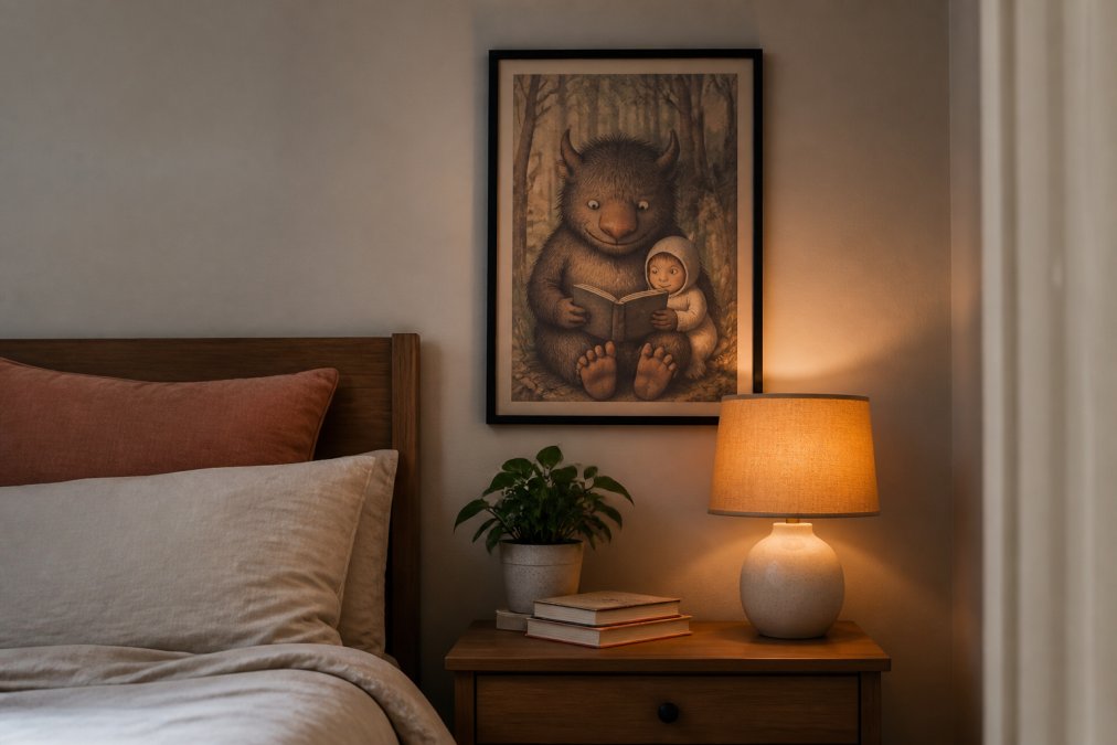
The rules that hold up across both styles:
- Hang one large piece rather than four small ones in a small bedroom. Visual clutter shrinks a room.
- Leave at least 8 to 10 inches between the top of a headboard and the bottom of the frame.
- Match frame finish to existing hardware. Black frames suit moody, graphic prints; natural wood suits warm, folk-influenced work.
- Keep the wall behind a whimsical print plain. Pattern behind pattern kills the focal point.
Frame choice does more work than the print itself: a loud print in a thin, quiet frame reads as curated, while the same print in an ornate gold frame reads as a theme.
Sizing and Layout Math That Actually Works
What separates a styled wall from a decorated one is the relationship between print size, wall width, and the furniture below it. Interior stylists commonly size artwork to roughly 60 to 75 percent of the width of the furniture it sits above: a 60-inch-wide dresser pairs best with a print or grouping spanning about 36 to 45 inches. Go wider and the art floats; go narrower and it looks like a stamp.
Above a queen or king headboard, a 24x36-inch vertical print is the workhorse size, it fills the vertical space without crowding the pillows. For narrow walls beside a window or closet, use a 12x18 or 16x20 vertical format. Square formats (18x18, 24x24) balance easiest in two- or three-piece arrangements because the eye reads them as a single unit.
Spacing rules for multi-piece layouts:
- Keep 2 to 3 inches between frames in a tight pair or triptych.
- Keep 3 to 4 inches between frames in a looser gallery arrangement.
- Center the grouping on the furniture below, not on the wall itself, unless the wall is symmetrical and empty.
- Align the bottom edge of the lowest frame with the top of the headboard or the top of the nightstand, whichever creates the cleaner line.
The Hybrid Layout: One Whimsical Piece, Minimalist Everything Else
This is the layout most bedrooms actually need. Instead of choosing a side, treat the whimsical print as the room's single narrative moment and let the surrounding wall, bedding, and furniture stay quiet: one character-driven piece centered above the bed or in a reading nook, with no other art on that wall and no competing pattern in the bedding or curtains.
The minimalist half does the calming work: neutral bedding, a single textural throw, and a plain wall let the whimsical print carry the personality without turning the room into a set. The whimsical half does the storytelling: one figure, one scene, one moment of color.
A practical test: stand at the foot of the bed and squint. If the whimsical print is the only thing that jumps out, the ratio is right. If two or three things compete, remove one.
Lighting and Texture Considerations
Lighting changes how both styles read, and it's the factor most buyers ignore until the print is on the wall. Satin-finish prints carry a soft sheen that deepens color and makes dark tones glow, suiting whimsical and moody work. Archival matte prints scatter light instead of reflecting it, holding detail under glare and reading as painterly or museum-like, ideal for minimalist and monochrome pieces.
Texture matters too: a matte print against a plaster or linen-textured wall gains depth, while a satin print under a direct, warm lamp gains glow.
The Best Whimsical Art Prints for 2026
Here's how the current collection maps to different rooms:
| Mood | Best Room | Finish to Choose | |
|---|---|---|---|
| Whimsical snail Art Poster | Storybook, folk, colorful | Kids' room, nursery, reading nook | Satin for color pop |
| Dish ran away with the spoon | Whimsical noir, charcoal | Reading nook, studio | Archival matte |
| The creator | Urban, moody, graphic | Studio corner, above a desk | Either |
| monkeys and monolith | Cinematic, dark landscape | Living room, small gallery wall | Archival matte |
| Retro Black & White Cartoon Poster | Vintage-industrial, monochrome | Study, compact nooks | Satin for tonal glow |
guidance on hanging and caring for fine art prints


Choosing Art for Neutral Interiors and Small Spaces
Small spaces demand stricter rules:
Balancing Playfulness with a Restful Environment
How to Measure the Ratio in a Real Room
The Time-of-Day Test
The Hybrid Resolution
consumer guidance on buying art prints online
Frequently Asked Questions
What type of art is best for bedrooms?
The best bedroom art depends on whether you want calm or personality. Minimalist pieces with neutral palettes and simple lines keep the room restful. Whimsical character art adds storytelling and joy but can feel busy if overdone. A hybrid approach works well: one whimsical statement piece as a focal point, surrounded by quieter minimalist prints. This gives you visual interest without sacrificing the calming stillness bedrooms need.
Does character-driven art work in a minimalist bedroom?
Yes, if you treat it as a single focal point rather than filling every wall. Choose one character-driven piece, frame it in a thin black or natural wood frame, and leave generous empty wall space around it. The contrast between a detailed, whimsical print and a bare minimalist wall actually makes both look better. Stick to two or three colors in the artwork that echo your room's palette.
How do you balance character art with minimalist decor?
Use the 2/3 rule for wall art: artwork should cover about two-thirds of the width of the furniture below it. In a minimalist bedroom, keep character art to one or two pieces, choose frames that match your existing hardware, and avoid visual clutter. Let the art carry the personality while the rest of the room stays quiet. Textural elements like linen bedding and a woven rug add warmth without adding busyness.
What makes a room feel whimsical?
Whimsy comes from unexpected details and storytelling. Character art drawn from fables, playful accents like a curved lamp or a scalloped mirror, and a touch of fantasy in the color palette all contribute. A single whimsical print can shift a room's mood from plain to imaginative. The key is restraint: one or two whimsical themes feel intentional, while too many compete for attention and create visual clutter.
How to choose between bold whimsical prints and subtle minimalist art?
Ask how you use the room. If you read, rest, and want low visual stimulation, subtle minimalist art supports that. If you want the bedroom to express personality and creativity, a bold whimsical character print does more work. You can also split the difference: bold whimsical art above a dresser, minimalist pieces near the bed. Consider the room's existing color harmony before deciding which direction to push.