
Table of Contents
- What Defines Golden Age Illustration and Why It Matters Today
- Contemporary Fantasy Illustrators Reviving the Golden Age Aesthetic
- Golden Age of Illustration Techniques Modern Artists Still Use
- Archival Matte vs Satin Prints for Illustration
- How Modern Artists Blend Literary Interpretation with Visual Storytelling
- Character-Driven Art: From Classic Fables to Contemporary Walls
- Frequently Asked Questions
Last Updated: September 2, 2026
What Defines Golden Age Illustration and Why It Matters Today
Golden age illustration refers to the period roughly spanning the late 1800s through the early 1900s when illustration became a dominant art form in print culture, periodicals, and book publishing. Artists like N.C. Wyeth, Arthur Rackham, and Edmund Dulac created images that carried the weight of the stories they accompanied, balancing technical mastery with genuine narrative power.
This era emerged at the intersection of demand and technology. Chromolithography and advanced printing techniques made color reproduction possible at scale (loc.gov). Magazines, newspapers, and publishers understood that well-illustrated work drove readership and sales. The result was a golden age where illustrators were celebrated, well-compensated, and given genuine creative freedom.
Today, that aesthetic has returned. Modern artists are reviving the techniques, visual language, and narrative depth of that era. The demand for character-driven art inspired by classic tales and fables has grown significantly. Collectors are choosing pieces that carry genuine artistic legacy over mass-produced alternatives.
Why does this matter now? Because golden age illustration principles solve a real problem: how to create meaningful visual storytelling in an age of algorithmic content and generic design. The period's emphasis on careful draftsmanship, intentional color choices, and emotional resonance offers a counterweight to the visual noise most of us navigate daily.
The Smithsonian's collection of American illustration archives documents the technical and cultural significance of this period. Understanding what made it work helps explain why these pieces command attention on contemporary walls.
Contemporary Fantasy Illustrators Reviving the Golden Age Aesthetic
Modern artists are deliberately reaching back to golden age illustration principles, taking the visual vocabulary, pen and ink precision, watercolor technique, and narrative composition and applying it to contemporary subject matter.
The best contemporary fantasy illustrators understand something fundamental: the golden age wasn't about decoration. It was about visual interpretation. When Arthur Rackham illustrated folklore, he added psychological depth, atmospheric mood, and compositional choices that made the image memorable independent of the words. Modern artists working in this tradition do the same.
These artists often work across multiple mediums, traditional pen and ink, watercolor, digital tools, but maintain the aesthetic commitment of the golden age. The work feels hand-made. There's evidence of decision-making in every mark. The color choices feel considered rather than algorithmic.
The market response has been substantial. Collectors who grew up with illustrated editions of classic literature now seek original artwork and high-quality reproductions that capture that same feeling. Mind Eracing Studio's collection of character-inspired posters, pieces like the Mad Hatter Art Poster and the Alice in Wonderland Tea Party Poster, reflects this exact demand. These are character-driven pieces that echo the narrative depth of golden age illustration while maintaining contemporary visual sophistication.


What separates the strongest contemporary work is technical foundation. Artists who studied classical illustration, who understand pen and ink control and watercolor wash, produce work with visible authority.
Golden Age of Illustration Techniques Modern Artists Still Use
The techniques developed during the golden age remain foundational because they solve real artistic problems.
Pen and Ink Draftsmanship
Pen and ink work requires absolute commitment. You cannot erase. Every line is a decision, and that constraint forces clarity. Golden age illustrators developed extraordinary control over line weight, cross-hatching patterns, and compositional structure because they had to.
Modern artists return to pen and ink for exactly this reason. The discipline of working without a safety net produces drawings with genuine presence. The visual storytelling emerges from economical, precise mark-making rather than accumulation of detail.
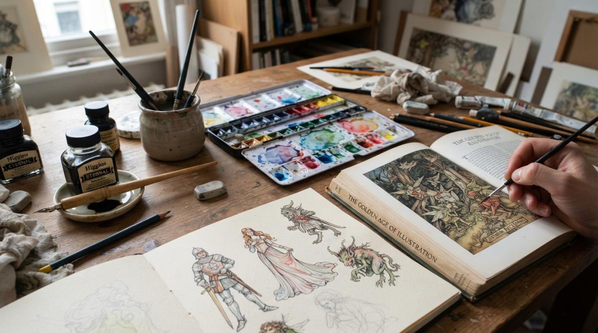
When contemporary illustrators combine pen and ink with watercolor wash, they're following a technique perfected during the golden age. The ink provides structure and narrative clarity. The watercolor adds atmosphere and emotional resonance.
Watercolor Wash and Layering
Watercolor wash allows illustrators to build atmospheric depth without losing the underlying drawing. Golden age artists used this approach to suggest light, shadow, and mood while maintaining the precision of their pen work.
Modern artists understand that watercolor creates compositional hierarchy. Darker washes recede. Lighter washes advance. The viewer's eye is guided through the image by subtle shifts in value and saturation. A skilled contemporary illustrator can use watercolor wash to direct attention as effectively as any compositional choice.
Chromolithography Influence on Color Palettes
Chromolithography was the printing technology that made the golden age possible. The process had technical limitations, certain color combinations worked better than others, certain pigments reproduced more faithfully, and these limitations shaped the aesthetic of the era.
Modern artists often reference chromolithography's color sensibility even when working in digital or contemporary print mediums. The color palettes tend toward saturation without garishness. There's often a slight warmth to the overall image, a quality of aged paper that chromolithography naturally produced. The colors feel intentional rather than infinite.
Archival Matte vs Satin Prints for Illustration
When displaying character-driven illustration, the print finish matters significantly. The choice between archival matte and satin affects how viewers experience the image.
Archival matte paper has a textured, non-reflective surface that emphasizes the drawing itself. There's no glare competing for attention. The image feels closer to the original artwork because the matte finish mimics the quality of paper and pigment. For illustrations with intricate draftsmanship and subtle watercolor gradations, matte finish preserves those details without distraction. It's the finish you see on fine art prints in galleries.
Satin finish adds a subtle sheen that makes colors appear more vibrant and luminous. The slight reflectivity catches light, enhancing the visual impact of saturated color palettes. For illustration with rich, warm tones inspired by chromolithography, satin can amplify that effect. The image seems to glow slightly, enhancing emotional resonance.
The choice depends on the specific artwork and display context. A detailed pen and ink piece with subtle watercolor wash typically benefits from archival matte. A piece with bold color and strong emotional impact often benefits from satin.
Mind Eracing Studio offers both finishes because different pieces demand different treatments. The Whimsical Snail Art Poster works beautifully in either finish, while the Snow White Illustration offers three finish options because the warm, lantern-lit interior renders differently depending on how light interacts with the surface.

| Finish Type | Best For | Effect on Artwork | Durability |
|---|---|---|---|
| Archival Matte | Detailed pen work, subtle detail | Emphasizes draftsmanship, reduces glare | Long-lasting, fade-resistant |
| Satin | Bold color, emotional impact | Enhances vibrancy, adds luminosity | Long-lasting with subtle sheen |
How Modern Artists Blend Literary Interpretation with Visual Storytelling
Golden age illustrators were fundamentally interpreters of literature (si.edu). They read the text, understood its emotional core, and created images that deepened that experience. They weren't illustrating scenes mechanically; they were translating narrative into visual form.
This approach shapes how modern artists work. When a contemporary illustrator approaches a classic tale, they're engaging with the text as a source of visual and emotional material, not as a set of literal scenes to depict.
The best contemporary work demonstrates interpretive depth. A literal approach might depict the Mad Hatter's tea party exactly as described. An interpretive approach considers what the scene means, the surrealism, the displaced time, the slightly unsettling quality of forced hospitality, and creates an image that conveys those qualities visually.
Modern artists working in the golden age tradition understand that visual storytelling operates differently than literary narrative. A single image must communicate mood, character, and narrative significance simultaneously. This requires compositional choices that guide attention, color choices that suggest emotion, and draftsmanship that conveys character through physical presence.
The pieces in Mind Eracing Studio's collection demonstrate this interpretive approach. The March Hare Tea Party Poster captures the surrealism and playful menace of the scene through compositional choices and color saturation. The Pinocchio print conveys the character's moral ambiguity through pose and expression in ways that deepen the narrative.
This interpretive approach makes the work resonate beyond its immediate context. A viewer who knows the story recognizes the emotional accuracy. A viewer encountering the image without that context still responds to the visual storytelling.
Character-Driven Art: From Classic Fables to Contemporary Walls
Character-driven illustration, work where the depicted figure carries narrative and emotional weight, represents one of the strongest continuities between golden age practice and contemporary work. The golden age produced iconic characters that remain visually recognizable more than a century later.
What makes character-driven art effective is specificity. A figure with distinctive visual presence, particular facial expression, specific costume choices, and characteristic pose communicates immediately. Golden age illustrators invested in character design as seriously as they invested in draftsmanship.
Contemporary artists recognize that character-driven work on a gallery wall or in a home must sustain engagement without the support of surrounding text. This demands even more specificity and visual presence.
The contemporary fable illustration has become a significant category. These pieces carry narrative weight while remaining visually self-contained. The Aesop's Fable poster demonstrates this perfectly. The image communicates mystery and discovery without requiring you to know which specific fable it references.
This approach makes the work accessible to viewers with different levels of literary knowledge while rewarding those who recognize the specific source. A child sees adventure and whimsy. An adult familiar with the fables recognizes layers of moral significance.
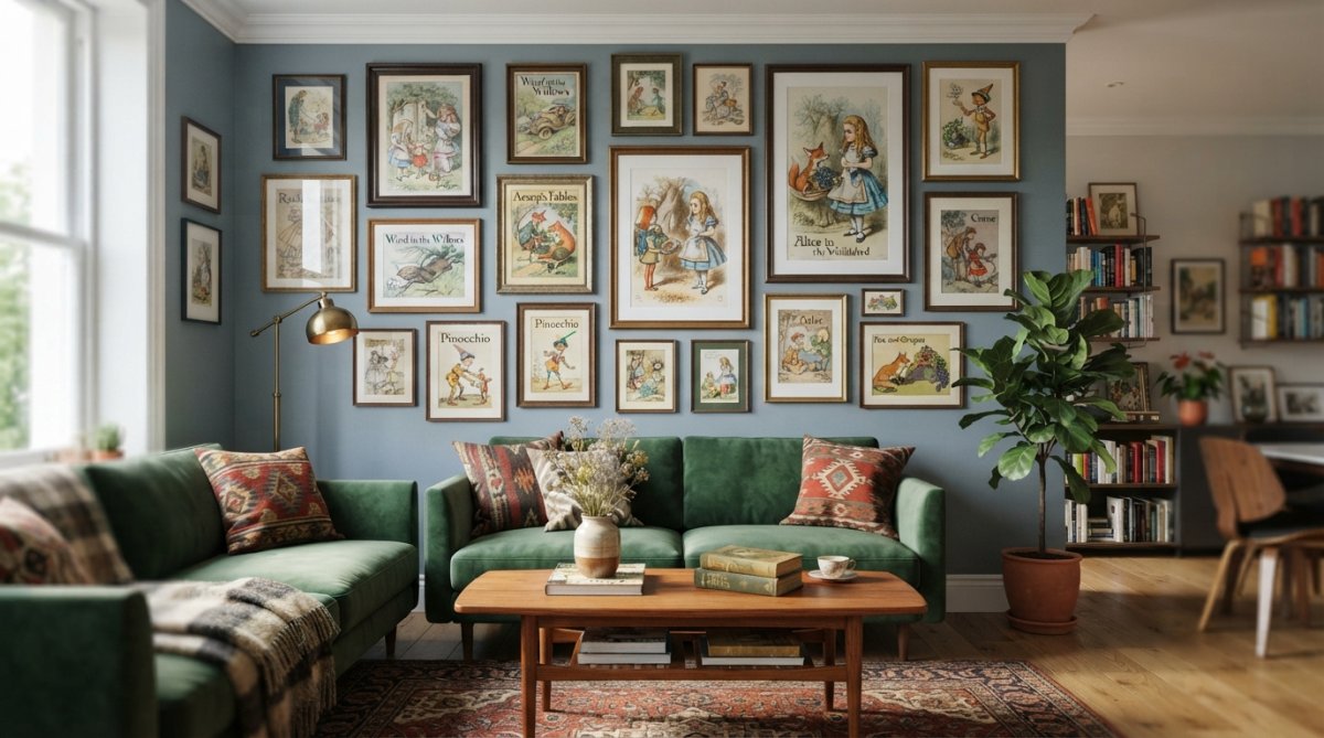
The pieces that work best as contemporary wall art balance specificity with universality. The character must be distinctive enough to carry visual interest and narrative weight. The image must work aesthetically in a modern space without feeling dated. The Lampwick poster and The Coachman print accomplish this balance. They're unmistakably character-driven and rooted in classic narrative, but visually sophisticated enough to function as serious wall art.
The golden age of illustration established principles that remain foundational: the power of careful draftsmanship, the emotional resonance of considered color choices, and the capacity of a single image to carry narrative depth. Modern artists working in this tradition aren't creating historical reenactments. They're extending a proven approach to visual storytelling into contemporary contexts.
When selecting character-driven art for your space, understanding these principles helps clarify what you're responding to. The work that resonates most deeply typically demonstrates technical foundation, interpretive depth, and compositional intention. Mind Eracing Studio's curated collection prioritizes exactly these elements. Each piece offers the visual storytelling and artistic legacy of the golden age rendered in contemporary print formats. Whether you choose archival matte for museum-quality presence or satin for enhanced vibrancy, you're investing in work that carries genuine artistic intention.
Frequently Asked Questions
Q: Who are some notable modern artists specializing in Golden Age illustration?
A: Contemporary illustrators continue the visual storytelling traditions of the Golden Age. They blend pen and ink draftsmanship with digital tools, creating character-driven narratives that echo the compositional structure and narrative art of early 20th-century masters. Many focus on literary interpretation, bringing classic fables and contemporary stories to life with the same aesthetic movement and myth-making quality that defined the original era.
Q: What materials did Golden Age illustrators use that modern artists still prefer?
A: Pen and ink remain foundational for sketching and line work, while watercolor wash continues to define color palettes and atmospheric depth. Modern artists value these techniques because they create authentic draftsmanship and visual vernacular that digital tools alone cannot replicate. Lithography's influence on color reproduction also shaped how contemporary illustrators approach chromatic choices. Many modern artists combine these traditional methods with digital finishing, preserving the tactile quality and artistic legacy of the Golden Age while gaining efficiency.
Q: How does archival matte paper differ from satin when displaying illustration prints?
A: Archival matte paper offers a soft, museum-quality finish that reduces glare and emphasizes brushwork detail, making it ideal for pen and ink or watercolor-heavy pieces where you want to see every stroke. Satin finishes add a subtle luminous sheen that enhances color vibrancy and makes illustrations pop on the wall. For Golden Age-inspired artwork with rich color palettes, satin can lift highlights and create visual impact, while matte preserves the painterly, understated elegance of traditional illustrative styles. Both archival options protect your prints from fading over time.
Q: Can Golden Age illustration styles work in modern home decor?
A: Absolutely. Character-driven art from classic tales and fables adds whimsy and narrative depth to contemporary spaces without feeling dated. The key is treating these pieces as focal points in a curated gallery wall or pairing them with clean, minimalist framing. Modern apartments and homes benefit from the visual storytelling and compositional strength of Golden Age illustration, which transcends era. Many collectors find that these prints bring personality and conversation to neutral interiors, bridging nostalgic appeal with current design sensibilities.
This article was written using GrandRanker