
Table of Contents
- What Is Character Art and Why It Works in Contemporary Spaces
- How to Style Character Art in Modern Homes
- Best Whimsical Art Prints for 2026
- Incorporating Storytelling Art Into Interior Design
- Scale, Proportion, and Technical Framing for Character Art
- Budget-Friendly Ways to Add Character to Your Walls
- Common Misconceptions About Character Art and Modern Design
- Conclusion
Last Updated: August 26, 2026
What Is Character Art and Why It Works in Contemporary Spaces
Character art is figurative, narrative-driven artwork that brings expressive human or fantastical figures into a space, drawing from storytelling traditions, classic literature, and fables. Unlike abstract or minimalist pieces, character art communicates through recognizable subjects and emotional resonance. Contemporary design celebrates personal expression and curated collections, making character art an ideal fit when framed and scaled thoughtfully.

The misconception many people hold is that contemporary interiors demand cool neutrality and restraint. In reality, modern design has evolved to embrace emotional storytelling. Character art bridges the gap between personal sentiment and spatial design, allowing collectors to display pieces that matter without sacrificing aesthetic cohesion. Homes incorporating character-driven pieces can feel more intentional and lived-in, with walls reflecting the inhabitant's personality rather than generic trends.
How to Style Character Art in Modern Homes
Styling character art in contemporary spaces requires understanding balance, scale, and visual hierarchy. Your character art should feel like an intentional design choice, not an afterthought.
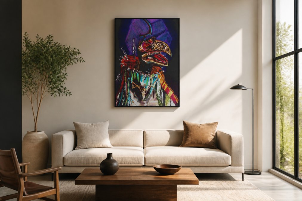
Start by identifying your room's visual anchor, the element that naturally draws the eye, whether a sofa, fireplace, or architectural feature. Character art works best when it dialogues with this anchor rather than competing against it. Hang the artwork at eye level above your primary furniture piece, creating a relationship between the two.
Consider your space's color palette. Contemporary interiors often rely on neutral base tones, whites, grays, warm beiges, which actually serve character art beautifully. A piece with saturated colors or rich jewel tones becomes more striking against a restrained background. This contrast is intentional design, not clash.
Scale matters profoundly. A small character art print on a large wall reads as insignificant; a piece that's too large overwhelms the space. The artwork should occupy roughly one-third to one-half of the wall space above a furniture piece. For a standard sofa, this typically means a single large print (24" × 36" or larger) or a carefully arranged gallery wall of smaller pieces.
Balancing Bold vs. Subtle Artwork
Not all character art carries the same visual weight. Bold character art with high contrast, vivid colors, or dynamic composition functions as a statement and works best in rooms with restrained surrounding elements. Subtle character art with softer palettes and quieter compositions integrates differently, coexisting well with other visual elements because it doesn't demand dominance.
Before purchasing, consider how the piece will read in your actual space. Understanding your own space, its light, existing palette, and visual weight, is essential.
Creating a Focal Point Without Overwhelming Space
To create a focal point with character art without overwhelming your space:
- Ensure adequate wall space around the piece (at least 12-18 inches of clear wall on each side) (aiga.org)
- Hang the artwork at eye level (57-60 inches from floor to center of frame) (the American Academy of Dermatology)
- Use lighting to draw attention; a picture light above the frame highlights the piece
- Keep furniture arrangement oriented toward the artwork
- Avoid competing visual elements in the immediate vicinity
A single well-placed character art piece with supportive spacing and lighting creates more impact than multiple pieces fighting for attention.
Best Whimsical Art Prints for 2026
Character art encompasses a range of styles and subjects. For 2026, collectors and homeowners are seeking distinctive pieces that reflect personal taste and storytelling rather than mass-produced decor.
Whimsical character art, with imaginative subjects, playful composition, or fantastical elements, has particular resonance in contemporary homes. These prints bring personality without requiring thematic consistency across your entire space.
Mind Eracing Studio specializes in character-inspired designs drawn from classic tales and fables. The Emperor delivers bold, handcrafted energy with rich jewel tones and layered textures that read like modern folklore. For subtler character work, Anistasia brings soft, impressionistic portraiture with painterly brushstrokes and warm, sunlit tones, working particularly well in intimate spaces. Scientist offers high-contrast contemporary character art with saturated color and gritty texture, ideal for creative studios or spaces where bold visual statements align with the inhabitant's aesthetic.

The common thread across these pieces is intentional design. Each print functions as a complete artwork, not filler.
Incorporating Storytelling Art Into Interior Design
Storytelling art transforms a room from functional space into a space with personality. Character art is inherently storytelling art, a figure from a fable carries centuries of narrative weight, and a portrait suggests a life, a moment, an emotion.
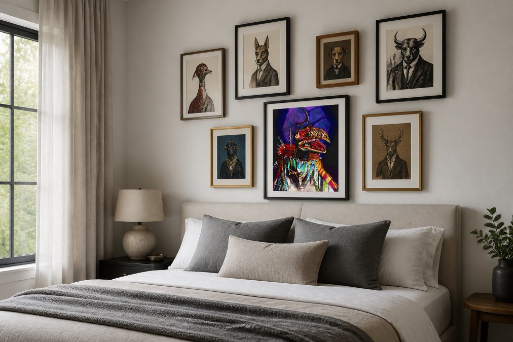
The key to successful integration is consistency of intent. If your character art comes from diverse, unrelated sources, the collection reads as random. If your pieces share thematic connection, all drawn from classic literature, all featuring a particular color palette, all rendered in similar artistic styles, the collection reads as curated. This curation transforms character art from decoration into design.
Mixing Old-World Art With Modern Interiors
Old-world art contains depth and craftsmanship that modern design often seeks but rarely achieves. Mixing old-world character art with modern interiors works because contemporary design values authenticity and intentionality. A classical portrait in a minimalist space is a deliberate choice that suggests taste and knowledge.
Frame selection becomes crucial. A classical portrait in a clean, modern frame, natural wood, matte black, or simple metal, becomes a bridge between eras. The frame signals that you're integrating historical artistic value into contemporary life, not recreating the past.
Placement and Layout Strategies for Character Pieces
Single Large Piece: Hang above the primary furniture element at eye level, creating immediate visual hierarchy.
Gallery Wall: Group 3-5 character pieces with consistent spacing (typically 2-3 inches between frames). The collection becomes the focal point rather than individual pieces.
Symmetrical Pairs: Hang matching or complementary character prints flanking a central element, creating visual balance.
Staggered Series: Arrange character prints at varying heights along a hallway or long wall to guide movement through the space.
Corner Integration: Place character art in corners or alcoves to activate dead space.
Your placement strategy should enhance the room's spatial flow, not interrupt it.
Scale, Proportion, and Technical Framing for Character Art
Scale is the relationship between the artwork's size and the wall it occupies. Proportion refers to the artwork's dimensions relative to what it hangs above. If you're hanging character art above a sofa, the artwork should be roughly 50-75% of the sofa's width (asid.org).
Technical framing affects how character art reads in contemporary spaces. Archival-quality materials preserve the artwork and signal thoughtful investment. Mind Eracing Studio offers both satin and archival matte print options. Satin finishes create subtle sheen that deepens colors and adds dimension. Archival matte finishes provide a soft, museum-quality appearance.
Frame selection should complement your contemporary aesthetic. Natural wood frames feel warm and accessible. Matte black frames read as modern and sophisticated. Thin metal frames suggest minimalism. For character art with dimensional texture or brushwork, floating frames enhance the viewing experience by allowing light to play across the surface.
Budget-Friendly Ways to Add Character to Your Walls
Character art doesn't require significant investment. High-quality prints capture artwork's essence at a fraction of original painting costs. Mind Eracing Studio's prints start at $6.58 for smaller pieces like Garthum, perfect for reading nooks or gallery walls. Larger prints like The Emperor and Scientist are priced at $16.27, offering substantial visual presence without original work costs.

Invest in quality printing, archival-quality prints preserve color and detail over time. The difference between a cheap print and a $16 archival print becomes obvious within months as cheaper options fade or discolor.
Strategic lighting costs far less than additional artwork but dramatically improves how character art reads. A simple picture light above a frame highlights the piece and creates visual emphasis, particularly effective for moody, detailed character art.
Rather than purchasing pre-made gallery wall sets, curate your own collection over time. Start with one character art piece you love, then add complementary pieces as budget allows. Embrace varying frame styles as intentional curation, vary frame materials while maintaining consistent spacing and alignment.
Common Misconceptions About Character Art and Modern Design
Misconception 1: Character art is too "traditional" for modern spaces. Contemporary design is about intentionality. Character art, when thoughtfully placed and scaled, reads as a deliberate curatorial choice.
Misconception 2: Character art clashes with neutral palettes. Neutral walls amplify character art's visual impact. A bold character print against white or gray walls reads as more striking.
Misconception 3: You need thematic consistency across all your art. A single character art piece can stand alone as a focal point. Multiple pieces coexist if they share color palette, frame style, or placement strategy.
Misconception 4: Character art is frivolous or decorative only. Quality character art carries artistic merit, technical skill, and often historical significance. Pieces from classic tales contain centuries of narrative depth.
Misconception 5: Online character art never looks as good in person. This depends on printing quality and material selection. Archival-quality prints retain color accuracy and detail.
Character art is increasingly essential to contemporary homes. As modern interiors evolve beyond minimalist austerity toward spaces reflecting inhabitant personality, character-driven artwork fills that need perfectly. The pieces offer narrative depth, emotional resonance, and visual interest without requiring thematic compromise.
The challenge isn't whether to include character art in your contemporary space, it's choosing pieces that align with your aesthetic, scaling and placing them thoughtfully, and investing in quality printing and framing. Mind Eracing Studio's curated collection of character-inspired prints provides starting points for building a collection that feels both personally meaningful and visually integrated. Add to your collection with Mind Eracing Studio and transform your walls into spaces that tell stories worth living in.
Frequently Asked Questions
Q: Will character art from classic tales actually work in a contemporary home?
A: Yes. Character art thrives in modern spaces when you treat it as a visual communication tool rather than nostalgia. Contemporary interiors benefit from expressive artwork that adds personality and emotional resonance. The key is choosing pieces with strong graphic form and color palette that complement your existing decor. Figurative or character-driven prints create architectural detail and focal points that minimalist spaces often lack, making them a genuine design asset, not an aesthetic clash.
Q: How do I know if a character art print will look good on my wall in person?
A: High-quality character art prints like those from Mind Eracing Studio use archival materials and professional color reproduction that remain true to the original design. Satin finishes add depth and make colors pop, while archival matte paper provides a soft, museum-quality appearance. Before purchasing, check the print dimensions against your wall space, review the color palette against your existing furnishings, and confirm the paper option matches your lighting. Most reputable art retailers offer return policies if the piece doesn't meet expectations once it arrives.
Q: What makes character art prints worth the investment compared to cheaper alternatives?
A: Quality character art uses archival-grade materials, professional printing techniques, and curated designs that maintain color vibrancy and detail over time. Cheaper mass-produced prints often fade within months and use lower-grade paper that yellows or warps. Character-driven pieces from specialty studios like Mind Eracing Studio offer unique, hand-crafted designs with intentional storytelling rather than generic stock imagery. You're paying for longevity, artistic integrity, and a piece that genuinely enhances your space's personality and spatial flow.
Q: How should I arrange character art in a gallery wall for maximum impact?
A: Use the 3-5-7 principle as a starting framework: arrange pieces with consistent spacing, balancing scale and proportion across the wall. Mix frame styles and mat colors to create visual interest while maintaining cohesion through a unified color palette. Leave breathing room between prints to avoid visual clutter, and ensure the arrangement has a clear focal point. Character art works best when pieces relate thematically or through color, for example, grouping prints from the same fable series or using complementary tones creates a curated collection that feels intentional rather than random.
This article was written using GrandRanker