
Table of Contents
- Understanding Your Space and Character Art Vision
- Gallery Wall Layout Ideas for Character Posters
- Best Frames for Character Posters and Print Protection
- How to Hang Wall Art Without Damaging Walls
- Creating Visual Balance and Focal Points
- Integrating Character Art with Existing Room Decor
- Common Mistakes to Avoid When Styling Character Wall Art
- Conclusion
Last Updated: August 11, 2026
Understanding Your Space and Character Art Vision
Before you hang a single frame, take time to assess what you're working with. The space itself, lighting, wall color, room purpose, existing furniture, determines everything that follows. Character wall art works best when it complements rather than fights its surroundings.
Start by identifying your room's dominant colors and mood. A bedroom with soft neutrals and minimalist furniture calls for a different approach than a vibrant living room or a cozy reading nook. Character-inspired designs from classic tales come in countless color palettes, from rich jewel tones to whimsical pastels. Your art should enhance the room's existing aesthetic, not demand that everything change to match it.
Natural light matters more than most people realize. Rooms with abundant daylight can handle bolder, more saturated character art. Spaces with limited natural light benefit from prints that reflect light well, this is where satin finishes shine compared to matte options. Mind Eracing Studio offers both satin and archival matte print options, giving you flexibility to match your room's lighting conditions.
Consider the wall itself. Is it large and bare, or already decorated with furniture, shelves, or mirrors? A spacious empty wall invites a bold gallery wall layout. A wall above a dresser or console table suggests a more contained, intentional arrangement. The wall's dimensions shape everything: how many pieces you can fit, what sizes work best, and how much negative space you can afford to leave.
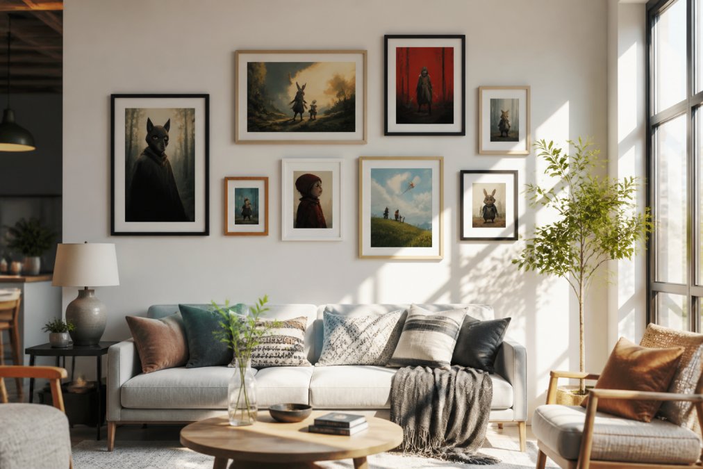
Think about your room's traffic patterns and sight lines. Where do people naturally focus when they enter? That's your prime real estate for a focal point, a standout piece or cluster that draws the eye first. The goal is intentional arrangement, not random placement.
Gallery Wall Layout Ideas for Character Posters
Gallery wall layout ideas have evolved beyond the rigid grid. Modern arrangements celebrate asymmetry, varied frame sizes, and deliberate spacing. For character posters specifically, you have two primary compositional strategies.
Symmetrical vs. Asymmetrical Arrangements
Symmetrical arrangements create formal, balanced compositions. You center a large piece and flank it with matching smaller prints on either side, or arrange pieces in a perfect grid. This approach works beautifully in traditional or transitional spaces. It conveys order and intentionality. The downside: symmetry can feel static if not executed with enough visual variety in the art itself.
Asymmetrical balance is more forgiving and visually dynamic. You place pieces of varying sizes across the wall without mirror-image matching. One side might have a large piece with breathing room; the other might cluster several smaller frames. The key is distributing visual weight evenly, a heavy, dark piece on the left balances a lighter, busier composition on the right. Asymmetrical layouts feel more curated and personal, which suits character-driven art perfectly.
For most spaces, asymmetrical arrangements work better with character posters. They allow you to showcase multiple beloved characters without rigid formality. The whimsy of character art from classic tales pairs naturally with organic, flowing layouts.
The 3-4-5 Rule for Balanced Composition
This simple framework prevents gallery walls from feeling chaotic. Start with a primary piece, your largest or most striking character poster. This anchors the composition and establishes scale. Then add secondary pieces at roughly 60-75% of the primary piece's size. Finally, include smaller accent pieces at 40-50% of the primary size.
For a wall with five pieces total, follow this ratio: one large (primary), two medium (secondary), two small (accent). For seven pieces, add one more medium and one more small. This creates visual hierarchy without requiring mathematical precision.
Spacing matters as much as size. Leave roughly 2-3 inches between frames for a cohesive gallery wall. Tighter spacing creates intimacy; wider spacing emphasizes individual pieces. Consistent spacing, even if asymmetrical, signals intentional curation rather than random arrangement.
Best Frames for Character Posters and Print Protection
Your frame choice determines whether character art enhances or detracts from your space. The right frame protects your investment while amplifying the visual impact of the print itself.
Matching Frame Style to Your Aesthetic
Wood frames suit traditional, bohemian, and eclectic spaces. Natural wood tones ground character art and add warmth. Darker woods (walnut, espresso) work with jewel-toned prints; lighter woods (oak, natural pine) pair with pastels or vintage-inspired character designs.
Metal frames, particularly black, gold, or brushed steel, suit modern and contemporary spaces. They're clean, minimal, and let the art take center stage. Metal frames work especially well when you're mixing multiple pieces with different color palettes.
Floating frames (where the print appears suspended between glass) create a gallery-quality look. They're ideal for high-quality satin and archival matte prints from sources like Mind Eracing Studio, where the print quality itself deserves showcasing. Floating frames cost more but elevate the presentation.
Matting adds sophistication and protects your print. A mat creates breathing room between the frame edge and the artwork, directing focus to the image itself. For character art, neutral mats (white, cream, soft gray) keep attention on the design. Colored mats can complement the print's palette but risk overwhelming smaller pieces.
Frame width matters. Thin frames (0.5-1 inch) suit delicate, detailed character art and contemporary spaces. Wider frames (1.5-2 inches) work for bold, statement pieces and traditional rooms. Consistency across your gallery wall, even if frame styles vary, creates cohesion.
How to Hang Wall Art Without Damaging Walls
This is where many people hesitate, especially renters. The good news: modern solutions make damage-free hanging realistic and reliable.
Measuring, Marking, and Spacing
Start with a template. Cut kraft paper or newspaper to match your frame dimensions. Tape these templates to the wall in your desired arrangement. Step back, adjust, live with it for a few hours. This prevents costly mistakes before you commit to holes.
Use a level for every piece. Even slightly tilted frames disrupt visual balance and look careless. Mark your hanging points with a pencil before installing hardware.
For spacing between pieces, measure from the center of one frame to the center of the next. Consistent measurements, even if asymmetrical, create visual rhythm. Aim for 2-3 inches of negative space between frames.
Rental-Friendly Installation Methods
Adhesive strips (like Command strips rated for your frame weight) are the standard for damage-free hanging. They hold securely when properly applied and remove cleanly. The key: follow weight limits precisely. Overloading strips causes failure and potential wall damage.
For heavier pieces, damage-free picture hanging hooks designed for rental walls work well. They use small nails and leave minimal holes. Many renters find these acceptable and easy to patch.
Leaning art against the wall (propped on shelves, dressers, or floating shelves) eliminates hanging entirely. This works beautifully for gallery walls above furniture. You get flexibility without commitment.
Magnetic strips on metal walls (if your space has them) offer another damage-free option. They're less common but perfect when available.
Test your hardware on a less visible wall first. Confirm it holds weight before installing your full gallery.
Creating Visual Balance and Focal Points
A successful gallery wall doesn't just display art, it creates visual balance and draws the eye purposefully.
Using Negative Space Effectively
Negative space is the breathing room around and between pieces. It's not wasted space; it's essential design. Crowded walls feel chaotic. Generous negative space makes each piece feel intentional and allows viewers to absorb individual works before scanning the whole composition.
A common mistake is filling every inch of wall. Resist this. A gallery wall with 30% negative space feels curated. One with 10% feels cluttered.
Negative space also affects mood. Sparse arrangements (few pieces, lots of breathing room) feel modern and meditative. Densely packed galleries feel bohemian and collected. Match your negative space to your aesthetic goals.
Scale, Proportion, and Eye Level
Eye level is roughly 57-60 inches from the floor to the center of your wall arrangement. Pieces positioned at this height feel natural and engaging. Gallery walls that drift too high feel inaccessible; those too low feel cramped.
For a focal point, position your largest or most striking character piece at eye level. This commands attention immediately. Smaller pieces can sit slightly above or below, creating visual flow.
Scale relationships matter. A tiny frame surrounded by large ones looks lost. A massive frame with tiny companions looks domineering. Gradual size transitions feel balanced. A large piece, then medium, then small creates visual rhythm.
Proportion extends to the wall itself. A small gallery on a massive wall feels timid. A large gallery on a small wall feels overwhelming. Generally, your gallery should occupy 50-75% of the available wall space.
Integrating Character Art with Existing Room Decor
Character-driven art doesn't exist in isolation. It lives alongside furniture, lighting, and other decorative elements. Successful integration makes everything feel cohesive.
Color Palette and Mood Coordination
Pull colors from your character art and repeat them elsewhere in the room. If your prints feature rich jewel tones, echo those in throw pillows, a rug, or accent wall. This creates visual connection and prevents art from feeling like an afterthought.
Conversely, character art can anchor a color palette. If you love a particular print's color story, build your room around it. This is especially effective with character-inspired designs that carry specific moods, whimsical, nostalgic, bold, serene.
Mood matters. Playful character art from fables and classic tales suits rooms designed for imagination and creativity. A child's room, reading nook, or creative workspace welcomes this energy. More formal spaces require character art with sophisticated color palettes and refined designs.
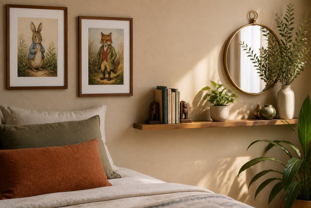
Mind Eracing Studio's curated collection offers character-inspired designs that work across contemporary, bohemian, and eclectic spaces because the artwork itself carries visual sophistication.
Mixing Character Art with Mirrors and Shelves
Mirrors amplify light and create visual expansion. Pairing character art with a mirror creates a dynamic focal point. Position art slightly off-center from the mirror, allowing each element to breathe while creating a unified composition.
Floating shelves introduce texture and functionality alongside art. A shelf beneath a gallery wall displays books, small sculptures, or plants, these elements echo colors and themes from your prints. The shelf grounds the wall arrangement and creates visual weight at the lower portion of the composition.
Avoid competing focal points. If your character art gallery is the statement, keep shelves and mirrors supporting players. If shelves are primary (displaying a curated collection), position character art as a backdrop rather than a competing focal point.
Common Mistakes to Avoid When Styling Character Wall Art
Understanding what doesn't work prevents costly missteps.
Hanging art too high is the most common error. People position pieces assuming standard wall height, forgetting that eye level varies. Step back after hanging and check sight lines from seated and standing positions. Adjust if pieces sit above natural viewing height.
Inconsistent spacing creates visual unease. If you space some frames 2 inches apart and others 4 inches, the arrangement feels accidental. Measure and maintain consistency, even in asymmetrical layouts.
Mismatched frame styles confuse the eye. Mixing ornate wood with sleek metal without intentional variation reads as indecisive. Commit to a frame aesthetic, whether varied sizes within a cohesive style, or deliberately eclectic with clear color coordination.
Ignoring wall color is another trap. Character art on a wall color that clashes with the print's palette looks jarring. Neutral walls (white, cream, soft gray, pale blue) work universally. Colored walls demand prints that complement or intentionally contrast.
Overcrowding kills impact. Every piece doesn't need to be displayed simultaneously. Rotate character art seasonally or as your taste evolves. This keeps your space fresh and prevents gallery fatigue.
Neglecting print quality undermines everything. A beautifully arranged gallery of low-quality prints feels disappointing. Investing in high-quality satin and archival matte options, like those from Mind Eracing Studio, ensures your carefully curated arrangement looks stunning for years.
Styling character wall art transforms a room from decorated to intentional. The space becomes a reflection of what you love, stories, characters, imagination rendered visible. Start with your room's existing palette and mood. Choose frames that enhance rather than compete. Measure carefully, space deliberately, and leave breathing room for visual balance. When you approach character art as a curated collection rather than random decoration, the results speak for themselves. Explore Mind Eracing Studio's character-inspired designs and add distinctive, colorful wall decor that captures the imagination and elevates your space with artistic vision grounded in storytelling.
Frequently Asked Questions
What is the 3-4-5 rule for styling character wall art?
The 3-4-5 rule is a composition principle where you group artwork in clusters of 3, 4, or 5 pieces to create visual rhythm and balance. This method prevents your gallery wall from feeling random or scattered. Groups of odd numbers naturally appeal to the eye and create more dynamic, intentional-looking arrangements than even groupings. Apply this rule by clustering character prints together with consistent spacing, then spacing these clusters strategically across your wall.
How do I balance character art with my existing room decor?
Start by identifying your room's dominant color palette, furniture style, and overall aesthetic. Character art from classic tales works in modern, bohemian, minimalist, and eclectic spaces when the frame style and wall placement align with your existing decor. Choose frames that echo your furniture finishes (wood, metal, or painted), and position art at eye level as a focal point or secondary accent. Layer character prints with mirrors and floating shelves to create texture and visual interest that complements, rather than competes with, your existing pieces.
Should I frame character wall art or hang it unframed for a modern look?
Both approaches work for modern spaces, but framing offers better protection and visual polish. Framed character art creates defined boundaries that feel intentional and curated, while unframed prints can feel more casual and contemporary. For high-quality archival prints, framing protects the artwork from dust, fading, and damage over time. Choose a minimalist frame style, thin metal, natural wood, or simple black, to keep the modern aesthetic clean. Unframed prints work best when mounted on acid-free backing or behind glass to preserve color and longevity.
What height should I hang character wall art?
Hang character art so the center of the piece is at eye level, approximately 57-60 inches from the floor. This standard height creates natural sightlines and feels balanced in most rooms. For gallery walls, aim for the center of the entire arrangement to be at eye level rather than each individual piece. Above furniture like sofas or shelves, maintain 6-12 inches of space between the top of the furniture and the bottom of the frame. Adjust for room function: higher placement works in entryways, lower placement suits intimate seating areas.
This article was written using GrandRanker