
Table of Contents
- Determine the Right Hanging Height for Fable Art Prints
- How to Hang Art Without Nails: Damage-Free Mounting Techniques
- Gallery Wall Layout Ideas for Character-Driven Prints
- Best Frames for Art Prints: Choosing Style and Material
- Spacing and Arrangement: Creating Visual Balance on Your Wall
- Lighting and Climate Control for Long-Term Print Preservation
- Display Your Fable Art Prints with Confidence
Last Updated: August 15, 2026
Determine the Right Hanging Height for Fable Art Prints
The ideal hanging height for art is 57-60 inches from the floor to the center of the print. This positions artwork at eye level, creating a natural focal point that draws viewers in without requiring them to crane their necks. Eye-level placement works because it matches the average human line of sight when standing or sitting in a room.
However, hanging height shifts based on context. Above a sofa, lower the center point to 8-10 inches above the furniture's back. Above a desk or console table, aim for 6-8 inches of clearance. In hallways or entryways where people stand rather than sit, the 57-60 inch standard applies directly. The key is creating visual balance between the artwork and what's beneath it.
For character-driven prints from fable art collections, this principle matters even more. Whimsical designs demand engagement, viewers should feel invited to lean in and explore details. Hanging too high diminishes that connection. Too low, and the artwork competes visually with furniture rather than complementing it.

When displaying multiple fable art prints, maintain consistent eye-level alignment across the group. If prints vary in size, base your measurement on the largest piece. This creates visual order even when frames differ in style or orientation. Mind Eracing Studio's character-inspired prints work best when they command attention at eye level rather than disappearing into upper wall space.
How to Hang Art Without Nails: Damage-Free Mounting Techniques
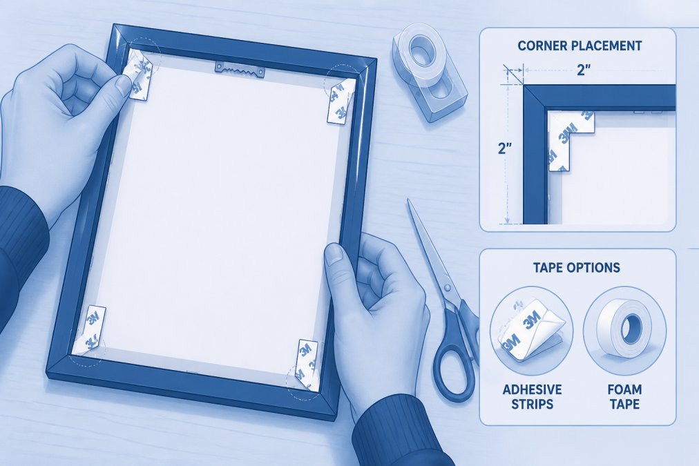
Damage-free mounting preserves walls while securing artwork safely. Adhesive strips rated for the weight of your frame offer the simplest solution. Picture hanging strips work by distributing weight across a larger surface area, reducing pressure on any single point. For prints under 10 pounds, quality adhesive strips hold reliably without damaging drywall.
The process is straightforward:
- Clean the wall surface thoroughly with a dry cloth to remove dust and debris
- Measure and mark the center point where your frame will hang
- Apply adhesive strips to the back corners of the frame (not the wall)
- Press firmly for 30 seconds to ensure full contact
- Wait 24 hours before hanging to allow adhesive to cure
Picture ledges offer another damage-free alternative. These shallow shelves mount to walls and hold prints upright without any fasteners on the frames themselves. Ledges work especially well for gallery wall arrangements where you want flexibility to swap prints seasonally or adjust positioning. They're ideal for displaying how to hang art without nails while maintaining a polished look.
For heavier pieces or permanent installations, toggle bolts and wall anchors provide secure holding power without requiring studs. Drill small pilot holes, insert the anchors, and hang your frame. This method works on drywall, plaster, and most interior surfaces. Always check the weight capacity of your chosen hardware against the actual weight of your framed print.
Avoid adhesive strips on textured walls or freshly painted surfaces. Wait at least two weeks after painting before applying strips, paint needs time to cure fully. For textured walls, picture ledges or traditional mounting hardware become your best options.
Gallery Wall Layout Ideas for Character-Driven Prints
Gallery walls transform empty spaces into curated collections that tell a visual story. Character-driven fable art prints are ideal for gallery arrangements because each piece carries narrative weight. A collection of whimsical characters creates visual interest without feeling chaotic.
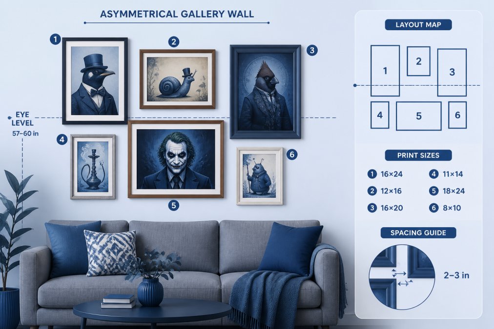
Start with an asymmetrical layout rather than rigid grid patterns. Asymmetrical arrangements feel more intentional and allow prints of varying sizes to coexist naturally. Sketch your layout on paper first, measuring distances between frame centers. A common spacing pattern uses 2-3 inches between frames, though this varies based on frame size and wall dimensions.
The classic gallery wall approach combines portrait and landscape orientations. Alternate between vertical and horizontal frames as you move across the wall. This rhythm prevents monotony and guides the viewer's eye through the arrangement. For fable art prints, mixing orientations lets different characters and scenes breathe individually while contributing to a cohesive whole.
Consider creating a focal point within your gallery wall. Choose one larger print or a print with bold coloring to anchor the arrangement. Position it slightly off-center, typically in the upper third of the wall. Smaller prints radiate outward from this anchor, creating visual hierarchy.
Mind Eracing Studio's archival matte print options work beautifully in gallery walls because the matte finish reduces glare and allows each piece to maintain its character without competing reflections. When mixing frame styles, which gallery walls encourage, matte prints maintain consistency even when frames vary.
Best Frames for Art Prints: Choosing Style and Material
Frame selection determines whether your fable art prints blend seamlessly into your space or stand out as intentional focal points. Material and finish matter more than most people realize. Wood frames convey warmth and work across aesthetic styles, from minimalistic to eclectic. Metal frames project contemporary sophistication and pair well with modern interiors. Combination frames mixing wood and metal offer flexibility for transitional spaces.
Finish color deserves careful consideration. Natural wood tones anchor artwork without demanding attention. Black frames create bold contrast and work especially well with colorful prints. White or light frames suit minimalistic spaces and let artwork take center stage. For character-driven prints with rich, saturated colors, neutral frame finishes prevent visual competition.

Frame width affects perception. Narrow frames (under 1 inch) feel contemporary and let the artwork dominate. Medium frames (1-2 inches) balance the print and frame visually. Wide frames (over 2 inches) make statements and work best for smaller prints or gallery wall anchors.
Matting decisions impact both preservation and aesthetics. Archival matting protects prints from acid damage over decades. The mat creates breathing room between the frame glass and print surface, essential for long-term preservation. Matting also allows you to display smaller prints in larger frames, creating visual impact without oversizing the artwork itself.
For prints from Mind Eracing Studio, which come in both satin and archival matte finishes, frame selection should complement the print's surface. Matte finishes pair naturally with simple wood frames that don't compete with the artwork. Satin finishes benefit from frames that echo their slight sheen, brushed metal or polished wood work particularly well.
Glass or acrylic? Museum-quality UV-protective glass preserves color fidelity and blocks harmful light. Acrylic is lighter, cheaper, and safer for homes with children or pets, though it scratches more easily. For character-driven art you plan to enjoy for years, UV glass justifies the investment.
Spacing and Arrangement: Creating Visual Balance on Your Wall
Spacing between prints determines whether a gallery wall feels intentional or accidental. The 2-3 inch rule provides a starting point, but your eye is the final arbiter. Step back frequently as you arrange, what looks balanced at arm's length may feel cramped from across the room.
Visual balance means distributing visual weight evenly across the wall. Darker prints, larger prints, and prints with bold colors carry more visual weight than light, small, or subtle pieces. If you place all dark prints on one side, the arrangement feels lopsided. Distribute them throughout to create equilibrium.
The center point of your arrangement should align with eye level, approximately 57-60 inches from the floor. This doesn't mean every print centers at that height. Rather, the visual center of gravity of the entire arrangement should sit at eye level. This principle keeps the gallery wall from feeling top-heavy or floating.
Furniture spacing matters as much as frame spacing. Above a sofa, leave at least 6-8 inches between the furniture's top edge and the lowest frame. This creates breathing room and prevents the artwork from feeling like it's pressing down on the seating. Above a console table or desk, follow the same principle, adequate clearance prevents visual claustrophobia.
Horizontal alignment creates order. If you're hanging multiple prints in a row, align either their tops or centers. Mixing alignment styles, some centered, some top-aligned, introduces visual chaos. Choose one method and commit to it across the entire arrangement.
For asymmetrical gallery walls, imagine an invisible grid underlying your arrangement. Prints don't need to sit on the grid lines, but the overall composition should feel organized rather than random. Sketch your layout at actual scale on the wall using painter's tape before hanging anything permanently. This prevents costly mistakes and lets you visualize spacing before committing.
Lighting and Climate Control for Long-Term Print Preservation
Light exposure is the primary threat to print longevity. Direct sunlight fades colors and degrades paper over months or years. Indirect natural light is acceptable if supplemented with UV-filtering window treatments. The best approach combines controlled ambient lighting with strategic window placement.
Avoid positioning prints in direct sunlight from east or west-facing windows. North-facing light is ideal, it's consistent, indirect, and won't fade colors. If your wall receives afternoon sun, install sheer curtains or UV-blocking blinds to diffuse the light. This preserves the print while maintaining the room's natural brightness.
Artificial lighting requires equal attention. LED bulbs emit minimal heat and UV radiation, making them ideal for displaying artwork. Avoid incandescent or halogen bulbs near prints, they generate heat that can damage paper and accelerate fading. If you use picture lights above framed prints, ensure they're LED-based and positioned to illuminate without creating hotspots.
Climate control protects archival quality. Paper expands and contracts with humidity fluctuations, causing warping and buckling over time. Maintain indoor humidity between 30-50 percent. In dry climates, a humidifier helps. In humid regions, a dehumidifier prevents moisture damage. Consistent temperature, ideally 65-75 degrees Fahrenheit, prevents the expansion and contraction that stresses paper fibers.
Mind Eracing Studio's archival matte prints are manufactured to resist fading, but environmental control extends their lifespan significantly. Archival materials resist acid degradation, but light and humidity remain variables you control. Store spare prints or seasonal artwork in acid-free boxes in a cool, dry location rather than attics or basements where temperature and humidity fluctuate wildly.
Dust accumulation damages prints over time. Clean framed artwork quarterly using a soft, dry cloth. Never use water or cleaning solutions, they risk damaging the print surface. For matte finishes, gentle circular motions work best. For satin finishes, wipe in one direction to avoid streaking.
Display Your Fable Art Prints with Confidence
Displaying fable art prints successfully combines technical precision with creative vision. You've now covered the fundamentals: hanging height determines viewer engagement, damage-free mounting preserves your walls, gallery wall layouts tell visual stories, frame selection amplifies the artwork's impact, spacing creates visual balance, and environmental control ensures decades of enjoyment.
The real confidence comes from understanding that these principles work together. Eye-level placement at 57-60 inches means nothing if your spacing feels haphazard. A beautiful frame won't matter if your print fades from sun exposure. Character-driven artwork deserves a display approach that honors its narrative weight and artistic detail.
Start with one print. Hang it at eye level using damage-free mounting. Step back and observe how it interacts with your space for a week. Then add a second print, maintaining consistent spacing and alignment. Build your display gradually rather than rushing to fill walls. This measured approach lets you develop an eye for what works in your specific space.
Mind Eracing Studio's collection of character-inspired prints from classic tales gives you flexibility. Whether you're creating a cohesive gallery wall or displaying individual statement pieces, the whimsical energy of fable art translates across aesthetic styles. Pair bold character prints with neutral frames and controlled lighting, and you've created something that feels both intentional and timeless.

The prints you choose matter, but how you display them matters equally. Take the time to get hanging height right, select frames that complement rather than compete, maintain proper spacing, and control your environment. Your fable art prints will reward that attention with years of visual pleasure and conversation-starting presence in your home.
Displaying fable art prints transforms how you experience your space. The character-driven designs from Mind Eracing Studio deserve careful placement that honors their storytelling nature. By following these display principles, from eye-level hanging height to proper spacing and climate control, you create an environment where whimsical artwork becomes a cherished part of your home's visual identity. Start with archival preservation guidelines from the Library of Congress to understand how environmental factors affect your prints long-term, then implement these techniques to ensure your collection remains vibrant for decades to come.
Frequently Asked Questions
What is the standard height for hanging fable art prints?
The center of your fable art print should hang at 57 inches from the floor to eye-level. This creates a natural, comfortable viewing experience. If hanging multiple prints as a gallery wall, maintain this eye-level center point for the arrangement's focal point. Above furniture like a sofa, position prints 8-10 inches above the piece to create visual cohesion without overwhelming the space.
How do I hang art without nails and avoid wall damage?
Adhesive strips rated for your print's weight are the safest damage-free option. For lighter fable art prints under 5 pounds, use heavy-duty removable strips designed for drywall. Picture ledges offer another excellent solution, allowing you to display prints without any wall penetration. If using nails, install them at a 45-degree angle into wall studs for maximum security and minimal damage. Always test adhesive on a small area first.
Can I display fable art prints without frames?
Yes, unframed prints can work beautifully, especially if you're using archival matte paper like Mind Eracing Studio's options. Unframed display works best for bold, character-driven designs that don't need additional visual structure. Use adhesive strips or picture ledges to display unframed prints. However, framing offers UV protection and helps preserve your print's colors and quality over time, making it the preferred choice for long-term display.
How do I choose the right frame for a fable art print?
Select frames that complement your print's aesthetic without competing for attention. Minimalistic black or natural wood frames work well with colorful, whimsical fable art. Match the frame material to your interior style: gallery-style frames for contemporary spaces, ornate frames for traditional decor. Consider matting to add depth and protect your print from glass contact. Ensure frames include UV-protective glass to prevent color fading and preserve archival quality over years of display.
This article was written using GrandRanker