
Table of Contents
- Understanding Minimalist Art Principles
- Defining Your Color Palette for Minimalist Wall Art
- Minimalist Wall Art Ideas for Every Space
- Selecting Size, Scale, and Composition
- Minimalist Art Placement Tips and Hanging Height
- Adding Texture and Warmth Without Sacrificing Simplicity
- Curating Your Pieces: Quality Over Quantity
- Frequently Asked Questions
Last Updated: October 1, 2026
Understanding Minimalist Art Principles
Learning how to choose art for a minimalist home means being intentional about every piece you hang. It's not about having less art, it's about selecting pieces that breathe, that belong, and that don't fight for attention with everything else in your space.
The foundation of minimalist art starts with understanding two core principles: negative space and intentionality. Negative space isn't empty. It's the breathing room that lets your art stand out. When you fill every wall with color and pattern, nothing gets noticed. When you leave room around your pieces, each one becomes a focal point.
Intentionality means asking yourself why a piece matters before you buy it. Does it speak to something you actually care about? Does it fit your color story? Will it work with the furniture and light in the room? If you can't answer yes to those questions, it doesn't belong in a minimalist space.
The role of negative space and breathing room
Negative space is the uncluttered area around and between your art. It's what prevents visual clutter and gives your eye a place to rest. In a minimalist home, negative space is as important as the art itself.
Think of it this way: a single piece of art on a large, empty wall feels intentional and powerful. The same piece surrounded by five other pieces feels cramped. The wall hasn't changed. The art hasn't changed. But the negative space has, and so has the entire feeling of the room.
When you hang art in a minimalist space, leave at least as much empty wall as you have covered. If your piece takes up a quarter of the wall, the remaining three-quarters should stay open. This creates visual balance and prevents the room from feeling busy.
Intentionality over abundance
Understanding how to choose art for a minimalist home means curating, not accumulating. You're building a collection where each piece has a reason to exist in your home.
Common mistake: buying art because it's on sale or because it fits a trend. In a minimalist space, this leads to walls that feel disjointed and cluttered. Instead, choose pieces that align with your aesthetic, your color palette, and your personal taste.
Intentional collecting means waiting for the right piece rather than filling space quickly. It means rotating art seasonally if you want variety, rather than displaying everything at once. It means understanding that a single strong piece often works better than three mediocre ones.
Defining Your Color Palette for Minimalist Wall Art
Your color palette sets the mood for your entire space. In minimalist design, the colors you choose either create calm or create chaos. There's no middle ground.
The most effective minimalist spaces use a limited, cohesive color story. This doesn't mean everything is beige. It means the colors work together, not against each other.
Neutral and muted tones as your foundation
Neutral colors form the backbone of minimalist wall art. These include soft whites, warm grays, charcoal, taupe, and beige. They recede into the background and let the composition and form of the art do the work.
Muted tones are colors that have been softened, think dusty blue instead of bright blue, sage green instead of neon green, warm terracotta instead of bright orange. These tones feel intentional and curated rather than random.
The advantage of a neutral base is flexibility. You can add accent pieces without disrupting the overall calm. A single piece with deeper color or contrast stands out without overwhelming the space.
Many people worry that neutral palettes feel boring. The truth is the opposite. When you remove color noise, people actually see the art more clearly. They notice the composition, the texture, the details that get lost in busier spaces.
When and how to introduce accent colors
Accent colors are where personality enters a minimalist space. They should be used sparingly and intentionally.
A single accent color works best. This might be a deep forest green, a warm rust, a soft blush, or a cool navy. Choose one color that resonates with you, then use it in only one or two pieces.
The key is proportion. If your accent color covers more than 20 percent of your visible wall art, it stops being an accent and becomes the dominant color. Keep it to small, strategic areas, perhaps a single piece with that color, or a small section of a larger composition.
Introduce accent colors in pieces that already have a strong neutral base. This prevents the accent from feeling jarring or out of place.
Minimalist Wall Art Ideas for Every Space
The best minimalist art works with your space, not against it. Different rooms benefit from different approaches.
Single focal point pieces
A single strong piece often works better than a gallery wall in minimalist design. One large, well-chosen print can anchor an entire room.
Single focal point pieces work best when hung at eye level, roughly 57-60 inches from the floor to the center of the frame. They should be proportional to the wall, a large piece on a large wall, a medium piece on a medium wall.
The advantage of a single focal point is clarity. There's no question about what draws the eye. The room feels intentional, not scattered.
Geometric shapes and clean lines
Geometric art fits naturally into minimalist spaces. Sharp lines, simple shapes, and bold compositions feel intentional and curated.
Look for art with clean geometric elements: circles, rectangles, triangles, or abstract compositions built from simple forms. These pieces don't compete with your space, they enhance it.
Abstract landscapes and moody compositions
Abstract landscapes bring depth and atmosphere without the visual weight of realistic detail. A moody landscape with soft colors and atmospheric perspective can anchor a space beautifully.
Selecting Size, Scale, and Composition
Size matters in minimalist design. Too small and your art disappears. Too large and it dominates the room in the wrong way.
Proportion relative to your wall and furniture
A good rule: your art should be about two-thirds the width of the furniture below it. If you're hanging art above a sofa that's 8 feet wide, aim for a piece that's roughly 5-6 feet wide.
Balancing art with negative space
Balance isn't about symmetry. It's about visual weight. A single large piece on the right side of a wall can feel balanced if there's enough negative space around it.
Minimalist Art Placement Tips and Hanging Height
Placement determines whether your art feels intentional or accidental. The right placement makes a piece feel like it belongs.

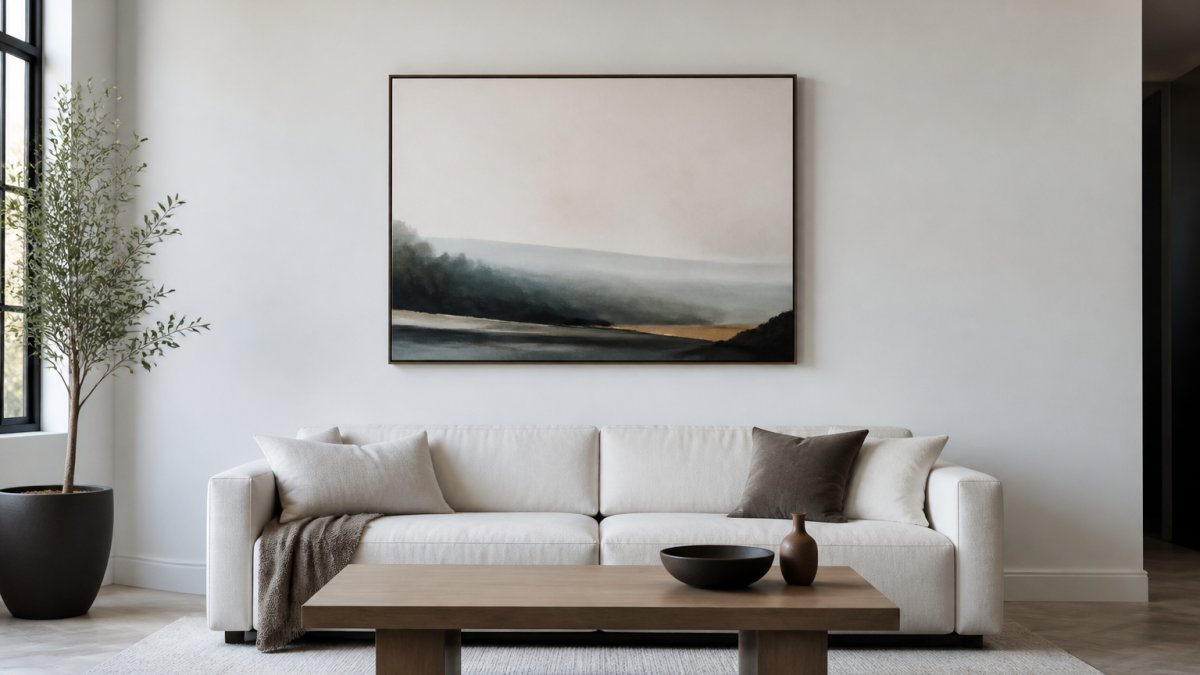
Standard eye-level positioning and variations
Eye level is roughly 57-60 inches from the floor to the center of the frame. This is the standard for galleries and museums because it's where people naturally look.
Creating visual balance without clutter
Visual balance in a minimalist space depends on how you distribute your pieces. A single piece creates instant balance. Multiple pieces require more thought.
Adding Texture and Warmth Without Sacrificing Simplicity
Texture prevents minimalist spaces from feeling cold or sterile. It adds dimension and warmth without adding visual clutter.
Paper finishes: satin versus archival matte
The finish of your print affects how it looks and feels. Satin finishes have a gentle sheen that brings out color depth and makes the image feel luminous. Archival matte finishes have no reflection, creating a museum-like appearance that emphasizes brushwork and subtle tonal shifts.
Framing choices that enhance minimalist aesthetics
Framing is where many people add unnecessary complexity. In minimalist design, keep frames simple.
Curating Your Pieces: Quality Over Quantity
A minimalist collection is built slowly and intentionally. Each piece should be something you genuinely want to live with.
Investing in archival-quality prints
Quality matters more in minimalist spaces than in busy ones. When you have fewer pieces, each one gets more attention. Poor quality becomes obvious.
Building a cohesive collection over time
A cohesive collection doesn't mean everything matches. It means pieces relate to each other through color, style, or theme.
Frequently Asked Questions
How do I choose art for a minimalist home if I want color instead of black and white?
Minimalist art doesn't have to be monochromatic. Choose pieces with a limited, intentional color palette, think muted earth tones, soft whites, or a single accent color. Pieces like the Monkeys and Monolith poster use warm reds and cool indigos in a balanced composition that feels minimalist despite its color richness. The key is restraint: select colors that complement your space rather than compete for attention, and ensure the composition itself remains uncluttered with clean lines and plenty of breathing room.
What size art should I hang in a minimalist space?
Scale matters in minimalist design. A piece that's too small disappears; too large overwhelms. Consider the wall dimensions and the furniture below. The goal is proportion and balance, not filling every inch.
Can character-inspired art from classic tales work in a modern minimalist apartment?
Yes, if the composition and color palette align with minimalist principles. Character-driven art doesn't inherently clash with contemporary spaces, it depends on execution. Pieces with clean lines, intentional composition, and restrained color schemes integrate seamlessly. The Creator poster, for example, uses inked outlines and muted neon highlights on a textured background, creating a moody, art-school sensibility that feels modern and minimalist despite its figurative subject. Pair character art with simple frames and plenty of negative space to maintain the aesthetic.
How do I know if a print will actually look good on my wall before ordering?
Mind Eracing Studio offers both satin and archival matte finishes, satin provides a gentle sheen that enhances color depth, while archival matte delivers a museum-style, low-reflection finish. Consider the room's lighting. Pieces printed in the USA on heavyweight, archival-quality stock (like Mind Eracing Studio's 210-230 gsm options) maintain color accuracy and detail over time, reducing the risk of fading or discoloration that can occur with lower-quality prints.