
Table of Contents
- Why Art Matters in Your Home Office
- Best Wall Art for Home Office: Start With Your Work Style
- Office Art Color Psychology: How Colors Affect Your Mood and Focus
- Home Office Art Ideas: Size, Scale, and What Actually Works
- Where to Hang Art in a Home Office for Maximum Impact
- Nature, Landscape, and Abstract Art: Which Works Best
- Testing Your Choice Before Committing
- Frequently Asked Questions
Last Updated: October 6, 2026
Why Art Matters in Your Home Office
The right wall art shapes how you focus, think, and feel during your workday. But many home-office claims, a print that "boosts productivity by 15%", stretch general environmental-psychology findings past what the studies show. Here's a more honest framing.
What the evidence supports
- Mood and affect. Research on viewing natural scenes finds that nature imagery can reduce self-reported stress and improve mood in the short term, a real, repeatable lab effect.
- Attention restoration. The Kaplans' "attention restoration theory" proposes that natural scenes let directed attention recover. It's widely cited, though real-office effect sizes vary and are hard to isolate from lighting, noise, and task differences.
- Aesthetic preference and satisfaction. People report higher satisfaction with visually pleasing workspaces. That isn't output, but it influences how long you'll stay at the desk.
What the evidence does not establish
- A direct, measurable productivity gain. No credible study shows a specific poster adds a specific number of completed tasks or deep-work hours. Anyone quoting a precise percentage is overreaching.
- A universal "best" image. Responses to imagery are individual. A scene that calms one person can feel sterile to another.
- A one-time fix. Art is one input among many, monitor height, chair, lighting, noise, and task design usually matter more for output than what's on the wall.
The practical takeaway
Treat art as a mood and attention-support tool, not a productivity lever. The realistic benefits: a workspace you want to sit in, a visual anchor that rests your eyes from the screen, and a cue that shifts you between work modes.
At Mind Eracing Studio, we offer art enthusiasts and collectors character-driven pieces for their workspaces. The difference between art that works and art that distracts comes down to intentional choices about imagery, color, and placement, not magic productivity math.

This guide walks you through selecting home office art that matches your work style, supports your focus, and looks great on your wall.
Best Wall Art for Home Office: Start With Your Work Style
Your work determines what kind of art you need. A designer needs different visual stimulation than someone doing accounting. Ask yourself one question first: Does your work require deep focus, or does it benefit from creative energy? This answer shapes everything that follows.
Calming Imagery for Focus and Concentration
If your work demands sustained concentration, calming imagery, landscapes, nature scenes, soft abstracts, protects your focus and reduces visual stress. It works because it doesn't demand attention: a quiet landscape or botanical print sits in your peripheral vision without interrupting thought.
Look for:
- Landscape paintings and nature photography
- Soft color palettes (greens, blues, earth tones)
- Minimal visual complexity
- Scenes with depth and space
A contemplative landscape like Mind Eracing Studio's Minas Tereth poster brings a quiet, textured cliff scene with moody skies and vibrant green foreground. The satin finish brings out luminous color, or the archival matte offers a museum-like depth.
Energizing Art for Creative Tasks
If your work involves creative thinking, problem-solving, or brainstorming, energizing art fuels momentum. Bold colors, dynamic compositions, and character-driven pieces wake up your visual system and keep your mind ready to think sideways.
Look for:
- Abstract art with bold color combinations
- Character-inspired or narrative artwork
- Pieces with visual movement and energy
- Colorful prints that feel alive
The key difference: calming art lets your mind rest. Energizing art gives your mind something to play with.
Office Art Color Psychology: How Colors Affect Your Mood and Focus
Color shapes how you feel in your workspace. Different colors trigger different mental states. Understanding this gives you control over your environment.
Blue and green support calm and focus.
Warm colors like orange, red, and yellow energize and motivate, slightly raising heart rate and mental activation, use them for creativity and problem-solving.
Purple bridges calm and creativity, contemplative yet imaginative, and suits spaces needing both focus and original thinking.
The trick is matching color to your actual work.
Home Office Art Ideas: Size, Scale, and What Actually Works
Size matters more than most people think: too small and art disappears, too large and it overwhelms. The right scale makes art feel intentional.
Matching Art Size to Your Space
Use this simple rule: art should fill 50-75% of the wall space it occupies. Not the entire wall. Just the visual area above a desk, shelf, or furniture piece.
For a wall above a desk:
- Small desk (3-4 feet wide): 18-24 inch poster
- Medium desk (4-5 feet wide): 24-30 inch poster
- Large desk (5+ feet wide): 30-36 inch poster or multiple pieces
For a wall with furniture:
- Small shelf or table: 16-20 inch poster
- Medium shelf or table: 20-24 inch poster
- Large wall space: 24-36 inch poster
Mind Eracing Studio offers 18 sizes across horizontal, vertical, and square formats, letting you match your exact space without compromise. Test by holding up a piece of paper cut to size and standing at your desk, does it feel right?
Avoiding Visual Clutter and Distraction
One strong piece beats five mediocre ones. A single well-chosen poster creates focus; multiple pieces create visual noise. If you want multiple pieces, use a gallery wall arranged in a grid or deliberate pattern, since random placement reads as clutter.
Keep these rules:
- Maximum 3 pieces in one area unless you're doing a formal gallery wall
- Leave breathing room between pieces (at least 2-3 inches)
- Align pieces by edge, not by center, for a clean look
- Stick to one color palette across all pieces
Too much visual complexity pulls attention from work. Your art should support focus, not compete for it.
Where to Hang Art in a Home Office for Maximum Impact
Placement determines whether art supports your work or distracts from it. The wrong location wastes good art, and can create glare on your monitor or eye strain that undermines the very focus you're trying to protect.
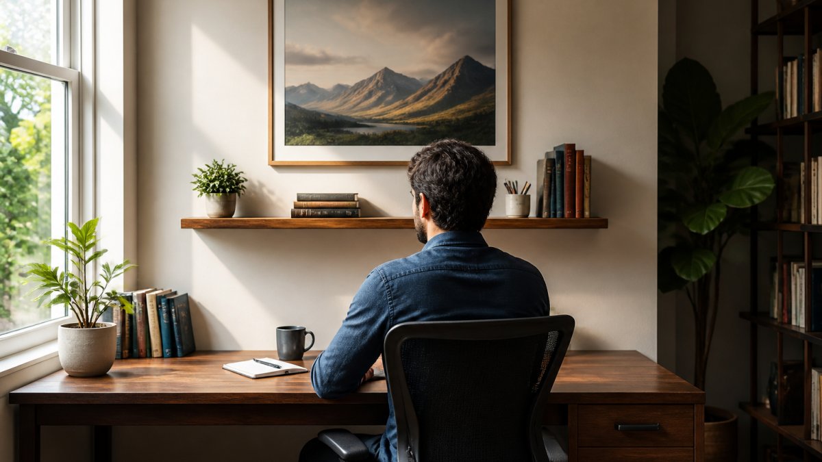
Start with your seated sightline
Hang art at seated eye level. When you're sitting at your desk, the center of the art should be at your eye height, a common rule of thumb is 57-60 inches from the floor to the center of the piece.
Avoid placing art directly behind your monitor. Your gaze drifts to it instead of your screen. Place art to the side or above your desk instead.
Position art where you naturally look during thinking breaks. If you look up and to the left when thinking, hang art there. Match placement to your actual gaze patterns.
The glare and screen-ergonomics check
This is the part most guides skip, and it's what actually affects how your eyes feel at 4 p.m.
- Watch for reflections in your monitor. A glossy or satin-finish print placed opposite a window or under a bright overhead fixture can bounce light straight into your screen, forcing your eyes to work harder. Matte and archival matte finishes scatter light instead of reflecting it, which is why they're usually the safer choice in a room with strong daylight.
- Don't hang art in the window-to-screen line of sight. If your monitor faces a window, anything on the wall between you and that window is a potential glare source. Move the piece to a side wall or the wall behind you.
- Mind overhead fixtures. Recessed lights and track heads aimed at a wall create hot spots on framed art that pull your peripheral vision. Angle fixtures away from the art, or use a dimmable lamp instead.
- Consider the 20-20-20 habit. Eye-care guidance recommends looking at something roughly 20 feet away for about 20 seconds every 20 minutes (the CDC). A piece of art on a far wall gives your eyes a legitimate distant target, a small, free ergonomic benefit.
Video-call backgrounds
If you take video calls from your desk, position art where it appears on camera to frame you professionally. Two practical notes:
- Avoid high-contrast or busy patterns behind you. They can cause webcam compression artifacts and make you harder to see.
- Check the camera preview, not the wall. Sit where you actually sit, open your camera app, and look at the frame. That's the only view that matters.
A quick placement test
Before you commit to a spot, sit in your chair at your normal working posture and do three things: (1) look straight ahead, is the art in your natural field of view without turning your head? (2) tilt your monitor slightly and check for any reflection of the art in the screen; (3) glance at the art the way you would during a thinking pause.
Nature, Landscape, and Abstract Art: Which Works Best
Different art types support different work. Understanding these categories helps you choose.
Nature and landscape art creates calm and focus, working best for concentration-heavy tasks.
Abstract art supports creative thinking.
Character-driven art brings personality and narrative.
The best choice depends on your work and personality.
Mind Eracing Studio specializes in character-inspired designs drawn from classic tales and fables. These pieces bring storytelling to your wall.
Testing Your Choice Before Committing
Check color accuracy. Online images don't always match printed colors.
Live with it for two weeks. Your first impression isn't your final verdict.
Trust the return policy. If the piece doesn't work, you need an easy return. Check terms before ordering.
Choosing art for a home office productivity is about matching visual support to your work. Start with your task.
The right piece doesn't just decorate your wall. With high-quality satin and archival matte print options available in 18 sizes, you can find the perfect fit for your home office. Add a piece that matches your work style and watch how your environment supports your productivity.
Frequently Asked Questions
What kind of art is best for a home office?
The best art depends on your work type. If you do focused, detail-oriented work, choose calming imagery like nature scenes and landscapes to reduce mental strain. For creative tasks, energizing abstract art or bold color palettes can spark inspiration. Avoid busy gallery walls or pieces with heavy visual complexity in your direct sightline, these create distraction rather than support focus. Character-driven art from classic tales works well if it resonates personally without pulling your attention away from your tasks.
Can wall art improve productivity in a home office?
Yes, the right art supports productivity by reducing stress and improving focus. Strategic artwork placement, particularly in your peripheral vision or on a wall you see during breaks, can lower mental fatigue. Art that matches your personal interests and workspace mood creates a sense of ownership and comfort. However, art placed directly in your work sightline or cluttered gallery arrangements can backfire and distract. The key is intentional selection and placement, not decoration for its own sake.
What colors are best for a productive home office?
Cool colors like blues and greens promote calm and focus, making them ideal for high-concentration work. Warm neutrals such as soft browns and muted earth tones create a grounded, steady environment. If you need creative energy, muted warm tones or soft greens with accent colors can inspire without overwhelming. Avoid high-saturation bright colors directly in your work sightline, they increase visual stimulation and mental load. Consider your personal response to color and test artwork in your space before committing, since individual color psychology varies by preference and work style.
Should I choose calming or inspiring art for my home office?
Choose based on your primary task. Calming art, nature landscapes, botanical prints, muted abstract pieces, supports focus and reduces stress during detail-heavy or repetitive work. Inspiring art, bold abstracts, motivational imagery, character-driven pieces, energizes creative thinking and problem-solving. Many home offices benefit from a mix: calming art in your main work sightline and more energizing pieces on adjacent walls or in break-time views. Your personal style and interests matter most, art you genuinely connect with will support your mood better than generic advice.