
Table of Contents
- Framed vs Unframed Art: Quick Comparison Table
- Aesthetic Differences: Gallery Wall vs Minimalist Look
- How to Style Literary Character Wall Art in Any Room
- Archival Matte vs Satin Print Quality: What Changes Under Glass
- Protecting Art Prints From UV Damage and Glare
- DIY Framing vs Professional Framing Costs
- Weight, Wall Damage, and Mounting Hardware
- Conclusion
- Frequently Asked Questions
Last Updated: September 11, 2026
Framed vs Unframed Art: Quick Comparison Table
Choosing between framed and unframed literary character art comes down to three factors: protection, presentation, and price. Framed prints offer archival protection and a polished finish; unframed posters keep costs low and styling flexible. This guide from Mind Eracing Studio breaks down where each option wins.
Short answer: if the artwork matters long-term, frame it. If you want flexibility and a budget-friendly entry point, leave it unframed.
| Factor | Framed | Unframed |
|---|---|---|
| Cost | Higher upfront | Lower upfront |
| Protection | Full glazing barrier | Exposed surface |
| Perceived value | High-end presentation | Casual, modern |
| Flexibility | Fixed look | Reusable, swappable |
| Weight | Heavier, needs anchors | Light, easy to hang |
| Best for | Gallery walls, focal points | Rotating displays, renters |
For collectors building a permanent display, the framed vs unframed literary character art decision usually lands on framing. For renters or anyone still experimenting, unframed prints from Mind Eracing Studio start at $16.27 and can be framed later.
Aesthetic Differences: Gallery Wall vs Minimalist Look
Framing changes how a print reads in a room before anything else. A framed piece carries a border, shadow line, and finished edge, pushing it toward gallery-style presentation. An unframed print sits flush against the wall and reads as looser, more contemporary, and more casual.
The gallery wall approach works when mixing several character prints: consistent frames create cohesion across mismatched sizes. The minimalist approach leans on unframed or thin-framed pieces with generous wall space, letting a single whimsical print carry the wall.
How Framing Changes Perceived Value
Framing raises perceived value immediately: a matted, glazed print signals intentionality, the way a museum presents a work. Unframed prints can look unfinished to some buyers, even when the artwork is strong. That gap matters most in rooms guests see: living rooms, entryways, and dining spaces where a focal point does real work.
How to Style Literary Character Wall Art in Any Room
Character art is not interchangeable with landscape or abstract prints. A character portrait has a face, a gaze, and a mood, and those dictate where it hangs, what frame it wears, and how large it should be. Here is how to style character-driven prints so the character does the work.
Match the frame to the character's mood
The frame is the character's stage. A few pairings that hold up in real rooms:
- Villains and antiheroes (Joker, Medusa, Dracula): a slim black or dark wood frame with a wide mat reads as theatrical and lets the character's menace sit forward. Skip ornate gold, it fights the mood.
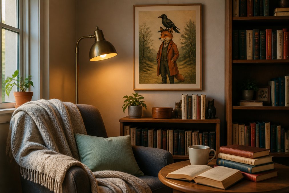
- Whimsical animals and fable characters: a natural oak or white frame keeps the tone light and lets the illustration breathe. Unframed works especially well here because the loose edge matches the loose linework.
- Tragic or gothic literary figures (Ophelia, Heathcliff, Frankenstein's creature): a deep mat in off-white or charcoal creates the museum-distance a heavy character needs. The mat is doing the emotional work, not the frame.
- Heroic or adventurous characters: a thin brass or matte black frame with a narrow mat keeps the energy forward and modern.
Use gaze direction to place the piece
Where a character looks should influence where you hang them. A character gazing left or right reads as looking into the room when placed on the opposite wall, pulling the viewer's eye across the space. A direct portrait looking straight out is confrontational and works best as a focal point, above a fireplace, at the end of a hallway, or centered over a sofa. A character looking down or away reads as introspective and suits a reading nook or study where the mood should be quiet.
Scale the character to the wall, not the wall to the character
A common mistake is hanging a single 12x18 character print on a large blank wall and wondering why it feels lost. The rule most interior stylists use: artwork should occupy roughly 60 to 75 percent of the width of the furniture beneath it (nga.gov). Over a 60-inch sofa, that means a framed piece or grouped set spanning about 36 to 45 inches. A single small print works on a large wall only if intentionally isolated with generous negative space, otherwise it reads as an afterthought.
Group by theme, not by size
When mixing multiple character prints, group by narrative world rather than matching dimensions. A trio of fable animals in matching frames reads as a collection. A Joker next to a Medusa next to a whimsical snail reads as clutter unless frames unify them. If characters come from different stories, let frame style and mat width be the common thread.

Room-by-room placements that actually work
- Above a bookshelf: pairs the artwork with the source material and reinforces the literary theme. Hang the bottom of the frame 6 to 8 inches above the top of the tallest book.
- In a nursery or kids' room: whimsical animal and fable prints soften the space without feeling juvenile. Keep the center at 50 to 54 inches from the floor so a child can see it at eye level.
- In a study or home office: darker character pieces add mood and personality to a room that is otherwise functional. Place behind the desk, not behind the chair, so the character faces the viewer.
- In a hallway: a vertical run of unframed prints keeps a narrow space from feeling heavy. Space them 2 to 3 inches apart for a tight gallery rhythm.
A common mistake is hanging character art too high. Center the piece at eye level, roughly 57 to 60 inches from the floor, so it connects to the furniture beneath it (nga.gov).
Archival Matte vs Satin Print Quality: What Changes Under Glass
Archival matte and satin finishes behave differently behind glass, and the choice changes how a print looks more than most buyers expect.
Archival matte is a paper finish with a non-reflective surface that produces soft, painterly tones and deep texture. It reads closer to a museum print.
Satin is a paper finish with a low-sheen surface that boosts color saturation and contrast while keeping glare manageable. It reads closer to a premium poster.
Under glass, matte finishes hold texture and resist reflection, ideal for rooms with strong window light. Satin finishes look richer in low light but can flatten behind standard glass because the sheen has nowhere to go.
For character art with heavy detail, like the Whimsical snail Art Poster, archival matte tends to preserve the illustration's softness. For bold, high-contrast pieces, satin pulls the colors forward.
Protecting Art Prints From UV Damage and Glare
UV exposure is the slowest and most common way prints fade (si.edu). Direct sunlight breaks down pigment over months and years, and the damage is irreversible.
The practical protections, in order of impact:
- UV-filtering glazing: the single most effective step; blocks most of the UV spectrum
- Indirect placement: keep prints off walls that take direct afternoon sun
- Matte finish: reduces visible glare even when UV protection is limited
- Acid-free backing: prevents yellowing from the mount itself
For unframed prints, protection is limited to placement and rotation. If a print is unframed and in a bright room, expect some color shift over time. Framing with UV glazing is the only real fix.
DIY Framing vs Professional Framing Costs
DIY framing wins on cost; professional framing wins on fit, finish, and protection. The gap is smaller than the price difference suggests, but depends on print size and paper finish.
What DIY framing actually costs
DIY framing means buying a standard-size frame, mounting the print yourself, and accepting its dimensions. For a print matching a common size, the math is simple:
| Print Size | Typical DIY Frame Cost | Typical DIY Frame + UV Glass |
|---|---|---|
| 8x10 | $8-$15 | $15-$25 |
| 11x14 | $12-$22 | $22-$35 |
| 12x18 | $15-$28 | $28-$45 |
| 18x24 | $25-$45 | $45-$75 |
| 24x36 | $40-$70 | $70-$120 |
These are big-box and online frame prices. They work when your print matches a common size and you do not need custom matting. The trade-off: standard frames rarely fit artwork perfectly, a 12x18 print in a 12x18 frame leaves no breathing room, and a 12x18 print in a 16x20 frame needs a custom mat you cut yourself.
What professional framing actually costs
Professional framing means custom-cut matting, archival mounting, and glazing matched to the artwork. For the same sizes:
| Print Size | Typical Professional Framing Cost |
|---|---|
| 8x10 | $60-$110 |
| 11x14 | $90-$160 |
| 12x18 | $120-$200 |
| 18x24 | $180-$300 |
| 24x36 | $280-$450 |
Prices vary by region and frame material, but the pattern is consistent: professional framing typically costs 4 to 8 times a DIY frame at the same size.
The math that actually matters
For a $16.27 print, professional framing at $120+ is several times the artwork itself. That math only makes sense in three situations:
- The print is part of a long-term display you plan to keep for years, not rotate seasonally.
- The print is a meaningful gift where the presentation is part of the value.
- The print is large enough that a DIY frame looks cheap, typically 18x24 and up, where the frame's proportions become visible.
For smaller prints (8x10 through 12x18), DIY framing with UV glass is usually the smarter call. You get most of the protection at a fraction of the cost, and if you later decide to upgrade, the print is still intact.
The hidden cost of bad DIY framing
Poor mounting can wrinkle a print over time, and cheap frames with non-archival backing can yellow paper. If you go DIY, two upgrades are worth it:
- Acid-free backing board instead of the cardboard that ships with budget frames
- UV-filtering glass or acrylic rather than standard glazing, especially in bright rooms
A DIY frame with those two upgrades still costs far less than professional framing and protects the print nearly as well for a decade or more.
When to skip framing entirely
If the print hangs unframed in a low-light room, you may not need a frame at all. Unframed prints on archival matte paper hold up well out of direct sun, and the savings can go toward a second print. The framed vs unframed decision is not permanent, start unframed, live with the piece, and frame it later if the wall calls for it.
Weight, Wall Damage, and Mounting Hardware
Framed art is heavier than unframed art, and that weight changes what you can safely hang it on. A framed print with glass can weigh several pounds even at moderate sizes, and larger pieces climb quickly.
The practical consequences:
- Drywall anchors: required for anything beyond a light unframed print
- Stud mounting: the safest option for large or heavy frames
- Adhesive strips: fine for unframed lightweight prints, risky for glass
- Rental walls: unframed prints minimize patching and deposit risk
Unframed prints win for anyone worried about wall damage. They are light enough for removable adhesive hooks: no holes, no anchors, no repair when you move.
Mounting hardware quality matters more than most people expect. Cheap hooks fail under load, and a falling frame damages both wall and artwork. Match the hardware rating to actual weight, not frame size.
Conclusion
The framed vs unframed literary character art decision comes down to how long the piece will live on your wall. Unframed prints keep costs low, stay flexible, and suit renters or anyone still building a collection. Framed prints deliver protection, perceived value, and a gallery-style finish unframed work cannot match.
At Mind Eracing Studio, every character print ships on your choice of satin or archival matte paper, in 18 sizes and three orientations, so you can start unframed and frame later without losing the look. Pieces like the Joker Portrait Poster and the Medusa Horror Art Poster are built to hold their color whether they hang bare or behind glass. Get started with Mind Eracing Studio and build a wall that tells a story.


Frequently Asked Questions
What are the key differences between framed and unframed art?
Framed art arrives ready to hang with a border, glass, and backing that protect the print from dust and handling. Unframed prints ship as the paper alone, so you choose the frame, mat, and glazing yourself. Framing typically raises the total cost and visual weight, while unframed keeps the price low and lets you match a frame to your existing decor later.
Do literary prints look better with or without a mat?
A mat adds breathing room between the artwork and the frame, which suits detailed character portraits and fable scenes with fine linework. Without a mat, the print fills the frame edge to edge and reads as a bolder, more contemporary statement. If your print has a busy border or you want a modern minimalist look, skip the mat. For a gallery-style presentation, a 2 to 3 inch mat usually works best.
How does framing affect the longevity of archival matte prints?
Framing under glass shields archival matte paper from dust, fingerprints, and airborne oils that degrade print longevity over time. UV-filtering glazing blocks most of the ultraviolet light that fades pigments, which matters most in rooms with direct sun. An unframed print left on an open wall will show color shift faster, so framing is the stronger choice when you want the piece to last decades.
Is unframed character art a budget-friendly option for wall decor?
Yes. A satin or archival matte poster from Mind Eracing Studio starts at $16.27, and you can hang it with clips, a magnetic hanger, or an inexpensive ready-made frame. That keeps the total under what custom framing usually costs. The trade-off is less protection from dust and light, so unframed works best in low-traffic rooms or when you plan to rotate prints seasonally.
Will a framed print damage my wall more than an unframed one?
Framed pieces weigh more because of the frame, glass, and backing, so they need anchors rated for the load, especially on drywall. A 16x20 inch framed print can weigh several pounds, while an unframed poster weighs ounces. Use a stud finder or toggle anchors for anything over a few pounds, and add felt pads to the frame's bottom corners to prevent scuff marks.