
Table of Contents
- Abstract Art Trends for 2026
- Modern Wall Art Trends 2026
- How to Style Art Prints in Your Living Room
- Archival Matte vs. Satin Prints for Home Decor
- Botanical and Nature-Inspired Prints
- Character-Driven Art for Contemporary Spaces
- Psychology of Color in Living Room Art
- Conclusion
Last Updated: August 19, 2026
Abstract Art Trends for 2026
Abstract art dominates contemporary living spaces because it works with any aesthetic without demanding visual hierarchy. Bold brushstrokes, layered textures, and unexpected color combinations create visual interest without forcing a specific narrative onto your walls.
What makes abstract art particularly relevant for modern living rooms in 2026 is how it bridges minimalism and artistic expression. You get the clean, uncluttered feeling of contemporary design while avoiding the cold, sterile look that sparse rooms can develop. Abstract pieces introduce movement and energy without the visual noise of representational imagery.
Mind Eracing Studio's collection demonstrates this principle well. Pieces like Scientist bring bold, painterly energy with saturated color and gritty texture that reads like a contemporary street canvas. The layered strokes and high-contrast palette create a dramatic focal point that works equally well in gallery walls or as a standalone statement piece.

2026 favors pieces with visible brushwork, intentional imperfection, and raw emotional expression. This shift reflects a broader move away from sterile perfection toward art that feels genuinely human and handcrafted.
Modern Wall Art Trends 2026
Modern wall art in 2026 emphasizes curated collections over single statement pieces. Contemporary design favors intentional groupings that reflect personal taste and spatial harmony. This shift toward gallery-style arrangements makes it easier to build a cohesive aesthetic without committing to a single dominant artwork.
The trend also reflects growing interest in character-driven and narrative-based art. Unlike purely geometric abstraction, 2026 sees a resurgence of pieces that tell stories or evoke specific moods. This means abstract work with personality, intention, and emotional depth.
Minimalist and Neutral Color Palettes
Minimalist color palettes remain foundational to modern living rooms, but 2026 shows a clear evolution toward warm neutrals rather than cool grays. Cream, warm white, soft beige, and muted taupe create a foundation that feels both sophisticated and livable. Texture, matte surfaces, subtle pattern, and layered finishes prevent neutral spaces from feeling flat.
When you strip away visual noise, every element gains importance. A single piece with muted elegance becomes the focal point. Neutral spaces reduce cognitive load and create a calm environment for rest and reflection.
For art placement within neutral rooms, introduce sophisticated pieces with limited palettes. A print with deep grays and soft whites, or warm ochres against cream, reads as intentional curation rather than decoration. This approach works particularly well in smaller living spaces where overwhelming color would feel cramped.
Oversized Statement Canvas Prints
Oversized canvas prints have become the standard for modern living rooms, but sizing strategy matters more than sheer scale. Your art should occupy roughly 50-75% of the wall space above your primary furniture piece.
Canvas prints offer advantages over framed posters. They eliminate the visual interruption of frames and glass, creating a seamless wall experience. The texture of canvas adds depth; light hits the surface differently than flat paper, creating subtle shadows that enhance brushwork and composition.
Mind Eracing Studio offers prints in 18 different sizes across horizontal, vertical, and square orientations, addressing the real problem most people face: finding art that actually fits their space. Rather than forcing a standard 24x36 into a wall that needs 30x40, you can match the exact proportions your room requires.

The satin finish on prints adds luminosity; colors appear richer and more dynamic. The archival matte option provides a museum-quality appearance that emphasizes texture over shine. For oversized pieces, the finish choice matters more than smaller prints because the scale amplifies the visual effect.
How to Style Art Prints in Your Living Room
Styling art prints successfully requires understanding spatial relationships, color balance, and the psychological weight of different compositions. This creates intentional visual harmony that supports how you actually live in the space.
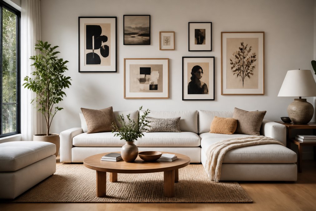
Identify your room's visual anchor, typically a sofa, fireplace, or window. Your primary art piece should relate to this anchor, either reinforcing it or creating intentional contrast. If your sofa is neutral, art can introduce color or drama. If your sofa is a statement piece, art should complement rather than compete.
Gallery Wall Layout and Arrangement Tips
Gallery walls work because they create spatial harmony through repetition and balance. Treat each piece as part of a unified composition, not independently. Your gallery wall should feel like a curated collection.
Start by laying out your pieces on the floor in your intended arrangement. This prevents frustration from hanging and rehanging. For mixed-size gallery walls, use weighted balance: distribute visual weight evenly rather than clustering heavy pieces on one side.
Consistent 2-3 inch gaps between frames create rhythm. Uniform spacing reads as more sophisticated than varying gaps. Match frame styles for a cohesive, curated feel, or intentionally vary them (all natural wood, all black, or all metallic finishes).
The center of your gallery wall should sit at eye level (approximately 57-60 inches from the floor). This creates a natural focal point that draws the viewer's gaze.
Balancing Art with Existing Furniture
Your art should complement your furniture's visual weight and style. A heavy, dark sofa demands art with presence; oversized pieces or bold color work well. A lightweight, minimalist sofa pairs better with subtle, refined artwork.
Consider your furniture's texture when selecting art. If your sofa is smooth leather, textured art (canvas, mixed-media, visible brushwork) creates visual interest. If your furniture is heavily textured, simpler art prevents sensory overload.
The color relationship between furniture and art determines whether they harmonize or create tension. Harmonizing works when art echoes the furniture's color palette. Creating tension works when intentional; a cool-toned art piece against warm furniture creates visual energy.
Art Placement for Small vs. Large Living Spaces
Small living rooms benefit from oversized art, which creates visual expansion. A single 36x48-inch print draws the eye outward, making the room feel larger. Multiple smaller pieces fragment the space visually.
Choose one or two significant pieces rather than a gallery wall in tight spaces. If you want multiple pieces, group them tightly (1-2 inches apart) so they read as a single composition.
Large living rooms benefit from gallery walls and multiple focal points. You can distribute art across walls without creating visual fragmentation. Consider creating two distinct gallery areas to establish multiple points of interest.
Archival Matte vs. Satin Prints for Home Decor
The choice between archival matte and satin finishes affects how your art appears in different lighting and contributes to your room's overall aesthetic. Both options use the same high-fidelity printing techniques and archival-grade materials; it's purely about visual preference and lighting conditions.
Archival matte prints have a velvety, non-reflective surface that emphasizes brushwork and texture. Light doesn't bounce off the surface, so you see the full tonal range without glare. This finish works particularly well in brightly lit rooms or spaces with windows that create direct light on walls. Matte finishes also feel more museum-like and fine-art.
Satin prints have a subtle sheen that enhances color saturation and creates luminosity. Colors appear richer and more vibrant because light interacts with the surface. This finish works beautifully in rooms with softer, indirect lighting.
In a room with significant natural light, matte prevents glare and maintains color accuracy. In a room with primarily artificial lighting, satin brings warmth and richness. The paper weight (210 gsm for satin, 230 gsm for matte) also affects durability and how the piece hangs; matte's heavier stock provides a more substantial gallery feel.
Mind Eracing Studio prints like The Emperor and Tarnaa come in both finishes, allowing you to test which works with your specific space.

Botanical and Nature-Inspired Prints
Botanical and nature-inspired art continues gaining relevance in 2026 because it introduces organic elements to interior spaces while maintaining the minimalist aesthetic that modern design favors. Unlike busy floral patterns, contemporary botanical art emphasizes clean composition and selective color.
This trend reflects broader interest in biophilic design, the principle that humans benefit from connection to natural elements. A carefully chosen botanical or landscape print provides that connection without requiring actual plants or complex maintenance.
Modern botanical prints differ from traditional botanical illustration. Rather than detailed scientific accuracy, contemporary pieces emphasize mood and abstraction. A print might suggest a landscape through color and form rather than depicting it literally. This aligns with current design preferences for muted elegance and artistic expression.
Pieces like Skekok, with its electric color and kinetic energy suggesting natural forms, represent this evolution. The print brings nature's vitality into the space without literal representation.
Character-Driven Art for Contemporary Spaces
Character-driven art, pieces that tell stories or evoke specific emotional responses, has emerged as a counterpoint to pure abstraction. This means abstract or semi-abstract work that carries personality, intention, and narrative weight.
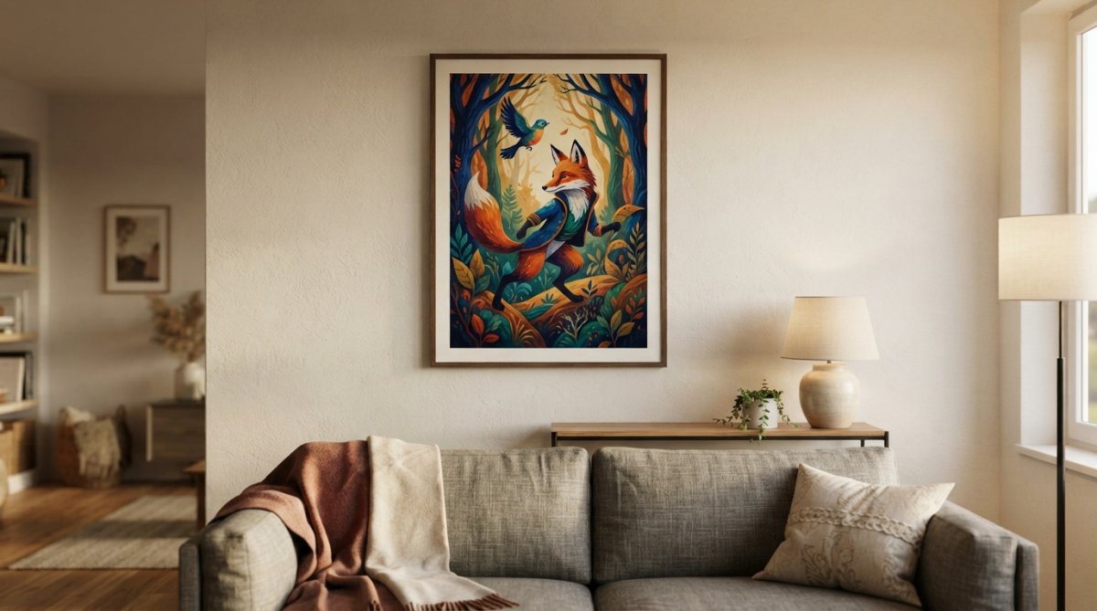
Character-driven pieces spark conversation and reflection. Unlike purely decorative art, they invite interpretation and personal connection. A piece with rich jewel tones and layered textures creates a mood that resonates emotionally, making the space feel more intentional and personal.
This approach balances minimalism's restraint with artistic expression's depth. You maintain the clean aesthetic of modern design while introducing work that feels genuinely human and handcrafted.
Mind Eracing Studio specializes in character-driven art from classic tales and fables. Pieces like The Emperor with its bold, handcrafted energy and mysterious symbolism, or Skekgra with its enigmatic figure and layered texture, demonstrate how narrative-based art enhances modern interiors. Select pieces that resonate personally rather than simply matching your color scheme.
Psychology of Color in Living Room Art
Color psychology significantly influences how a room feels and how you experience time in that space. Warm colors (reds, oranges, warm yellows) energize and stimulate social interaction. Cool colors (blues, greens, cool purples) promote calm and focus. Neutral tones provide visual rest.
For living rooms, the color choice depends on how you use the space. A living room primarily for entertaining benefits from warmer, more energetic tones. A living room serving as a retreat benefits from cooler, calming palettes. Art provides the solution for dual-purpose spaces: introduce energizing color through art while keeping walls neutral.
The saturation level of color also matters. Highly saturated colors create visual excitement and demand attention. Desaturated colors feel sophisticated. Muted elegance, the dominant trend for 2026, favors desaturated color with intentional accent pieces.
Contrast between your art and walls affects how the art reads. High contrast makes art a strong focal point. Low contrast integrates more subtly. Neither approach is better; it depends on whether you want the art to command attention or complement the space.
Personal experience matters enormously in color psychology. A color that energizes one person might feel chaotic to another. Select art based on your genuine emotional response rather than design rules.
Test your art in your actual space at different times of day before committing to hanging. North-facing walls appear cooler; south-facing walls appear warmer. Art with warm tones looks richer in cool light and might feel overwhelming in warm light.
Choosing art prints for your modern living room comes down to understanding your space, your personal response to color and composition, and trusting your instincts over design rules. The trend toward character-driven, intentionally curated art reflects a broader shift away from generic decoration toward spaces that genuinely reflect who you are.
Mind Eracing Studio's approach, offering museum-quality prints in both satin and archival matte finishes, with 18 size options and character-inspired designs, addresses the real challenge most people face: finding art that actually works in their specific space. Whether you're building a gallery wall, selecting a single statement piece, or introducing botanical elements, choose art that creates the emotional and visual experience you want from your living room. Start with Scientist or Tatooine if you want bold, energetic pieces, or explore more contemplative options like Garthum if you're seeking quieter, moodier work. The right art transforms a room from a space you occupy to a space you genuinely love.
| Finish Type | Best For | Lighting Condition | Visual Effect | Durability |
|---|---|---|---|---|
| Archival Matte | Museum-quality aesthetic, texture emphasis | Bright natural light, direct sun | Non-reflective, true color, velvety feel | 230 gsm heavyweight stock |
| Satin | Color vibrancy, luminous appearance | Soft indirect lighting, artificial light | Subtle sheen, enhanced saturation, depth | 210 gsm heavyweight stock |
Frequently Asked Questions
How do I know if art prints will look as good on my wall as they do in photos?
Quality matters. Art prints produced on heavyweight archival matte (230 gsm) or satin (210 gsm) paper with high-fidelity color reproduction retain their vibrancy in person. Satin finishes deepen colors with a subtle sheen, while archival matte emphasizes texture and brushwork with a museum-quality, low-glare appearance. Before committing, check the print's production standards, USA-made prints with vivid inks and careful assembly ensure colors stay true. Request product images showing the print in actual room settings if available.
Can character-inspired art from classic tales fit into a modern living room?
Absolutely. Character-driven art works in contemporary spaces when the color palette and composition align with your existing decor. Bold, abstract character prints with rich jewel tones or vibrant, electric colors complement modern minimalist interiors, while softer, impressionistic character art suits neutral, layered spaces. The key is choosing pieces with contemporary artistic expression, painterly brushstrokes, high-contrast compositions, and curated color palettes, rather than purely nostalgic imagery. This transforms character art into a statement piece that feels current and intentional.
What's the difference between archival matte and satin prints for home decor?
Archival matte (230 gsm) offers a soft, museum-quality finish that resists glare and emphasizes texture and brushwork, ideal for detailed artwork and rooms with bright natural light. Satin (210 gsm) provides a subtle sheen that deepens colors and adds luminosity, making it better for darker tones and moody compositions. Matte suits minimalist, contemporary spaces, while satin enhances richly hued, dramatic pieces. Both are durable and archival-quality; choose based on the artwork's color intensity and your room's lighting.
How do I choose the right size art print for my living room wall?
Measure your wall space and furniture scale. For a sofa, a single print should occupy 50-75% of the wall width above it. In small living rooms (under 200 sq ft), choose prints 18-24 inches wide; larger rooms (300+ sq ft) can accommodate 30-48 inch prints or gallery walls. Consider the room's visual balance, oversized statement pieces anchor open walls, while smaller prints (12-18 inches) work in tight spaces or as part of a curated gallery arrangement. Available in 18 sizes across horizontal, vertical, and square formats, you can find the perfect fit for your layout.
Why should I invest in curated art prints instead of mass-produced alternatives?
Curated art prints offer distinctive character, superior production quality, and intentional design that mass-produced options lack. Prints produced on heavyweight paper (210-230 gsm) with vivid, high-fidelity color reproduction maintain color vibrancy and texture detail over time. Curated collections emphasize artistic expression, bold compositions, layered brushstrokes, and thoughtful color palettes, rather than generic trends. Character-inspired designs from classic tales add narrative depth and whimsy to your space, making each piece a conversation starter and a reflection of your aesthetic values.
[EXTERNAL_LINK: Research on biophilic design and interior spaces | apa.org]
[EXTERNAL_LINK: Color psychology in interior design applications | colorpsychology.org]
[EXTERNAL_LINK: Gallery wall composition and spatial harmony principles | interiordesign.net]
This article was written using GrandRanker