
Table of Contents
- What Makes Art Prints for Literary Fans Different
- Top Art Print Collections for Book Lovers
- Canvas vs. Paper Prints: Which Format Works Best
- How to Frame Art Prints for Your Reading Nook
- Styling Bookish Wall Decor in Your Home
- Best Places to Buy Book Art and Literary Gifts
- Material Quality and Archival Standards Matter
- Addressing Common Concerns About Online Art Purchases
Art Prints for Literary Fans: 7 Best Collections for Book Lovers
Last Updated: August 4, 2026
When book lovers decorate their homes, they're creating spaces that reflect their deepest passions. Art prints for literary fans have become a thriving category because readers want their walls to speak their language. At Mind Eracing Studio, we understand that character-inspired designs drawn from classic tales resonate differently than generic wall decor. These pieces capture imagination and add genuine whimsy to your space.
Below, we'll show you how to evaluate art prints for literary fans, explore collections worth buying, and address concerns that stop most readers from making their purchase.
What Makes Art Prints for Literary Fans Different
Traditional wall art focuses on landscapes, abstracts, or celebrity culture. Art prints for literary fans center storytelling itself as the visual subject, celebrating characters, quotes, and worlds that readers love. A vintage book page print doesn't just fill wall space; it invites guests to ask what story it represents.
Quality collections differ from forgettable ones through intentionality. Are designs original or copying existing book covers? Does the artist understand source material? Mind Eracing Studio's satin and archival matte print options reflect this commitment, materials signal these pieces are meant to last.
Top Art Print Collections for Book Lovers
Spineless Classics prints entire novel text onto a single page, creating fully readable literary posters. The challenge is that reading requires standing directly in front of it; visual impact diminishes with distance. Spineless Classics offers various sizes, with some posters starting at $21.00.
Out of Print's Puffin in Bloom collection features vibrant floral artwork from classics like Little Women and Anne of Green Gables, designed by Anna Bond of Rifle Paper Co. These designs support literacy programs, though they're merchandise-focused rather than curated standalone prints.
The Literary Gift Company offers literary maps and classic book cover designs with A5 prints starting around £8.99. Their literary maps appeal to readers wanting geography with narrative, though the website operates in GBP, requiring currency conversion for US customers.
CafePress provides enormous selection with customizable options, but quality and artistic style vary dramatically. It functions as a marketplace rather than curated collection.
Mind Eracing Studio differentiates through deliberate curation. Rather than offering thousands of options, the collection focuses on character-inspired art bringing classic tales to life. Satin and archival matte print options ensure your investment holds color and integrity for years, prioritizing quality over quantity.
Character-Inspired Designs from Classic Tales
Characters are the heart of every story readers love. When you display character-inspired art, you're honoring figures who shaped your imagination. Mind Eracing Studio's character-driven approach means each piece centers on personalities that made source material unforgettable, capturing who these characters are rather than offering abstract literary imagery.
Character art works best when design respects source material while adding artistic interpretation. A well-executed character print should make you smile when passing it, spark conversations with guests who recognize the reference, and feel like it belongs in your space. Archival quality matters here, if you're investing in art celebrating characters you love, you want it surviving decades of display without fading.
Literary Quotes and Typography Art
Typography art transforms words themselves into visual design. A beautifully rendered literary quote becomes more than text; it becomes a statement about what you value. The challenge is execution, poor kerning, weak fonts, or cluttered layouts turn meaningful quotes into visual noise.
Minimalist literary design represents the intersection of typography and restraint. Rather than ornate flourishes, minimalist designs use clean lines, generous whitespace, and carefully selected fonts. A single quote from The Great Gatsby rendered in elegant sans-serif on cream background can anchor an entire room's aesthetic, working particularly well in contemporary spaces.
Vintage Book Page Prints and Minimalist Literary Design
Vintage book page prints extract pages from classic editions, preserving typography, illustrations, and wear patterns of originals. They work because they're authentic, actual pages from books readers love, not reproductions designed to look aged.
Minimalist literary design strips away everything except essential elements. A single word, subtle geometric pattern, or clean line drawing becomes powerful through what's been removed. The choice between vintage and minimalist depends on your space and aesthetic. Vintage prints pair well with eclectic, lived-in spaces celebrating history. Minimalist designs work better in contemporary homes where clean lines dominate.
Canvas vs. Paper Prints: Which Format Works Best
Canvas prints offer texture and depth, light creates subtle shadows paper cannot replicate. Canvas feels substantial but doesn't reproduce fine details as crisply as paper, and requires stretching over a frame, adding cost.
Paper prints deliver sharper detail and more vibrant color. Fine typography, intricate character details, and subtle color gradations reproduce with precision. Paper feels more refined for typography art and detailed character designs. Unframed paper requires protection without proper framing.
Mind Eracing Studio's satin and archival matte options represent the best of paper printing. Satin finish adds subtle sheen and enhances color vibrancy for character-inspired designs. Matte finish eliminates glare and creates gallery-quality appearance.
| Format | Best For | Durability | Detail Reproduction | Cost |
|---|---|---|---|---|
| Canvas | Casual, gallery aesthetic | High (with care) | Good | Higher |
| Satin Paper | Vibrant colors, character art | Excellent (archival) | Excellent | Moderate |
| Matte Paper | Typography, minimalist design | Excellent (archival) | Excellent | Moderate |
| Unframed Paper | Budget-conscious buyers | Low (requires framing) | Excellent | Low |
How to Frame Art Prints for Your Reading Nook
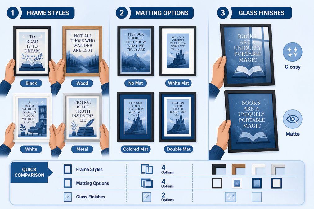
Framing transforms a print into a finished piece. The right frame enhances your art; the wrong frame diminishes it.
Choosing Frame Materials and Archival Quality
Archival quality matters more than aesthetics when displaying art you want to preserve. Archival framing uses materials that don't degrade or damage prints over time. Standard frames often use acidic mats and backing that yellow and deteriorate.
When framing art prints for literary fans, specify archival-quality materials: acid-free mats, lignin-free backing, and UV-protective glass. Professional framing preserves your investment for decades.
Frame material shapes your aesthetic. Wood frames work with nearly any décor style. Metal frames create contemporary feel. For character-inspired designs, simple wooden frames in natural or dark finish usually work best, letting art speak.
Mat selection is equally important. A mat creates breathing room between print and glass, protecting the print and improving visual impact. Neutral mats work universally. Mat width should be proportional to print size, a 16x20 print typically needs 2-3 inch mats.
DIY vs. Professional Framing
DIY framing saves money but requires precision and quality materials. DIY kits from art supply stores offer decent results at $20-40 per frame but rarely achieve true archival quality.
Professional framing costs more but delivers superior results. For prints you genuinely care about preserving, professional framing is worth the investment. For experimental pieces or prints you might rotate seasonally, DIY framing makes sense.
Styling Bookish Wall Decor in Your Home
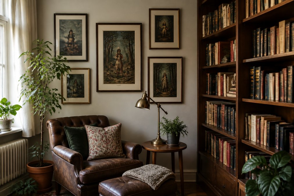
Art prints for literary fans only work when they integrate into your actual living space. A beautiful print hung randomly looks like decoration; thoughtfully placed, it becomes part of your room's story.
Integrating Literary Art into Modern Spaces
Character-driven art from classic tales can work in contemporary design through intentionality. In modern minimalist spaces, literary art works best as a singular, commanding focal point. A single large character print above a sofa anchors the room paired with simple, clean furnishings.
In eclectic, maximalist spaces, literary art thrives alongside other collections. Multiple prints of different sizes arranged in a gallery wall celebrate the abundance of stories you love.
The color palette of your print matters. Colorful artistic posters work best in rooms with complementary color schemes. Vibrant character prints need breathing room in predominantly neutral spaces. In rooms with bold colors, literary art in similar tones creates cohesion.
Creating a Cohesive Home Library Aesthetic
A true home library celebrates books visually. Literary art prints extend the library's narrative beyond the shelves themselves.
Start with bookshelves as foundation. Arrange books by color, series, or size, creating visual logic. Layer in literary art at eye level and above. Lighter prints with cream backgrounds create contrast against dark wood shelves. Character-inspired designs add warmth to minimal, modern shelves.
Warm-toned lighting (2700K color temperature) makes vintage book page prints and character art glow. Cool-toned lighting emphasizes minimalist designs. Position lights to highlight prints without creating glare.
Accessories reinforce literary aesthetic. A globe, vintage typewriter, reading lamp, or stack of leather-bound books signal this space celebrates stories. Literary art prints become part of a cohesive environment where every element reinforces the same message.
Best Places to Buy Book Art and Literary Gifts
Finding quality art prints requires knowing where to look. Not all sellers prioritize curation or quality.
Mind Eracing Studio stands out because curation is central to the business. Rather than offering thousands of options, the collection focuses on character-inspired designs genuinely celebrating classic tales and fables. Commitment to satin and archival matte options means quality is consistent. When you buy from Mind Eracing Studio, you're buying from a curator who understands what readers actually want.
Specialized retailers like The Literary Gift Company focus exclusively on book-inspired merchandise. This specialization means deep audience understanding, though selection is limited.
Broader platforms like CafePress and Etsy offer enormous selection but require significant filtering. You'll find genuinely creative designs alongside mediocre ones.
What to Look for in Quality and Curation
Quality curation means the seller made intentional choices about which designs to feature. Curated collections typically have 50-200 designs rather than thousands, sharing a cohesive sensibility.
Look for evidence the seller understands source material. Do character designs capture personality? Is typography art thoughtfully designed? Does the collection celebrate beloved books?
Production quality is equally important. Check if the seller specifies paper type, print method, and archival standards. Reputable sellers are transparent about acid-free materials, UV-protective options, and archival-quality inks.
Customer reviews reveal whether prints arrive as pictured and whether colors match expectations. Sellers with consistent five-star reviews and detailed customer photos have likely solved color accuracy through quality control.
Material Quality and Archival Standards Matter
Most readers get burned buying art prints online. A beautiful design printed on cheap paper with non-archival inks fades within a year or two. You're buying the promise that it will look good for years.
Archival quality ensures longevity. Archival-quality prints use acid-free paper, fade-resistant inks, and materials that won't yellow or deteriorate. If a seller doesn't mention archival quality, they're probably not using it.
Paper weight matters. Quality art prints use 100-300 pound paper, which feels substantial and lasts longer than standard 20-pound copy paper.
Pigment-based inks (used in giclée printing) last significantly longer than dye-based inks. Giclée is the fine art printing standard.
Mind Eracing Studio's emphasis on satin and archival matte options reflects commitment to quality. These are deliberate choices about delivering prints that actually last. When investing in art celebrating books you love, material quality isn't optional.
Addressing Common Concerns About Online Art Purchases
Buying art online creates legitimate anxiety. You can't see colors in person, feel paper texture, or be certain the print matches your space until arrival.
The color accuracy problem is real. Digital displays show colors differently than prints. Reputable sellers address this through consistent lighting in product photography and transparency about color accuracy. Some offer sample prints or detailed customer photos showing prints in actual homes.
Size perception is another common issue. A 16x20 print looks dramatically different on your wall than in a product thumbnail. Measure your wall space and visualize the print at actual size before ordering.
The question of whether prints feel "special" versus "mass-produced" matters to readers. Thoughtfully designed character prints from curated collections feel intentional. Generic literary quotes feel generic. Seller reputation and customer reviews reveal this difference.
Return policies reveal whether a seller stands behind their product. Generous 30-60 day returns signal confidence in product quality.
Frequently Asked Questions
How can I ensure art prints for literary fans will match the colors in my photos?
High-quality printing processes like giclée ensure accurate color reproduction, but monitor settings and lighting affect how prints appear online. Request samples or check detailed product photography showing the print in different lighting conditions. Archival-quality prints maintain color accuracy over time. Reputable sellers offer return policies if the final print doesn't match your expectations, protecting your investment in bookish wall decor.
What's the difference between satin and archival matte finishes for literary prints?
Satin finishes have a slight sheen that enhances color vibrancy and makes images pop, ideal for bold character-inspired designs. Archival matte finishes provide a non-reflective surface that reduces glare and offers a classic, gallery-like appearance. Matte finishes are better for minimalist literary design and typography art. Both formats preserve prints long-term when using acid-free, fade-resistant materials. Choose based on your room's lighting and the aesthetic you want for your reading nook.
Can character-inspired art from classic tales work in a modern apartment?
Yes. Character-inspired designs and vintage book page prints complement contemporary interiors when displayed thoughtfully. Pair literary art with clean frames and minimal surrounding decor to avoid visual clutter. Choose prints with a modern color palette or minimalist literary design rather than overly ornate pieces. Group multiple smaller prints for impact, or use one statement piece as a focal point. The key is balancing whimsical storytelling with your space's existing design language.
What should I look for in best places to buy book art to ensure I'm getting quality?
Look for sellers who specify print materials, offer archival quality options, and provide detailed product descriptions. Check return policies and customer reviews mentioning color accuracy and durability. Reputable sources clearly explain their printing methods (giclée, fine art printing) and paper types. Avoid sellers who lack transparency about materials or offer suspiciously low prices. Curated collections from dedicated literary art vendors typically offer better quality control than mass-market alternatives.
When you're ready to bring literary art into your home, start with Mind Eracing Studio's curated collection of character-inspired designs. The satin and archival matte options ensure your prints preserve their color and integrity for years. Rather than sorting through thousands of generic options, you get designs that genuinely celebrate the stories you love, exactly what readers deserve in their spaces.
This article was written using GrandRanker